Montreal B-Sides:
These are a small sample of images I didn’t post to my instagram feed ‘cause at the rate that I was posting, it would’ve taken another month to get stuff online. So here’s some imagery, sans captions for the sake of sharing. Enjoy!
wtitten by Emily Pohl-Weary
photography by Ryan Tacay
(A photo essay created with the initiative of the Koffler Arts “X-Neighbourhoods” project in collaboration with Toronto Clicks)
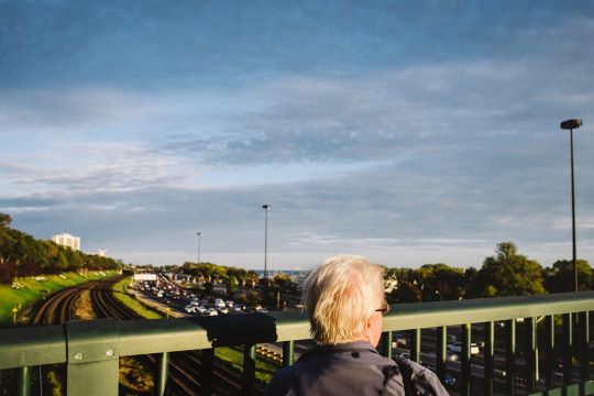
Almost my entire life has been spent within the little box of Toronto’s downtown west-end. Walk out of my childhood home, turn in one direction and skyscrapers bite the sky, turn in the other and a scar-like expressway extends forever, separating the city from the polluted lake and the evils of small-town Ontario.
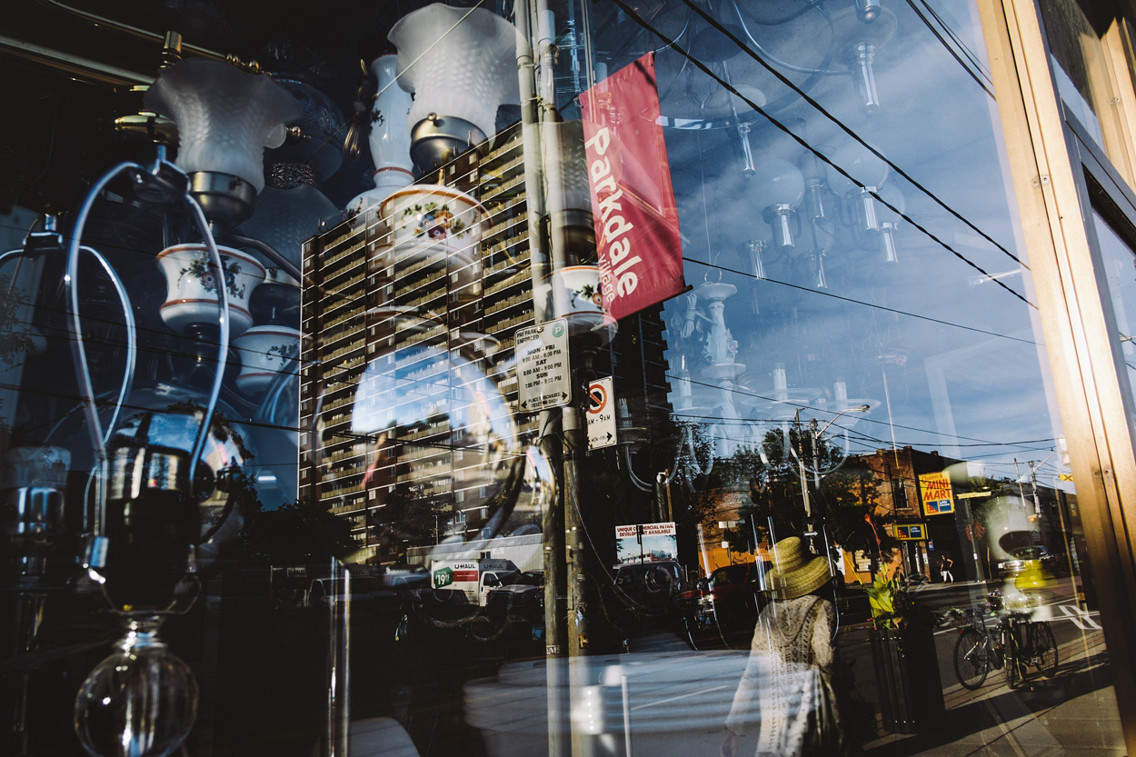
Parkdale isn’t lovely in any conventional sense. It’s a beautiful mess of neon-bright colours, perpetual gridlock, people from all walks of life and social strata, graffiti art, garbage, crumbling brick, and grey cement. The exorbitant cost of living, condominium developers, and pressure to gentrify may have forced steady change on it, but its heart remains. It’s a layered, intersectional part of the city, and while it may be possible to stay in your own particular layer some of the time, walking from one block to the next, you’ll pass chichi coffee shops, rooming houses, and faltering businesses.
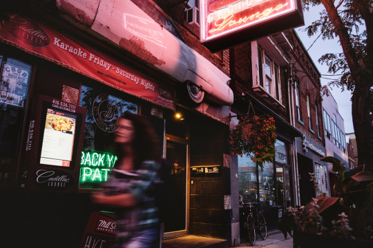
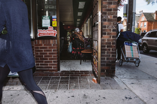
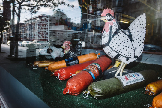
Growing up there in the 1980s—the decade that brought us Pac-Man’s release, Michael Jackson’s Thriller, and the World-Wide Web—I found comfort in the fact that maps were superfluous. I felt my way around with my eyes half-closed—sometimes reading a book or singing along to music. I loved shortcuts and back alleys. Some people preferred fine art galleries, but I would just head to my neighbourhood’s shadowy places to look at the ever-changing murals. Sticky situations were handled by making eye contact, picking my nose, giving someone the finger, ducking into a corner store, or hailing a cab.
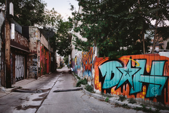
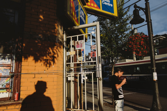
I learned to appreciate the things people who fled to the suburbs warned you about: chaos, the ugliness of haphazard growth, and “crazy” people. Given the choice between sterile serenity and hectic density, I always chose the latter. I’d still rather schlep my sorry ass around the city on crowded streetcars, with sweaty businesswomen in polyester suits breathing fishily down my neck, than live an enclosed bubble existence.
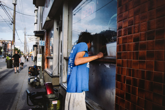
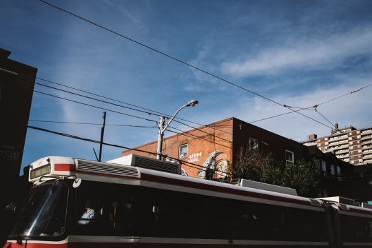
In Parkdale, nothing was truly private, and nobody bothered to pretend, because we lived on top of each other, and were forced to witness each other’s private moments and humiliations. Often we pretended not to see. But not always. A few years after my parents divorced, when I was about nine, my father moved to a tiny dead-end street called Virtue that consisted of about twenty houses. Virtue Street was an enclave of gossips who seemed to know and see all.
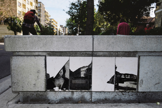
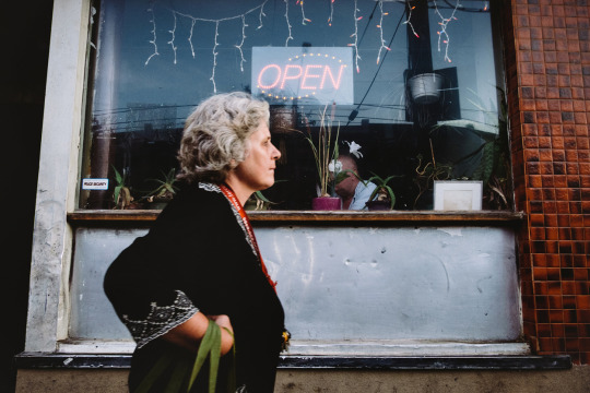
Every couple weeks, I stuffed all my clothing and school books into big black garbage bags, and lumped them on my back from one parent’s house to the other past the corner where the sex workers did business—they kept an eye on me. On foot seemed like the most hassle-free way to go. Waiting for a drive was intolerable, because I was an empowered, independent sort of girl who thought she was Nancy Drew incarnate. I took action, investigating all potential mysteries, taking people’s fingerprints, examining their handwriting, and poking around abandoned buildings for clues. Only now do I realize that maybe some of those things weren’t so safe.
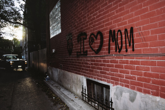
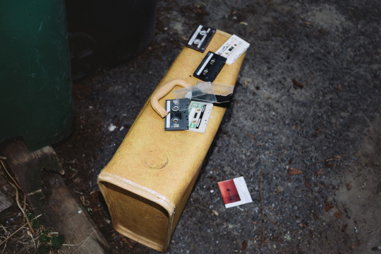
An insatiable desire to understand the why and what of my universe eventually turned me into a writer. It was either that or an anthropologist. There were so many characters. It was virtually impossible not to interact with someone on the way to the corner store. I remember this one man, an outpatient from the nearby mental health hospital, who sat on our corner, rocking back and forth, with his hands over his face, whispering his traumas. Summer, autumn, winter, and spring came and went, year after year, but he was still there, wearing thin lace-up leather shoes with no socks. We never spoke a single word to each other, and I have no clue whether he even saw me, but I was grateful for the sight of him there by the streetcar stop, because it meant I was home.
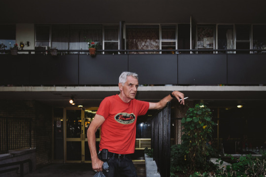
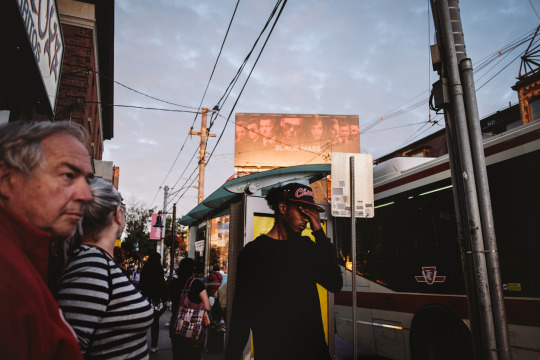
He is just one of the memories that follow me around the area. Rita Cox, the local children’s librarian, told the best Anansi the trickster stories. She saved incredible dress-up costumes for all her Parkdale “kids” in the basement of the library and rounded us all up so we could dance in the carnivalesque Children’s Caribana along the waterfront. I fell in love with steel bands, and the fact that gorgeous music could be made from the lid of a garbage can or an empty oil drum. That’s the music in my head when I think of Parkdale.
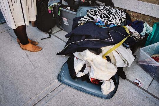
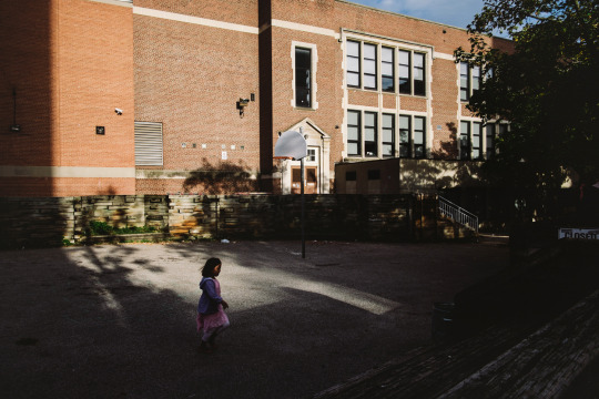
There was my best friend Sheena, who moved away, but used to live in the duplex unit upstairs from us. She was an amazing dancer and made me practice routines to Madonna’s early oeuvre and the Rocky Horror Picture Show until I pretended to hear my mother calling me for dinner. She was also the best teacher of everything naughty. She showed me how to light cigarette butts with a magnifying glass, how to cut a hole in my screen window so we could escape at night (or let the boys in), how to dress for clubbing, and how to do a strip tease the sexy way.
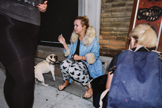
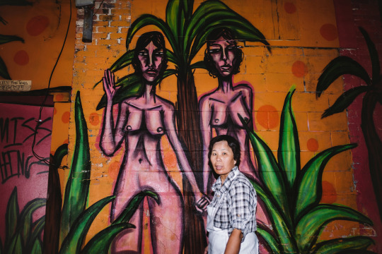
I once saw a man have a heart attack on Queen Street, within spitting distance of two beat cops, who did nothing until I screamed at them to call an ambulance. A frail Bird Lady lived in a boarding house on my street, and her family consisted solely of the pigeons she fed every afternoon. Her head was injured one day, when her door was busted down during a raid on her building, so I brought her flowers from the lilac bushes in our front yard, and asked why she’d refused to go to the hospital. She was convinced they’d lock her up.
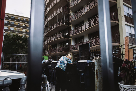
A person’s life was both worthless and priceless at the same time. It just depended on who was doing the measuring. Some people would be there for you no matter what, others would steal the shoes off your feet. Understanding this was the key to how the community functioned. If you were an insider, you were pretty safe, unless you crossed certain lines.
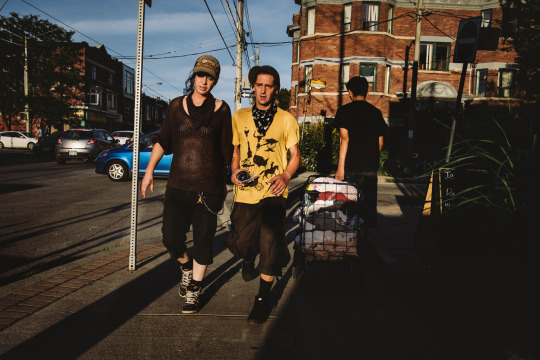
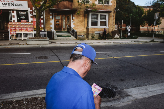
But when I traveled just twenty blocks in any direction, the rules changed. I got disoriented. People became inscrutable. North was no longer up, south wasn’t down. Things were further apart, more uniform, less familiar. If I went just a bit further, and blinked for a moment, when I opened my eyes, I’d shifted into a parallel universe.
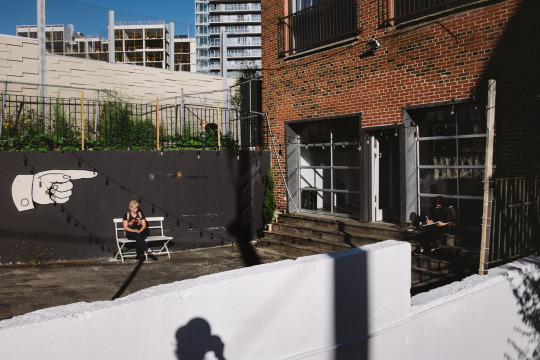
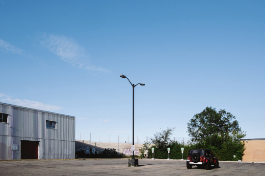
In some ways, flying through space would have been more appropriate than taking the subway out to North York. Everything matched: people, houses, box stores. I immediately missed the sound of a thousand different voices, the strains of every kind of music in the world floating down from open windows and out of tricked-out Honda Civics. Parkdale always had its own particular vibe.
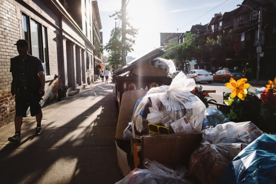
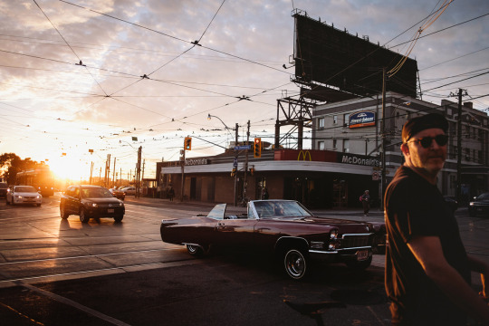
So I always returned with a sense of relief. While forays outside the little box were enlightening, nothing beat familiarity. Besides, a mental chasm existed between the urban and the suburban, between hectic chaos and artificial order.
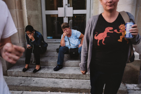
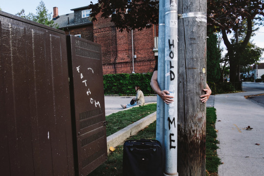
We are all shaped by our environments. I am a child of the city.
*An early version of this piece was published in City of Words edited by Sarah Elton (Cormorant Books, 2009).

First off, apologies for the lack of updates but since being back from shooting in Germany, I’ve needed to recharge my batteries (both literally and figuratively). Shooting 12hr days for 12days straight kinda takes a lot of physical/mental energy as does going through close to 4800 images and figuring out ways to organize them into smaller stories that are easier to share… like this one.
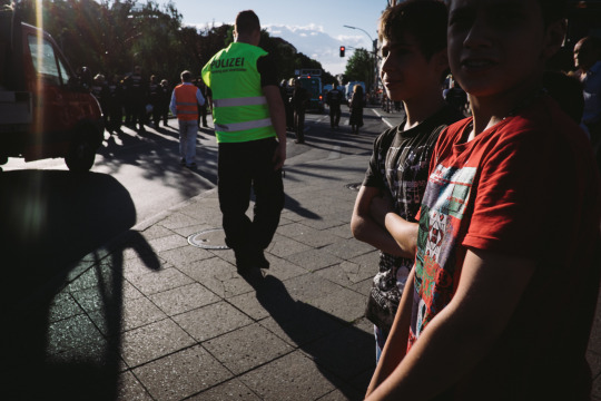
These shots were taken from my 4th day in Germany (July 25th, 2015), after traveling from Cologne to Berlin and only having been in the city for less than 2hrs.
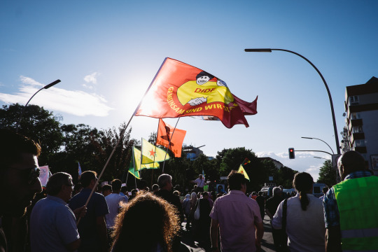
I needed a warm up to start my shooting day and this random Kurdish protest march that appeared out of nowhere was pretty much the ticket I needed to really get right in there and shoot strangers on the street.
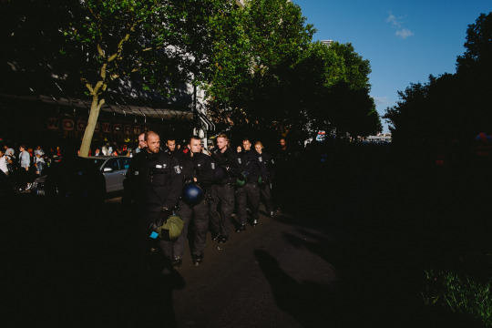
It was also one way to potentially get into a lot of trouble if things turned ugly …but anything to get the shot I suppose.
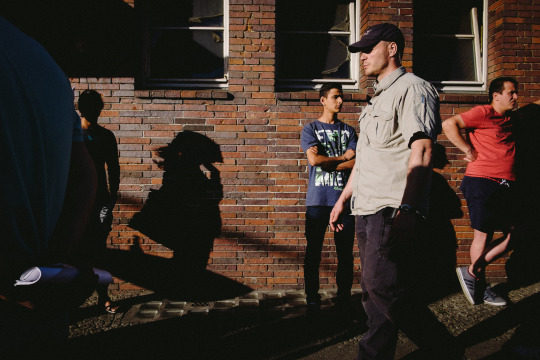
Now, I’m not a photojournalist, far from it in fact. I think there are significant differences between photojournalism and street photography and without boring you on the particulars, here’s a link to something I just googled that pretty much sums up what I believe so it saves me from having to paraphrase the article (aka I’m lazy to summarize) so here:
Photojournalism vs Street Photography
(just be sure to come back to what I’m writing here if you start venturing off to the land of external links;)
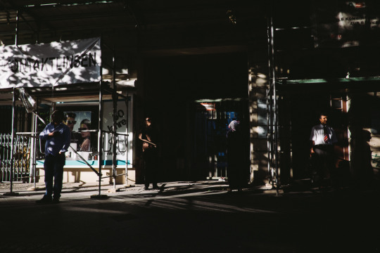
I’d hate to give the impression that I’m using someone else’s cause for my own personal gain but when an opportunity arises to get unique vantage points (like shooting from the middle of the street to get a wider POV of the storefronts in Berlin) then I’ll take it. I’ll just link to another article of what the protest is about HERE for anyone who wants to know more about it. #KarmaRestored
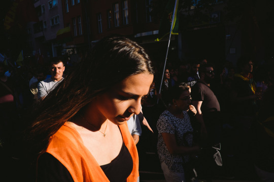
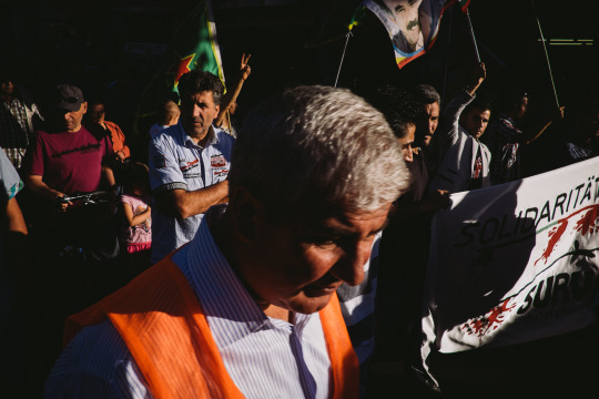
Interesting how sometimes you find yourself taking similar shots at different times and with different people. Kinda says something about what catches your eye by default. Personally, I’d like to say that “it’s a testament to my consistency” *Ahem-bullshit-ahem*
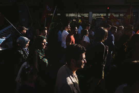
Aside from great pockets of light I was able to stand on a raised median platform in the middle of the street that offered a higher perspective. Then I was told that I couldn’t walk on there as a precaution to avoid upsetting the police who could book me for destruction of public property if I kept trampling over their flowerbed.
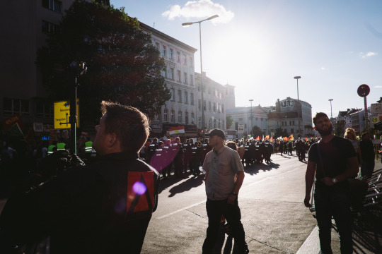
The police also had their own video guy to ensure their side of the story just in case things went ugly and the media (who I pretended to be a part of) were to try and twist things around. Honestly, I have no idea if that’s even the case here. I mean he could just be an officer who was excited to try out his new Sony 4k ActionCam.
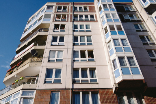
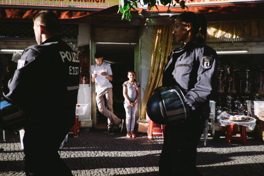
Naturally, these types of events have people curious, so a ton of people could be seen from the streets looking out their windows/balconies and pouring out from storefronts to figure out what was going on. Also, it was a nice day so there’s that.
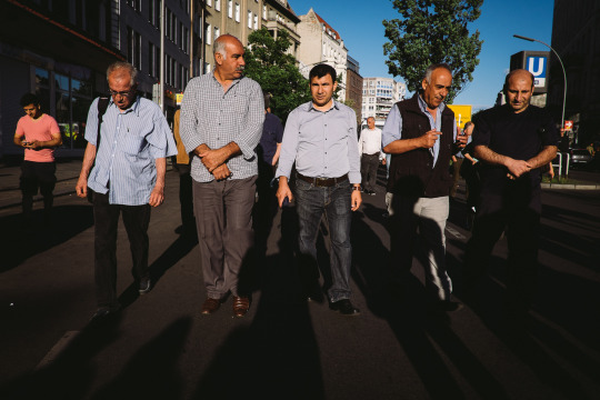
With the veil of being a “part of the media,” it was much easier to get in front of people and grab shots like these.
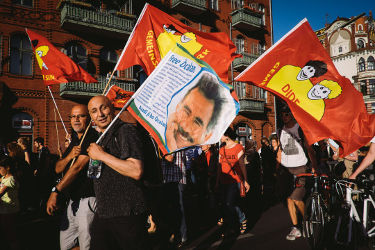
It was a great way to feel people out in how they’d react to having a camera on them, considering the right to privacy laws in Germany. I mean this was one of the reasons why I went there to shoot my project - to see how tough street photography is in a country that has strict rules regarding posting photos taken in public without consent. *here’s hoping I have some sort of “Canadian Immunity” for posting these while in North America*
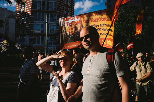
Clearly you had some people who had suspicious glares whenever the camera was brought up to my face, but if you’re marching in a public protest, chances are, there’s gonna be cameras around. Still, I had no confrontations at all while shooting this event.
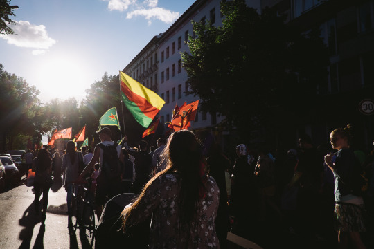
I honestly didn’t want to be restricted to boring shots of people silhouetted from behind.
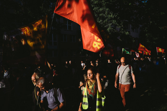
So I resorted to boring shots of people in the front instead ;)
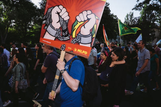
There were times when I wanted to find creative ways to obscure people’s identities but there were way too many people for that to have worked effectively.
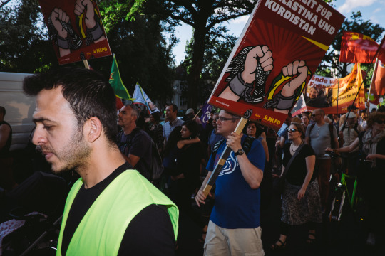
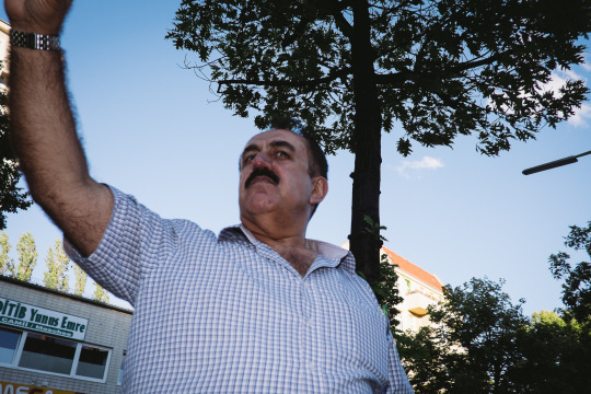
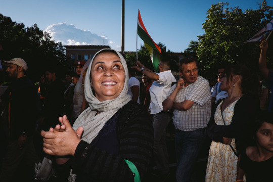
I also wanted to push my luck and see if I’d get any negative reactions if I started to use flash but still, everyone was ‘ok’ with me going about and shooting as I normally do.
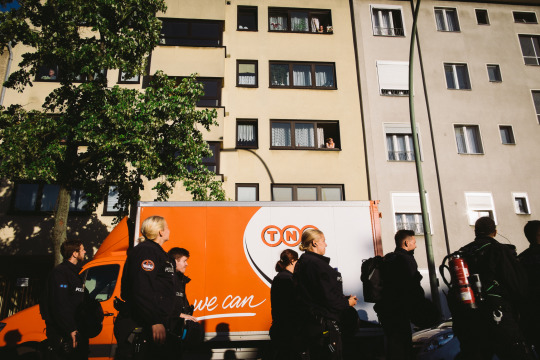
The police presence was heavy but everyone seemed to keep a cool head and luckily the only snag I witnessed was interrupting rush hour traffic.
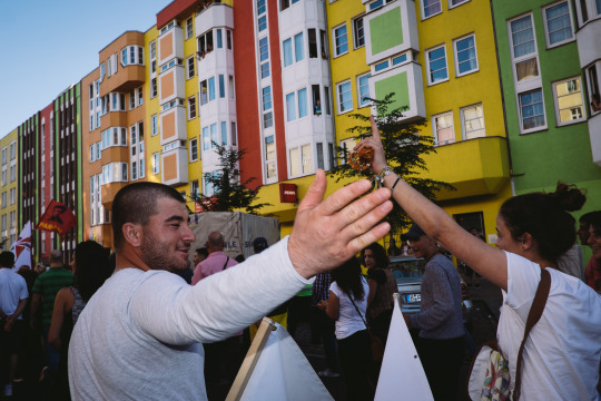
Even though there were pockets where there was no light at all, Berlin had really colourful buildings that provided enough of an interesting backdrop for some of my shots.
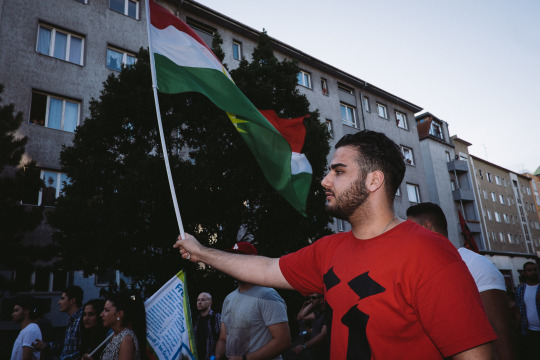
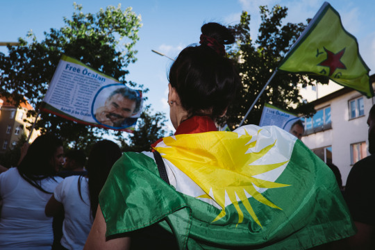
As with any other protest, there’s a ton of flag waving/wearing and the toughest part was trying to not get so many posts sticking out of people’s heads. Having to get right in there and bob/weave to line up my subjects was something I’d have never been able to do cold turkey. Really glad I got to get a decent warm up earlier on in the March.
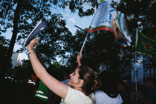
There were times during the entire trip that I wished I could just take off my shoes ‘cause my feet were killing me from all the walking, but at one point I just said, “screw it” and I ended up walking in my socks - but that’s a story for another time.
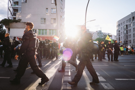
There came a point where I took enough twists and turns while blindly following the crowd to conclude that I had no idea where I was anymore. I decided that instead of spending so much time at this march, I should actually go and shoot some street while the light was still good. Also I had no idea what I was even going to do with these shots except share them as some sub-story on facebook or something. Kinda glad I was able to put something together here on tumblr to let you guys know that I’m still around and stuff ;)
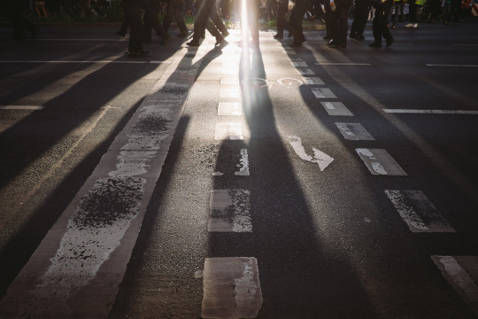
At the end of it all, I just wanted to go back to exploring Berlin and as fun as it was playing photojournalist for an hour and a half, I really wanted to to focus on my “Anonymous” project which I hope to finally curate into something by the end of the year. There’s enough images collecting virtual dust on my hard drive and it’s a big weight off my shoulders to at least share this set of images with all of you patient people.

Click the link HERE for the petition
*UPDATE*
Good News! It looks like the European Parliament voted down this proposal and Freedom Of Panorama will continue (for now) Click The link HERE for more info.
Important message, you guys - please take the time to read, thanks! Tomorrow (July 9, 2015) street photography could be illegal in ALL of Europe
The Freedom of taking photos in public places is in danger. Until now, in most European countries, you were able to shoot/publish photographs taken in public – This is called Freedom of Panorama. While on vacation, you could share images with your friends on social media but this may unfortunately change.
The new law would make it illegal to also take selfies in European cities EVEN just for personal use without having to share it anywhere. It would also be illegal to draw and film/record big movies without prior consent from the owner of the statues/buildings.
The timing of this couldn’t have fallen at a more pivotal time. As most of you know, I’ll be in Germany from the 21st to the 1st to shoot a project raising awareness of how strict the law of public privacy is in place over there and coincidentally this restriction could now very well be an issue in other countries as well.
Please stand up and save the freedom of photography. The link in my bio will take you to my blog which will link to the petition and more details of my upcoming project. Feel free to tag your friends, repost, and spread the word - thanks everyone! #.SaveFOP
Here’s the link again:
https://www.change.org/p/european-parliament-save-the-freedom-of-photography-savefop-europarl-en
*Original text modified from the petition website above.

I’m starting a new street photo project called “Anonym” which will consist of me trying to find creative ways to obscure the identities of the people I shoot, in accordance to the strict privacy laws there. I’m raising funds to get to Germany and get this off the ground!
As some of you know, I placed in the top 3 in the “Observe: Under Construction” international street photography competition in Iserlohn, so I’m also trying to finally see my work displayed in an international gallery. I made a promise on facebook that if I won, I’d would use my winnings toward seeing that print in person (and you simply don’t go back on facebook promises) …as it turns out, I’ll actually need a bit more than I expected to realistically go :) I can’t make this trip without your support so (with reservations) I’m asking those of you who enjoy my photography for help in funding this endeavour.
For those who know me, it’s a gut-wrenching struggle for me to ask for any help, let alone financial help. Chalk it up to stubbornness, pride, or simply being one of those people who have a complex about being in debt. Long story short, it took a lot of encouragement from friends to even consider something like this.
Instead of simply asking for donations, I want to be able to offer something in return so I’ve set up a couple fundraising accounts - all of which enable you guys to receive a token of gratitude, even for the smallest (but equally appreciated) donation.
I have set up 3 sites to cater to different levels of support!
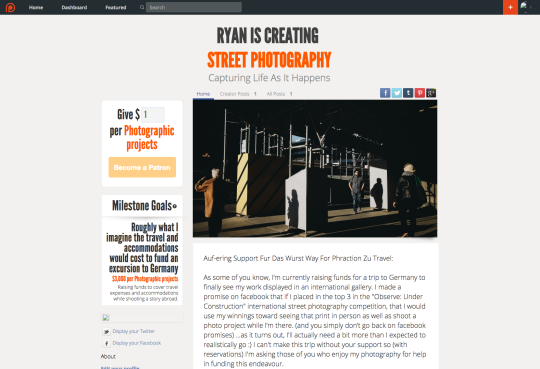
One site is called http://www.Patreon.com/phraction and there I will be hosting an on-going, monthly subscription-based artist fundraiser where I will be uploading behind the scenes content, images that hit the cutting room floor, stories, and articles that will mostly be exclusive to the “Patrons” who support me. There you can pledge as little as $1-$15 and have a chance to win signed prints and other rewards.
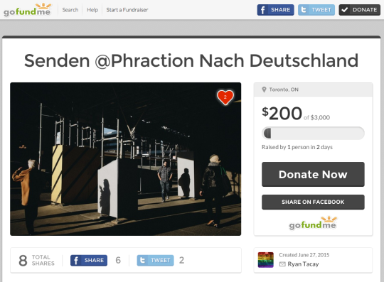
The other site is my http://www.GoFundMe.com/phraction page which I’m setting up specifically to raise funds for this Germany adventure and focus on a photo project while there. The reward levels here are catered more toward locals to Toronto (whom I can deliver prints to in person) but anyone can donate there and if you do, I’ll find a way to get you a print :)
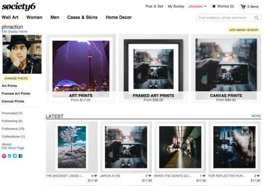
In addition to those 2 sites, I have also recently uploaded the very image that is hanging up in the gallery to my http://Society6.com/phraction print-on-demand site. Here you can purchase fine-art prints, framed images, and canvas versions of some of the images found on my instagram feed. This is especially useful for those of you who are not located anywhere close to Toronto and would like to simply purchase a print and have it shipped almost anywhere in the world.
All 3 offer totally different things so you can participate in as many or as little ways as you like… though you know, the more the merrier ;)
I’m using the 200euros I received as prize money toward the trip and I set an arbitrary goal of $3000 because I have no idea what anything actually costs - but rest assured, I’m doing what I can on my part to fill in the gaps by selling my old photo equipment (I have Nikon lenses for sale!), telling people to buy my book (buy my book!), eating less (I really should), and taking up a newspaper route (i’m kidding) just to fund this adventure.
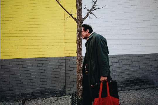
In regards to the photo project/essay while I’m there, apparently Germany is one country that has very strict privacy laws in place that prohibit one from publishing street photos without consent of any individual featured. The idea will be to see if I can creatively work around this restriction and challenge myself to come up with street photos that abide by this law as well as outline personal experiences while I go about creating this story. I hope to come back with a bunch of content to share - from images, to stories, to maybe even video. I want the opportunity to push myself and the boundaries surrounding the art of street photography.
It’s worth mentioning, that on top of never having been to Germany, let alone Europe, I will have to put all this together in less than 30 days as the gallery will be finished by July 26th.
Honestly I have no idea what to expect. I’m not an avid traveler, (I sometimes get turned around in my own city); I don’t speak German (except for swear words and sausage so there’s only so much I can imply with that); I’ve also gotten progressively worse at being organized (thus the last-minute planning of this entire campaign). You guys can have a first-person view of seeing me rise to the occasion or falling flat on my face (which makes for good TV) so let’s see where this goes and thank you all for entertaining the thought of supporting me by taking the time to read this novel :)
If you want to see what kind of images I can take while out of my comfort zone, please make a pledge. Thanks everyone!

“Orange you glad I’m not twisted”

As of a couple days ago, it’s been just over a year since I’ve been trying my hand at shooting street. I think it’s time to share my process because I’ve made tons of mistakes and it’s good to poke fun at old (young) me and realize that future (older) me will also look back on this and make fun of present me - ‘cause that’s not a confusing sentence. It’s also helpful to see how (if) I’ve really progressed in this genre and use this as a bookmark of sorts. While writing this, I didn’t realize this novel of a post was so long that it was getting to a point that even *I* didn’t want to read through it. I figured it would be better off as a bunch of ‘smaller’ articles instead of one ginormous wordy word post (at least by my standards).
So here’s part I (of who knows how many) of my work in progress..
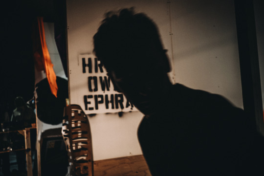
Instagram/flickr has been somewhat of a visual diary for me (cliche line, I know). To see photos that are not necessarily in chronological order but are in the order of what has caught my eye at the time is a great learning tool. I’ve noticed that I’ve gone from shooting people for the sake of shooting people to shooting scenes that mean more than just some dude who passed by me on the way to get some pizza.
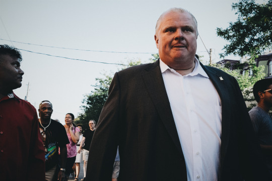
[Rob Ford - Sep 2014]
“If there’s one person who might know where pizza is..”
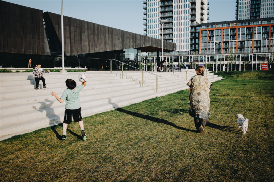
[Dog Walk - May 2015]
I now prefer to shoot scenes like this (as opposed to one’s with Rob Ford in them..)
I shoot to learn more about myself. I paraphrase Daido Moriyama’s words in my head all the time when it comes to why I shoot - we are essentially capturing ourselves in the photos we take of others. This is in addition to echoing Garry Winogrand’s philosophy of not looking at his photos for a long time after shooting, which he did in order to ‘create an emotional disconnect’. It ensured that personal feelings/emotions at the time of clicking the shutter would not skew his perspective of whether a photo is actually good or not. Obviously, these are different yet complimentary ways of thinking and I subscribe to both. Some photos, no matter how much time has passed, will always evoke some type of emotion from me and I now understand that those are just as powerful and meaningful as the photos that are aesthetically pleasing for technical reasons. So in a nutshell, I take photos but don’t look at them for a while so I can see them more objectively when the time comes to share. But I still take into consideration the images that still evoke strong emotions even after a period of time.
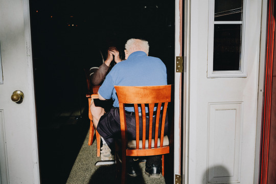
This was taken roughly a year ago and has never been shared until now. It’s still an image that resonates deeply as it’s a reminder of the time I spent working at a retirement home while learning to be patient (a trait I now apply when shooting)
These days I tend to favour scenes influenced by someone like Alex Webb vs Joel Meyerowitz, who was one of my first main influences (and still remains to be). It’s not to say their images are night and day from one another, both are colour shooters that uses golden hour light and shadows to enhance their scenes (at least from what I’ve seen of their work so far) but I just find my interests are getting caught in the Webb more-so than the Mayoral.. wit.. of the Meyerowi.. ok so I should’ve thought that phrase over a little bit more. Anyways.. similar to how Meyerowitz first started, I some(most)times get overwhelmed by the busyness of the streets and it’s hard to focus on one thing, so I shoot… everything. Afterward, I look hard to see exactly what was in that scene that I was responding to primarily. The best part about being new to all this is knowing I’ve yet to scratch the surface when it comes to discovering great images so experimenting with different styles is fun and exciting still. Also, I can play the n00b card for a little while longer until I have to smarten up and stop making excuses for using bad photos in my body of work ;)
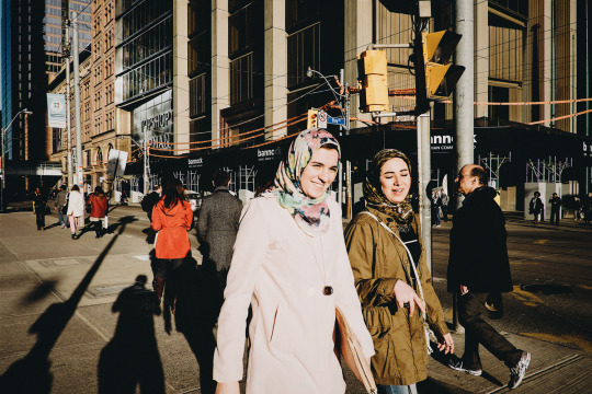
My interpretation of overwhelming busy streets which was taken with an unknown focus at the time - influenced by Joel Meyerowitz
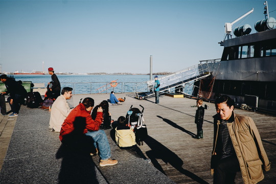
My interpretation of scenes with some depth from foreground to background - influenced by Alex Webb (clearly I still need a lot of work to really fill the frame as he does)
When I scroll down my instagram feed, I see that 2 dimensional images and shots where people horizontally or diagonally pass by ‘things’ are what caught my eye primarily. To a certain degree I still shoot these ‘cause old habits die hard and ‘cause it was instinctively what I thought street was all about.. people in the street. “Stride-By” shots, people passing by storefronts, and people who were just different/interesting-looking were images that I would naturally gravitate toward. Now I’m consciously trying to be a bit more dynamic and sometimes overly experimental with compositions but part of the learning process is seeing what works and what doesn’t.
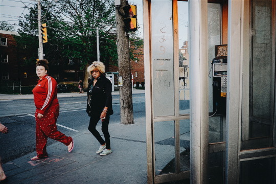
Not exactly a “Strideby” but an example of things that would catch my eye immediately. (too bad there’s poles coming out of their heads and no one was occupying the phone booth in the foreground)
I used to get very close simply because I felt I needed to. “If your photos aren’t good enough, you’re not close enough” was a Robert Capa phrase that echoed as I shot the street. Also, I think about the fact that he died because he got too close to a land mine. Now, I’m far less concerned of that happening to me in the city, though certain personality temperaments could be the equivalency during heated confrontations (which is also not really a concern of mine). *knock on wood*
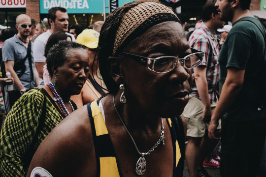
Taken at Pride 2014, I found it was like shooting fish in a barrel to walk a street festival and shoot people up close because of how crowded the event was.
Recently, I stopped getting close for the sake of getting close nor do I just take pictures of people because, people. It’s taken me a while (though I haven’t quite figured it all out yet) but I’ve realized that street can be void of people yet still embody the human element. I’ve learned to take a step back and see the big picture or show more of the environment because a spacious setting can say just as much as a super close-up. Also, I find myself now shooting at a wider angle (28mm) vs the 40mm which I shot with exclusively for months. Maybe I’m getting it all wrong, in which case I’ll at least have this piece of writing to look back upon and show me what 2015 Ryan was thinking at the time. Clearly, my style and focus (amongst many things) needs to be refined and who knows if I’ll ever find what I’m looking for in my shooting, but at least the journey so far’s been interesting to say the least.
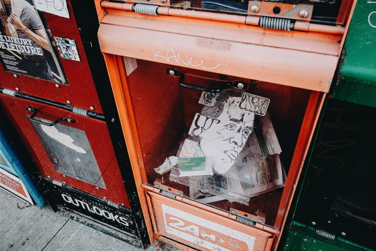
Well that’s all I’ll say for now. In future posts, I’ll talk more about what I do when I’m on the street (how I approach and photograph scenes) and what I look for and what I learn through my editing process. When I’ll get to it… well.. your guess is as good as mine. Maybe I should talk about how indecisive I can be and how that plays a roll in the decisive moment or maybe.. not. ;)
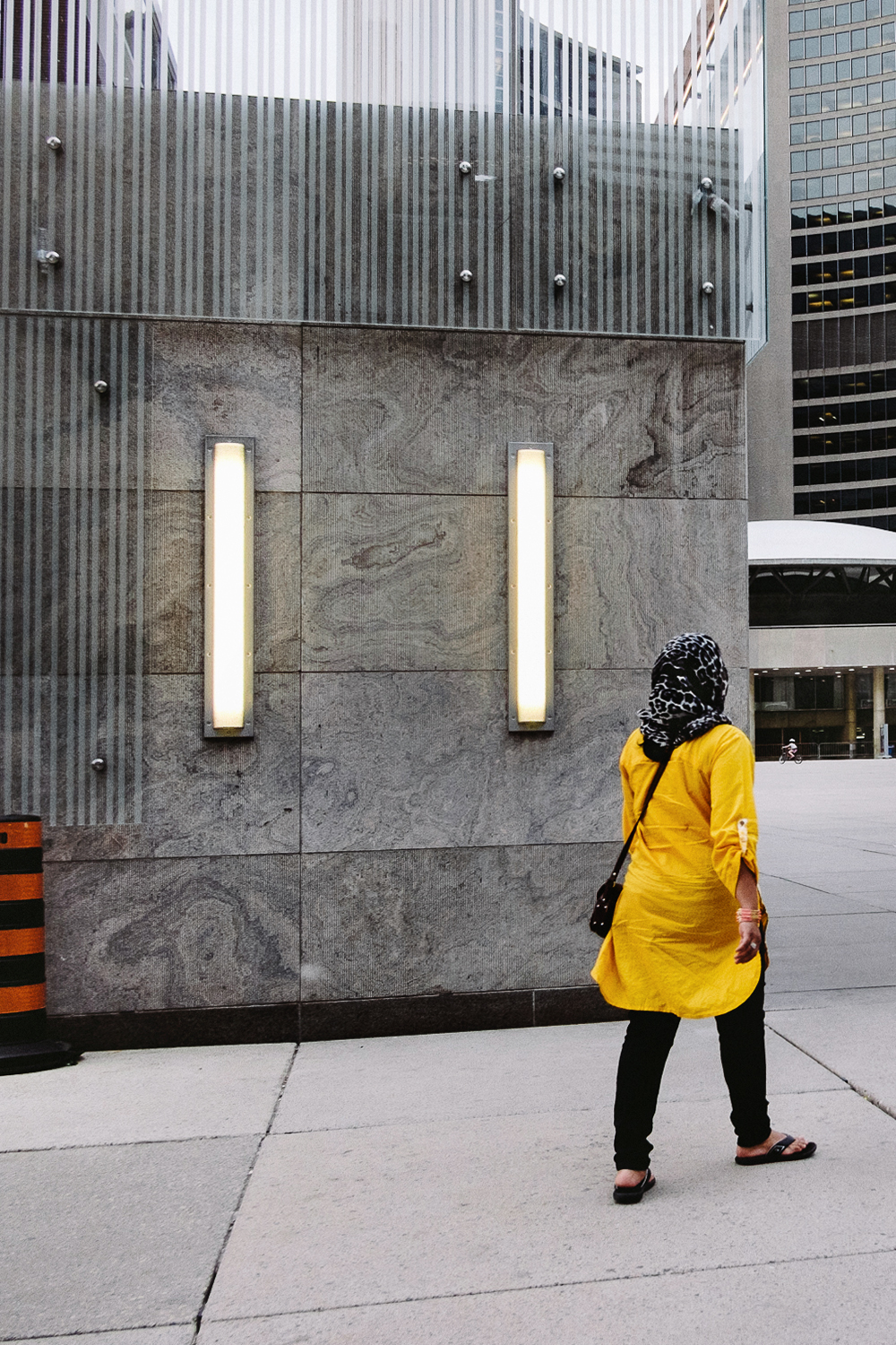
“Perpen-linear Pa-turned”
*sorry for the lack of posts with actual words - I’ve got photos to share though, that’s still pretty good right?
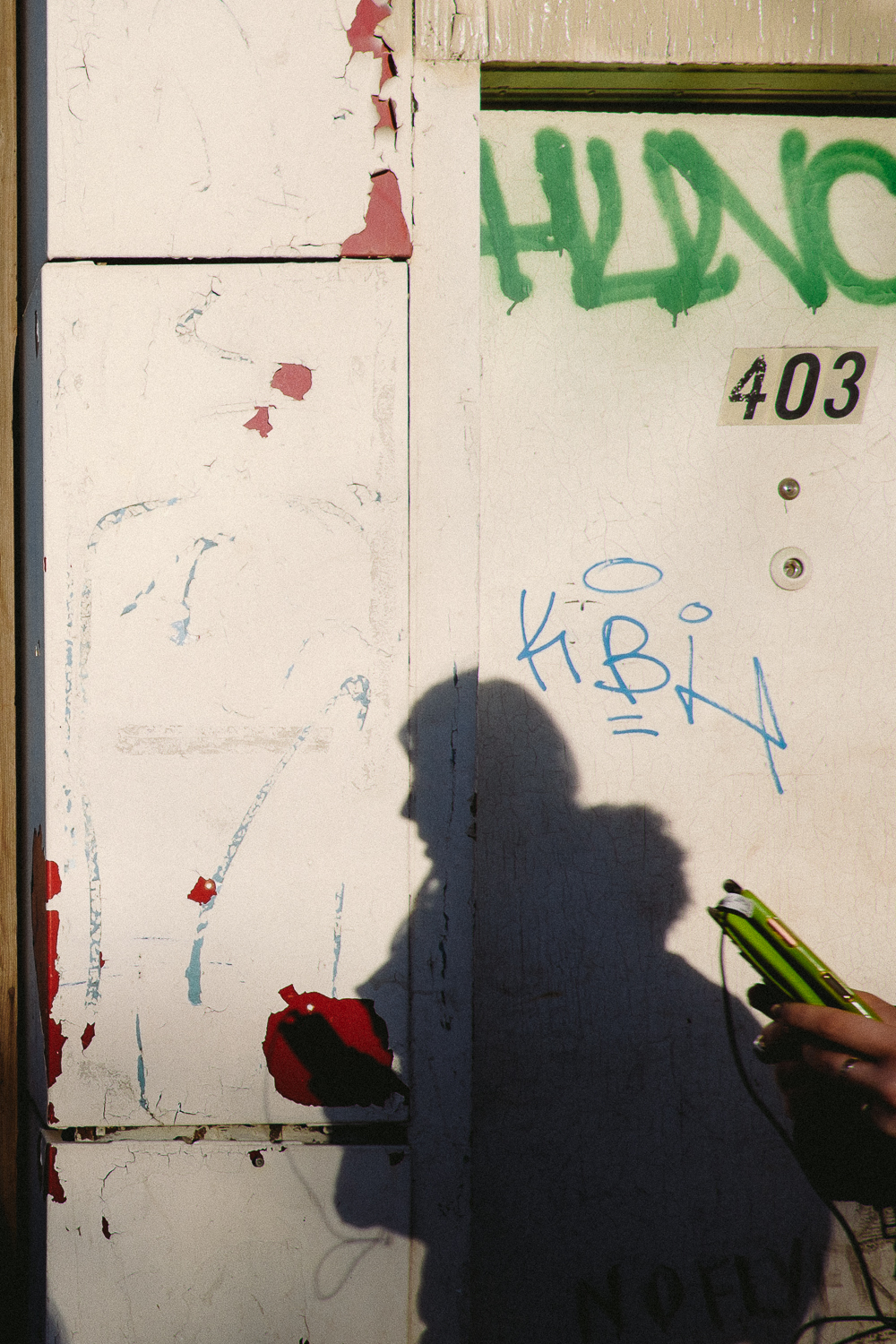
Connected Complimentary Colours
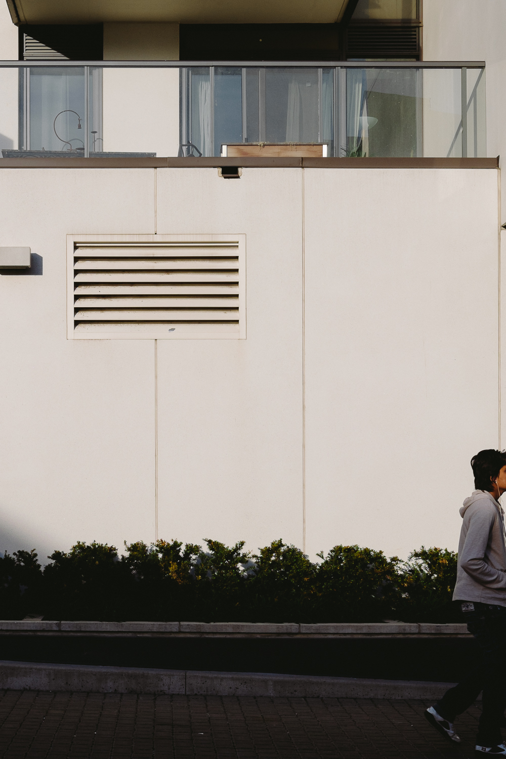
Facing An Unbalanced Reality


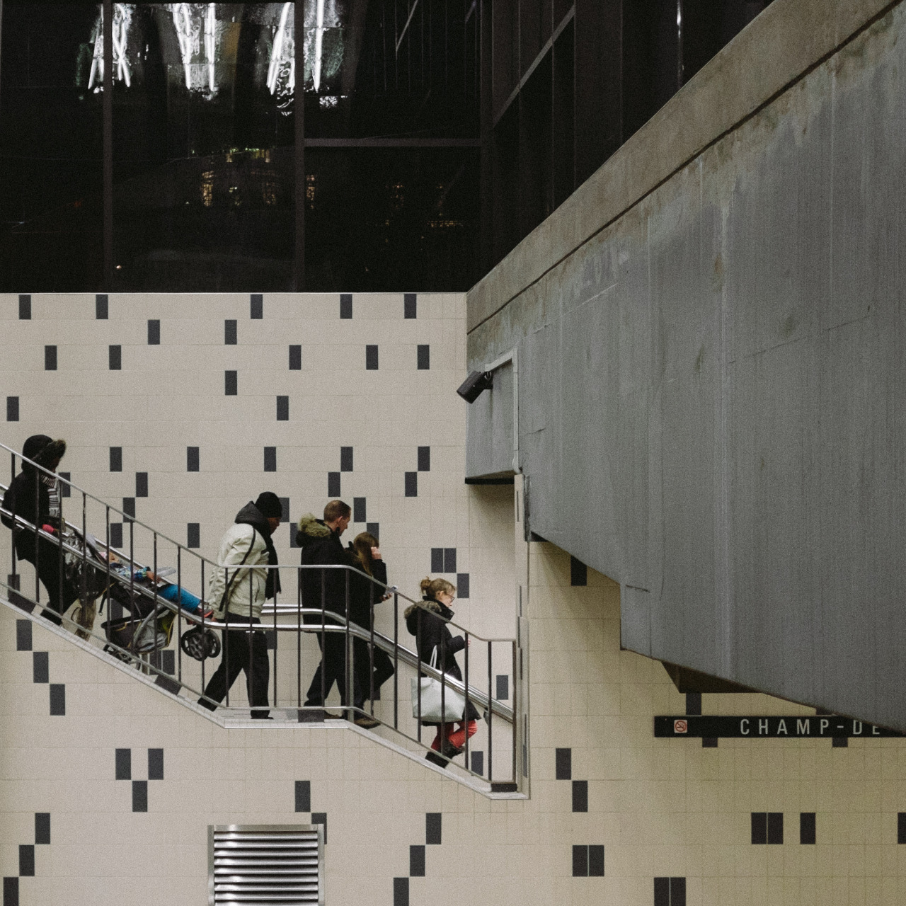


These are a small sample of images I didn’t post to my instagram feed ‘cause at the rate that I was posting, it would’ve taken another month to get stuff online. So here’s some imagery, sans captions for the sake of sharing. Enjoy!

I hardly shoot vertical because I never know what to do with my shots but this seems like a good place share them

*Update May 14, 2016: Once again, iconosquare gonna try to revamp their service again because on June 1st, 2016 all free service go away for good and everything I’ve said below will most likely become relevant again.
*Update May 2, 2015 : Since the fierce backlash from users from all over, iconosquare has felt the heat and put out the fire by rolling their site back to the way it used to be! Good decision on their part (though it kinda makes this article a bit irrelevant) Still, if that’s the price to pay, I’d rather that than the $200/month they were initially trying to charge for their service ;)

Today the one 3rd party instagram web-viewer I used to manage my accounts has turned a new leaf and undergone a complete overhaul to their services and interface. Iconosquare (formerly statigram, formerly awesome) was really good until now. This is unfortunate because I had just mentioned them in a recent article and kinda feel a bit embarrassed in recommending them now. I’d feel worse if I told you guys to go eat somewhere and then find out in an article the next day that they are under current investigations by food inspectors.
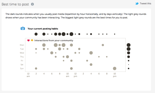
One of the fun aspects of their site is that they had before was seeing various statistics, such as the best times of day to post based on your community’s activity, new/lost followers, and the percentage of active users on your stream.
What I liked about it the most is the ability to sit at my laptop and be able to reply and comment easily using their interface instead of having to type on my phone which was always tedious (even with a bluetooth keyboard). Now it’s no better than using instagram’s web-interface. At least their emojis work now.. :|
Before:

After:

It’s not so much of the crazy fees they’re asking to use their premium service (as I would’ve been happy to just be a free user without all the bells and whistles), it’s really the massive change to the interface. Think of coming home after a long day to find that your toilet is now in your kitchen. Although somewhat practical in some aspects, it just not right.. So now it’s gone from a nice dark background with a large grid to view more images at once to a white background (which to me is a bit hard on the eyes after a while) and a smaller grid that you have to re-load every time you want to go past a certain point (and back again).
It’s gone from this:

To this:
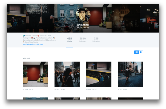
Though it may seem cleaner upon first glance, the moment you start to use it, it gets frustrating to say the least.
Another bummer was that I used their site to bookmark links to users that didn’t post as frequently whom I’d like to visit every now and then but now since the site change, the links are totally invalid. Remember those times back in the day where your contacts weren’t stored on the cloud and if you lost your phone, you lost your contacts? This.

Far be it for me to complain about any free service out there, as you get what you pay for, but you know, 1st world problems and all ;)
I mean they still had advertisements on the old model which is the bane of any free app/site, etc so they could’ve kept things the same and gave the new site to the paying users (but I’m no site expert so what do I know). It’s just too bad I guess. This was one tool that really helped in trying to keep contact and manage interactions on the instagram application. Now it’s gone (sort of). *insert virtual 2 year old tantrum here.
Personally, I’ve found websta to be the next best thing so but if any of you out there have some suggestions to any other awesome web-browser viewers, just let me know!
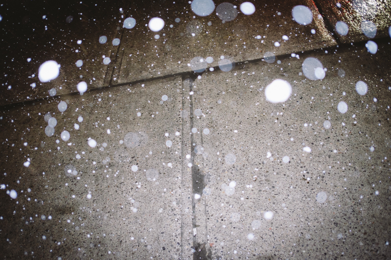


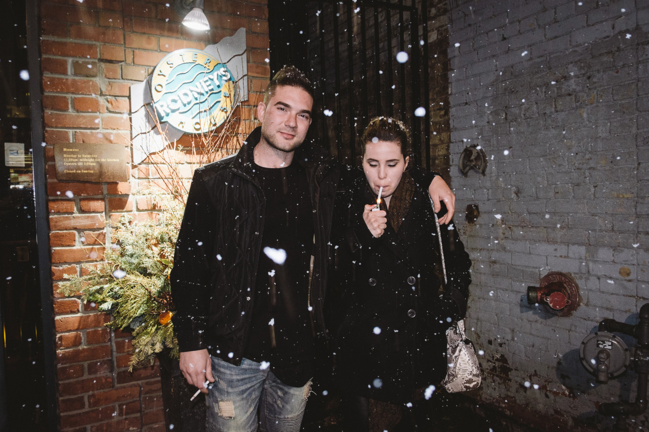
With the roller coaster winter we’ve been having here in Toronto this year, it’s only fitting that Mother Nature play a belated April fools joke on us in the form of the frosty white stuff.
This was the same night that Eric Kim was in town doing his workshop so I met up with the gang afterward at Wvrst on King/Portland to talk shop. When leaving the restaurant and seeing the snow come down, two things came to mind: “F-Me” and “Flash Time” (in the non-indecent exposure sense.. exposure..? ..nvm).
Having never shot flash for street before (especially at night) I figured I’d give it a shot (puns always intended). Since I had a few drinks in me already, I guessed that by this time some people might have too and may already be seeing stars as it is.
With liquid courage by my side, and my trusty side-kick to make sure I didn’t do anything too stupid, I channelled my inner Martin Parr, thought of his “Bad Weather” series he shot in Dublin, and convinced myself that now’s as good a time as any to experiment.
So here’s the outtakes of the selects posted on my @phraction_street instagram feed from that night.
Enjoy!
..As a side note, when taking pictures of random people through the window you pretend to know by waving at them, just keep in mind..
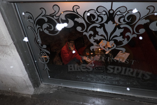
That the world is a small place and sometimes in the next window you may find someone you actually do know…
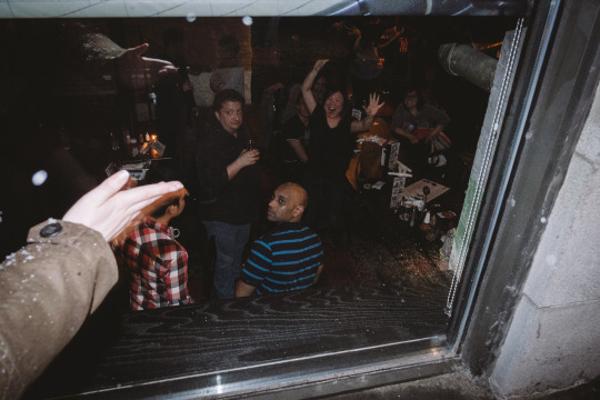
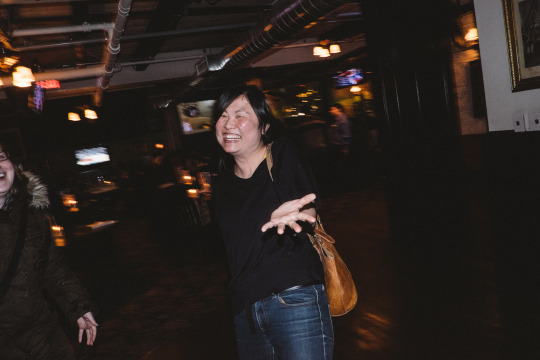
That’s when it’s time to put away the camera and catch up with old friends :)
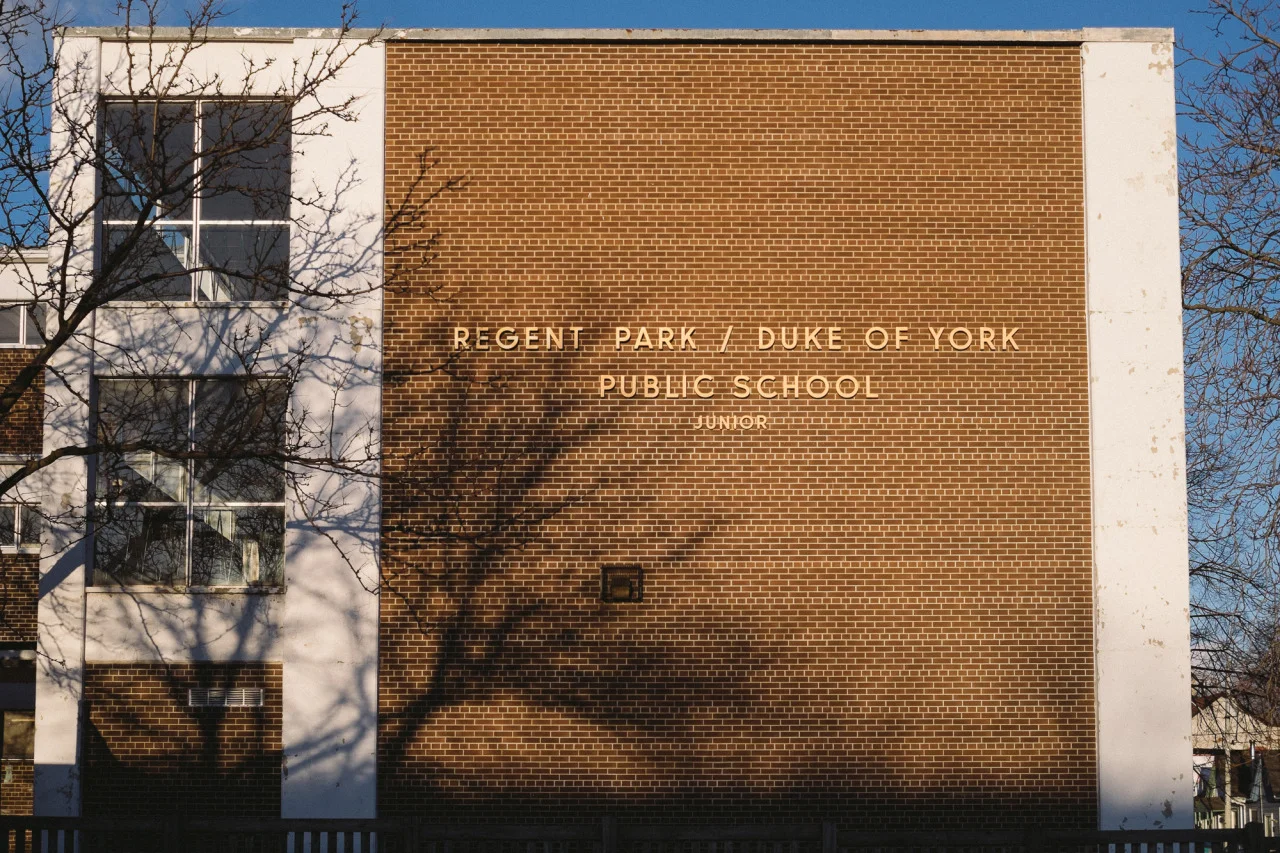


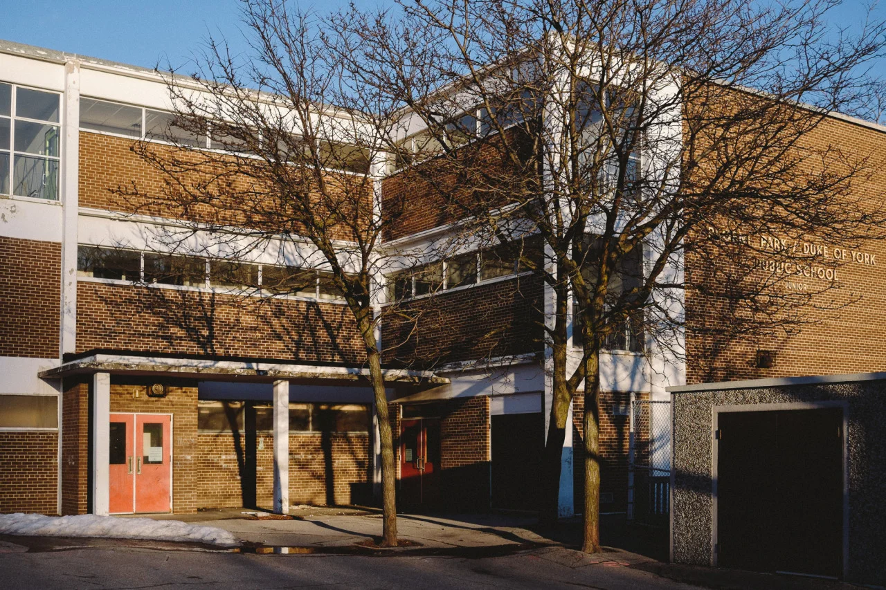


Sometimes if I come across an area interesting enough, I’ll either stop and explore the compositional possibilities or come back when the light is good enough. Luckily this day I had both (and bonus time on my hands) so I took the opportunity to take a look around at a place that’s literally a couple blocks from my pace.
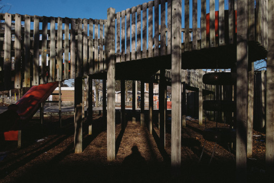
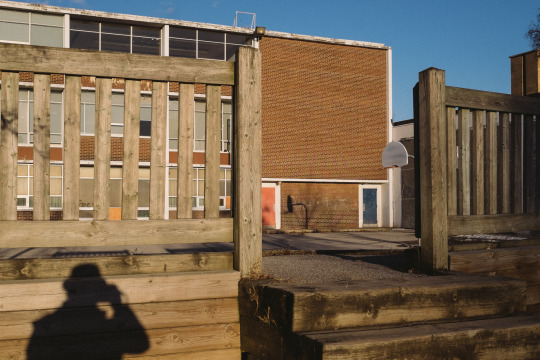
Forgive the over-use of my shadow-selfie ‘watermark’ as for most of these shots I really wasn’t trying to be in them but I couldn’t really avoid it so I do what I normally do and make cameo appearances as compositionally pleasing as possible..
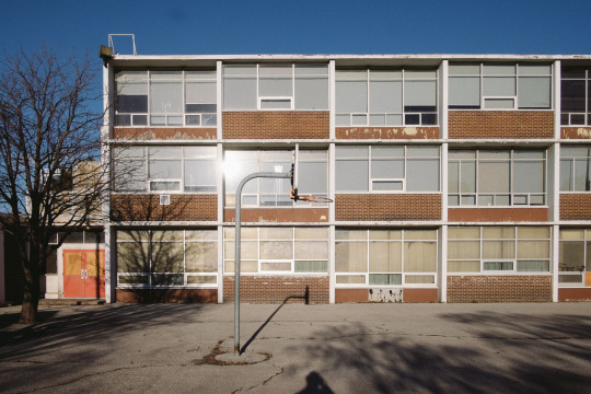
Ok so I know I could’ve tilted the camera upward a bit more..
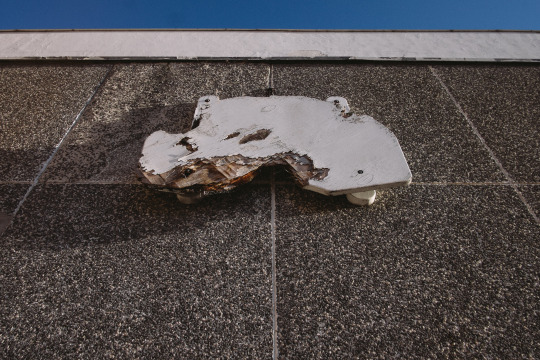
It’s been a while since I’ve gone and shot textures and random objects so it was refreshing. Also great to be outdoors after being cooped up in the house hibernating, because winter.
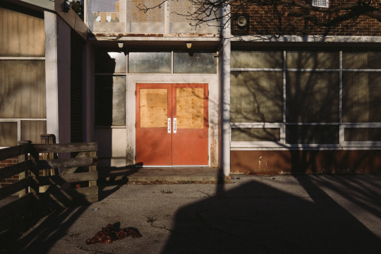
Not having too many people pass by I had to work with what I had which pretty much meant shadows and a discarded flannel shirt.
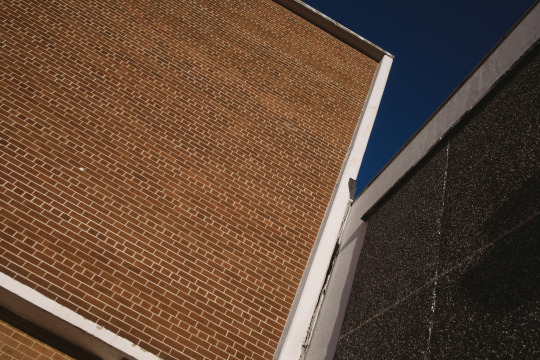
It also gave me the opportunity to work on some angles because I’m usually not good at abstract compositions so lately this has been something I’ve been doing behind the scenes as these wouldn’t really fit well on my instagram.
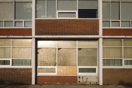
I’m not 100% sure of the story behind this place but I’ll take a stab at saying that it’s probably not in use anymore.
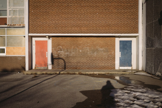
Finally good to see the white stuff melting (probably 90% of the reason I included the snow in this :)
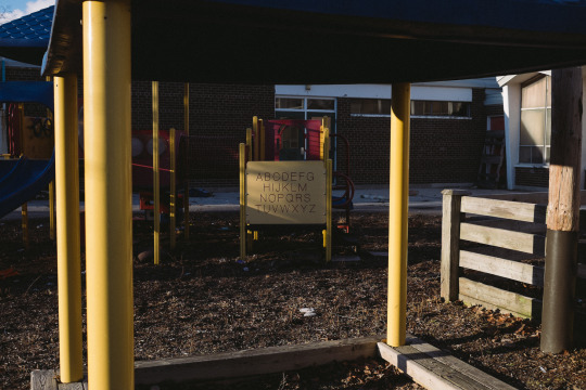
The place is wide open for the public and kids could still come to play but with the new playground that just opened up as part of the revitalization project of the area, I can see why they’d prefer to go there than here.
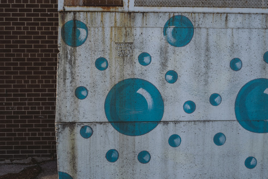
This composition looked better in my head than what came out.
And that’s pretty much it! I’ll try to keep the super-wordy posts at a minimum and see if I can share more photo sets that I wouldn’t know where to share anywhere else. I can only fit 10 shots in the ‘gallery’ at the very top so I used that area to showcase images that might benefit from a bit of zooming in to see the details.


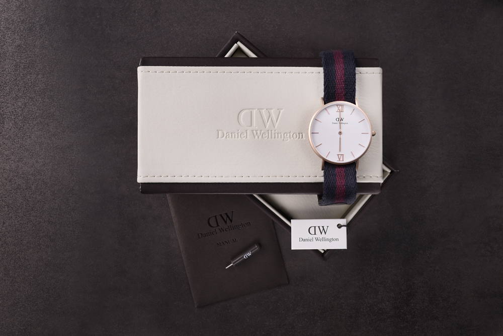

So as the title suggests, this is a product review but it’s also insight into product shooting and how these images were made. If you just want to hear what I think of the watch and then leave, then fine I’ll say it’s great - go buy one if you like - I have a promo code for 15% off (just enter my username ‘phraction’ which ends TONIGHT Feb 28th) BUT If you wanna know more stuff, keep reading below :)
Now, it’s been a while since I’ve done any kind of commercial product shooting. Mind you, I’m not an expert at this genre (at all). These are simple shots at best, but having started in a commercial food/product studio I do know my way around lighting equipment. I was never as good as those who have either studied this back in photo school or professionals who do this on a daily basis. As a photo retoucher, I have to know my studio lighting in order to keep any changes I make as realistic as possible. Wouldn’t make any sense for me to drop shadows onto a product in one direction if the light is clearly coming from the opposite.
Collaborating with Daniel Wellington Watches gave me an opportunity to revisit product photography as well as do a bit of a review on their stuff. Of course, I didn’t have to do any of this, I just wanted to do this to share a bit of knowledge with you all. #SharingIsCaring (hashtagging in the middle of blogs don’t work btw)

For this review we’re going to look at the “Grace London” watch simply because that’s the one I chose. For lighting I used Speedotron power packs and heads (tried and true work horses of the industry), a few softboxes, and my mirrorless camera. Not gonna go into any other gear details simply because I don’t feel like it (also because I’m an advocate that the brand/type of camera doesn’t matter as they’re just simply tools to create - these images can be made using pretty much any camera). Special thanks to Professional Photographer, Rob Kinghorn for letting me hijack his studio for a couple hours and use his setup for the shoot :)
The first impression of the product is that it is packaged pretty nicely. It comes with all you see here: the watch, a manual (which I didn’t actually read), and a little tool to help you remove the bar holding the strap in place so you can switch it around with others that you can buy from their accessories section on their site.

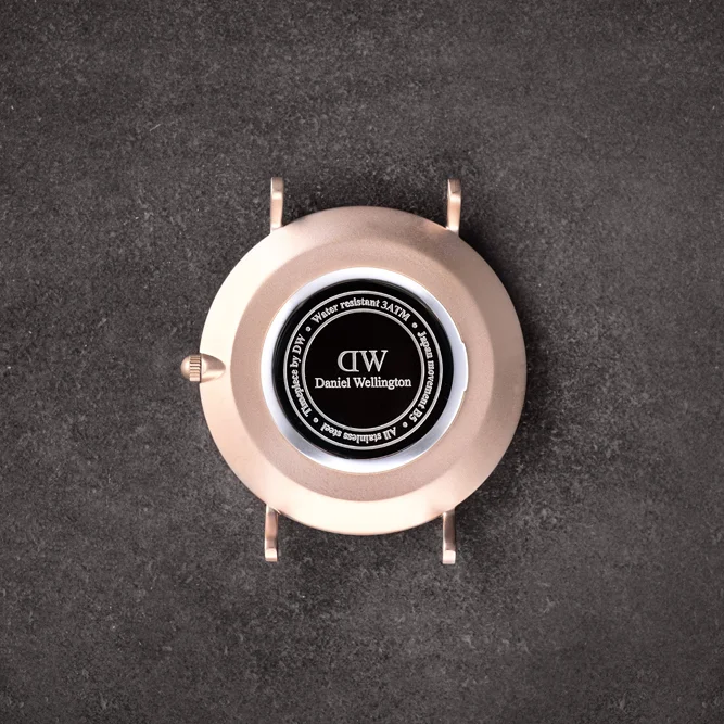
Obviously when going to any company’s website they’re gonna show you the best angles of the product because they want to show their best face (puns always intended). What I’m always curious of are the things you don’t get to see so I’ve disassembled the watch to show you what the undersides look like - it’s ok I got prior consent before doing so ;)
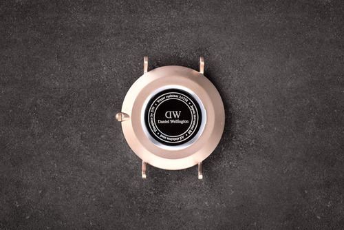
The bottom part is chrome and usually that’s one of the hardest things to shoot because it’s so reflective. This means even if alone in the studio, you should probably put on pants otherwise be exposed by the reflections in the surface. I of course didn’t want to put on pants so I decided to keep the middle dark and only add highlights to the rim. What this also does is create maximum contrast between the surface and the DW logo. Since I had trouble lighting it in such a way that would make the chrome shine silver, I made the executive decision to leave it as is. Also, I’m fine with not ripping my hair out because I couldn’t get the light the way I wanted exactly. If anyone asks I’ll say it’s intentional but that’s just between you and me ok?
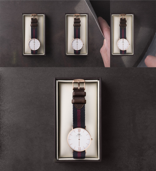
Here’s another shot of how the product looks like when seated in the box.
As you can see I’ve included the ‘before’ images with me using a silver card on a particular section. I would then shoot multiple frames while changing the card position so various sections are lit. Using these ‘plates’ I assembled them in into one shot like a puzzle using photoshop. That’s something that isn’t uncommon in commercial photography - rarely is a shot ever really just ‘one shot’. Most times, it can be made up of multiple frames where each section is lit in its optimal way individually and later pieced together. Some would say this is cheating but there’s certain instances where it’s virtually impossible to get everything lit in one shot without it having a negative effect on other aspects in the frame. Unless you had a million lights and precision shoots to target light onto one specific area, it’s probably still very counter-productive cost-wise in terms of hydro bills, managing equipment, and simply time. This is where retouchers come in - yay me.
If we look at the product shot from their website (the shot on white) you’ll notice that the leather portion of the watch appears a lot closer to the face but in reality it’s not. Sometimes when companies shoot products and want to include little details that normally wouldn’t show, they cheat it a bit to get it in one shot. So either the edges are photoshopped in or much of the strap was pulled in the middle and behind the face to bring the leather portion closer. Anyways, I took a couple shots of the watch both front and back so you can see what it looks like ‘fo real yo. Also the embossing on the inside is a nice touch - something I won’t really appreciate or see until I take it off but still is nice to know it’s there - like wearing fancy underwear when you’re single (aww).
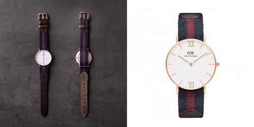
Another thing that I wanted to mention is how easy it is to forget the little details and how it can really affect the shot. I didn’t bother to check what ‘time’ the watches were set on the website until after I shot everything, and that was a huge mistake. I figured I’d just set it to 6 o’clock ‘cause it’s less distracting to have a simple line go down the middle. Makes sense, right? Well.. Daniel Wellington set their time to 10:10 and I’ll give you a minute to think about why that’s even better…
It’s cool, take your time, i’ll just be here looking at my watch…
Figured it out…?
Yeah. The logo. FML.
They set it to 10:10 because it frames the logo better… Live and learn. I could photoshop the hands to that time, or even go on their site and use the face on one of their shots and drop it on mine, but the photographer’s “itis” started to kick in and I just said, 'it’s fine’. Though what wasn’t fine was that I missed one other thing - I didn’t push the crown back in after setting the time. Now this worked in my favour as the time didn’t change, but that meant I had to make a selection around the crown, duplicate the layer on top, shift it over to the proper position, and then mask it out so it looks like it was pushed in the entire time. I actually didn’t mind doing it because that’s one thing that would really bug me more than anything else and only took me literally 1min to do it (I did leave it on the very last image in the blog so you’ll see what I mean). The lesson here is that it’s important to check your stuff on set and make sure your shots are as good as they can be in camera so you can ensure that you’re only spending minutes in photoshop and not hours. Time is money folks (see what I did there?)
OK so after all this, what do I think of the watch itself? “It’s nice”.
Fine, I’ll elaborate. The build quality is pretty good but I haven’t gone bumping my wrists into everything to see how it would survive against my old timex watch. It’s pretty light and the face seems like it’s made of plastic though it could be glass (I have no idea). I do enjoy the classic look and having worn a military watch with a nato strap prior to this, I had thought that the “Grace London” would have the same material but it’s not. The strap is more fabric like which means it’s more floppy (which made shooting a bit tough to keep its form when not laid flat on the surface). The leather is soft matte flexible one and doesn’t get scratched up or marked as easily as say ones with a glossy/hard finish to it. I have small wrists so the diameter of the Grace London fits me perfectly. It would appear that there are other mens models that are much bigger which would work if you’re super beefy or the hulk or maybe just not as noodle-wristed as me. Also the Grace London series is unisex so lock it up or risk having it ‘borrowed’ by your significant other more often than you’d like.
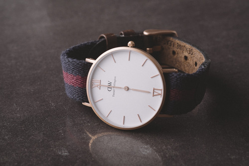
If there’s any drawbacks to it, it’s that just feels a bit flimsy and although it can be an everyday watch, the price that you pay for it makes me feel like I’d want to wear it to nicer occasions or gives the impression that it may not stand the test of time if I wore it every day. I know that’s just a personal thing and objects are made to be worn/used but coming from a $26 timex weekender military watch that’s taken a “lickin’ and kept on tickin’” I feel like I’d need to be a bit more delicate with this one. But that’s just me - and that could very well be this particular model. The full-on leather watches may seem more robust but I don’t know ‘cause I only have this one. If they wanted to send me another one to compare, I’d gladly take them up on that offer ;) *Oh don’t tell me you wouldn’t either.. :D
For $229 I’d say it’s a bit rich for my blood but it’s a 'I’m gonna treat myself’ kind of purchase (at least for me). But when you use the 15% discount code 'phraction’ (which expires at the end of the month Feb28th) and it gets bumped down to $156 (down from $183 which seems like a glitch - one that would work in your favour). I’d say it’s a good buy, well worth it for what you get. The only thing to remember is that if you do think you’re going to get one and would like to get another strap to go with it, buy it at the time that you get the watch because I find that shipping to Canada is super expensive but it’s free when you buy a watch.
This whole experience has taught me a couple things. One, it’s given me a renewed appreciation for the photographers I usually work with that do tabletop/product photography as it’s not that easy to just light a certain section sometimes. Two, I’ve learned that I put way too much time and effort to do the simplest things, but hey I still think it’s fun so it’s all good.
*btw be sure to click the images at the very top to see the shots in higher resolution - would me a lot since I went through all the trouble to kinda highlight the details :) Thanks!

Tonight (Feb 5th), as in right this moment, marks the opening for the “Mobile Photo Now” exhibit in Columbus Ohio and though I can’t be there in person, I figure that blogging about it is the next best thing… (kinda..:). It does give me the opportunity to finally get another blog post up, and discuss exactly what mobile photography means to me and how it’s played a part in changing the way we perceive photography in this age.
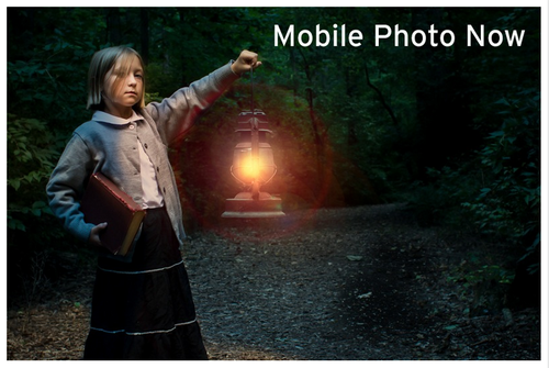
*Image credit Mitchell Seckman from the ColumbusMuseum.org website
A few months ago there was a contest held on the @joshjohnson instagram feed in collaboration with the Columbus Museum of Art to launch the largest mobile photo exhibit to date. The purpose was to “highlight the emerging art form of mobile photography and the power of social media and smart phones as a means of creative expression.” People could hashtag their images according to the daily theme to be eligible. For images to be considered, one had to register on the Museum’s website and give a brief description as to what their ‘story’ was in relation to the photos they were submitting; the only technical requirement was that images be either shot or edited on a mobile device.
The key word here is ‘or’.
That’s right, those who shot with regular cameras could submit images as long as in some way, they were edited on a mobile device. Of course this sparked a lot of debate over whether this would still be considered a ‘mobile challenge’. To me, I chose to play the devil’s advocate and say "yeah, why not?” I believe that mobile photography describes not just the medium in which an image has been taken but also the vessel in which the message is delivered.
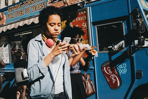
Mobile photography to me is photography that can reach the masses using mobile devices. It’s as much the sharing (if not more so) as it is the creating.
Of course I wanted to take part in this as well for the simple reason that I just wanted to share my artwork (but let’s be honest, how cool would it be to have your stuff in a museum, right?) So as soon as I found out that my work would be eligible because my images were edited on my tablet or on my phone I submitted a few from both my @phraction and @phraction_street accounts. None of them were featured on the @joshjohnson feed unfortunately. I figured that I didn’t make the cut in the ‘street photography’ category and many others didn’t either, which sparked a discussion about how those who were being selected may have been using a DSLR and had an unfair advantage when it came to the selection process due to the quality of the images. Knowing that a good photo is a good photo regardless of the tool you use to make it, I decided to share my two cents on the topic of the competition being open to those who didn’t necessarily use their mobile devices to capture the images for the challenges. You can find that discussion here or here.
If you don’t feel like reading through that format or if the links don’t work because I don’t know how to internet, here’s a excerpt of what I wrote:
“To me the concept of mobile photography shouldn’t be solely based on how an image was created but inclusive of the vessel in how it is shared and means of its distribution.
I agree that if this campaign was called a smartphone challenge and other cameras were used (including iPods, tablets, or anything without its own proprietary internet source) then it would definitely be wrong to include anything but phone photographs. But it’s not, and I feel that what people are really up in arms about is how DSLRs give an ‘unfair’ advantage to the ‘competition’ and that by including them, it gives less of a chance for those using ‘lesser’ smaller sensor cameras.
If we look at the example of the Samsung Galaxy NX camera which is pretty much a hybrid DSLR (mirroless)/smartphone camera that has an android operating system and can upload directly to instagram after being edited on snapseed, vsco, etc., we can present the same argument that it’s ‘unfair’ because this technology is far superior in quality and features than a simple smartphone… yet it could be classified as a smartphone (that looks weird when you put it up to your face to make a call:) Varied technology shouldn’t be the primary focus because by next year the iPhone 7 will probably have a 1” sensor, the iPhone 8 an APS-C (who knows)? If that happens will those still with the iPhone 6 cry foul when another mobile competition surfaces?
This is why I think the term ‘mobile photography’ is a very broad one at best and one shouldn’t discriminate one technology over the other. Frankly if you’re a good photographer, you can use anything to make great images and vice versa.
The best camera is the one that’s with you and for a lot of people it is their phone. For others, they may always carry around a DSLR, mirrorless, or ‘smart DSLR’. Cameras have always been mobile as far as I can remember (except for maybe 8x10s which would probably rip a hole in your back pocket if you tried to store it there) so the concept of mobile photography should really be about how it is viewed and not so much of how it was made. If a painter wanted to enter their art as a medium to fit into the challenges, would it matter if it were shot with a smartphone or DSLR? The quality of either would still be restricted to 640x640 pixels regardless.
I think the celebration of mobile photography isn’t the tool you use to make the image but the medium used to share it. It is a mobile revolution to think of how anyone can share pretty much anything (whether it be text, voice, or image) with anyone at anytime across the globe. We don’t have to be tethered to a desktop or worry about wifi with our laptops.
For most of us, we use our phones to view instagram photos from all over the world. To me, that’s the most important aspect and sharing these images is what all this should be about.”
So yeah, that.
There were some great responses to what I posted and even though they didn’t reflect my own views, it is always refreshing to hear different perspectives. These virtual discussions are exactly what reinforces the strength of communication through mobile devices and proves how something as simple as instagram can not only share images, but ideas as well. Try doing this 20 years ago when 28.8k modems were a thing and using your phone to connect to the internet meant something entirely different. *insert screechy bleep bloop white noise sound here*
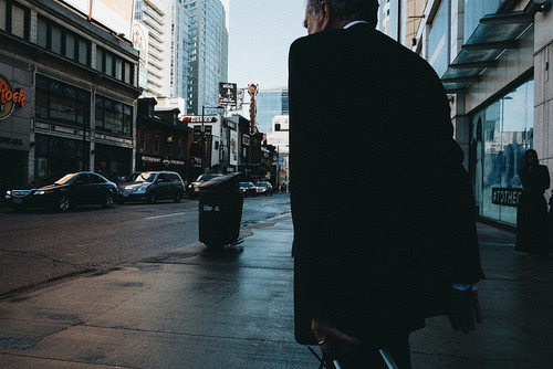
So after this online discussion let’s fast forward to a couple months back, which is actually rewinding, but for the sake of not sparking a space/time continuum debate in addition to what’s already been said, let’s just say ‘Afterward’. I get an email from the Columbus Museum informing me that not one, but three of my images from my @phraction_street feed were actually selected to be a part of the exhibition of about 300 images. None of my @phraction images made it but I’m actually happy that my street work (which is really my primary focus these days) is garnering recognition. When I received the news of course I thought, “hey this is super amazing-sauce!” (I’ve actually never used that term before..really, no really). I was excited and then I thought about the discussion and wondered if people would be upset that I shot these with a mirrorless device even though it has wifi and was edited/uploaded on a mobile device.
If I stick with what I said (which I do) then yeah, my images definitely deserve to be a part of this event and I should feel proud about this accomplishment. Looking at the images that were selected (which are the images you’ve been seeing throughout this post so far), I could’ve shot these with my phone just as easily given the quality of light, shooting conditions, and perspective. Regardless, I wanted to see for myself how good of a photographer I actually was, and so I took up the personal challenge of shooting street with my phone at any given possibility. I know that people know me as a street shooter with a mirrorless device, but not many really know what I can do with a mobile device (including myself).
It was hard to keep these images somewhat hidden and this news about the exhibit on the down-low until I got a collection of work up to go with the post. So now I’ve finally found a use for the vsco grid. To see what random street photography I’ve been uploading from my phone, check out this link here:
My VSCO Grid Featuring Mobile-Only Street Photography:
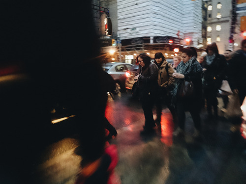
*this one ^ isn’t a part of the CMA exhibit btw
It’s like an exclusive reveal but not really ‘cause it’s been online for a while now and anyone with good creeping abilities has probably seen these already :)
Shooting from one’s phone is definitely a different experience and one that I’m finding useful for achieving that certain look that I’m getting, particularly at night. I’m still going to shoot mostly with my camera because I want to capture things with the best quality I can, and because I’m not entirely sure what I’m going to do with these images yet. All I know is that coming from the print industry, you use the highest resolution whenever possible in case things need to get blown up to larger proportions.
There’s different tools for different jobs and whatever it is that you choose to use to convey your message should be up to you. Use what works for your method of shooting because no one can decide what is best other than yourself.
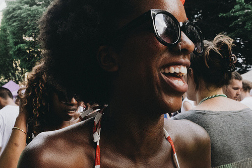
Right now I’m going to go search the #MobilePhotoNow hashtag in hopes that someone’s posted some images of my.. images. *update - just saw this image (above) in the background of someone’s shot but that’s about it. Anyways hopefully it won’t take another couple months before I have time to come up with another blog post :)
*Special thanks to JoshJohnson and The Columbus Museum of Art for giving me the opportunity to share my work in a platform that I’ve never thought possible :)
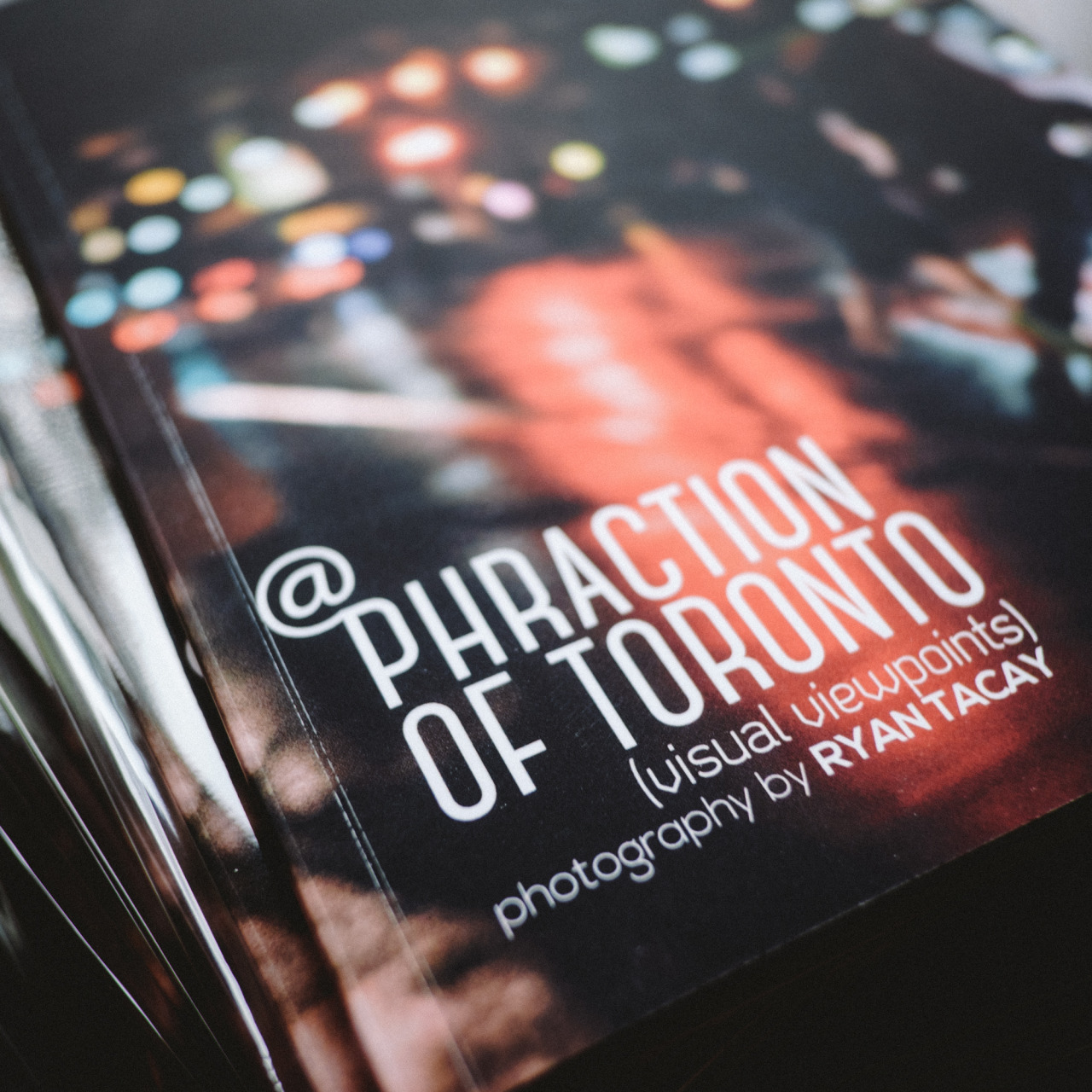


And the books are finally in! Hey all, I’m really pleased to announce that this book project that I’ve been playing around with for a while now has actually been made (took long enough). I’ve put together a limited-edition, 42 page (21front/back) softcover book containing 35 images and captions of select images of Toronto from my instagram feed and 5 never-before-seen/posted content! The book is 6x8 matte softcover, with 5 3/4” x 5 3/4” images, 260gsm heavyweight Matt, and 100% recycled stock with vellum lining on the front and back pages. To make things super legit and fancy schmancy, I will only be printing 100 of these and will be personally signing and numbering each one with a message saying that you’re cool for supporting me (unless you just want it blank which is fine too if you want to keep your coolness on the down low).
This is practically a labour of love so I’m pricing these at practically what I’m printing them at so I’ll be offering this first batch of 10 (cause I only made 10 so far) for $40CDN/book (taxes included) plus shipping if I can’t get these to you personally. It’s kinda like a $1 a print with bonus words! The first 10 orders will get a little something extra but you’ll find out what that is when you place your order ;)
If you’re interested in seeing my images off the screen and in print-form with this Toronto keepsake, send me an email at phractionIG@gmail.com (its an i just before the g) if you’d like to order one or more and I’ll get back to you on the details! *Only orders sent through that email will be processed (just to keep it organized in one place). I can accept paypal, EMT, or the traditional ca$hola, ‘cause dolla billz yo. *first time figuring this all out so bear with me ‘cause this might take a bit of time :)
Also, I just wanted to say thanks to all of you that have pushed me to get this project off the ground (and into a small stack on my floor instead) so it can literally be shined upon with the light of day. Now back to regular-scheduled programming.

I just uploaded a classic shot to Society6 from the archives that hasn’t been posted on instagram before (couldn’t fit the square format well). So up it goes on sale for all those who can’t wait for the white stuff to hit the trees.
BTW Society6’s has got a sale today for $10 off $75 / $15 off $100 / $30 off $150 + free shipping (free shipping is only for prints - not canvas or frames unfortunately).
If you’re wondering, this was shot with a Hoya r72 Infrared filter on an ancient Nikon D70 back in 2005. The exposure was at least 30s long thus a bit of movement in the trees. I might take this down shortly after today but you can see this image, along with other non-square photos available for print on my facebook page here. :)
Happy Weekend Everyone!

Hey everyone, sorry for the lack of postings on here but I’ve been working on a few projects - one is setting up a print-on-demand service on Society6 and the other is setting up a @Phraction Facebook Page, and lastly I’m also making a 40 image instagram book (but more on that later).
Before making my images available to everyone, I wanted to test the waters first and see what the quality is like and then price the prints accordingly. A few days ago I received my first print from these guys who are based out of the US and having shipments come into Canada sometimes means getting dinged for duty/taxes. Luckily this time I got off with no charges but that doesn’t mean that’ll be the case next time. Considering that they sent a GINORMOUS tube for my 17x17 print, I’d say there was no flying under the customs radar, but I’ll take all the breaks I can.
Speaking of which, though the tube was tough and nothing was ‘broken’ unfortunately one of my prints were scratched pretty heavily on one corner. I assume it happened at the time of printing and not damaged during shipment. They only offer art prints in a matte stock so these are somewhat susceptible to scratches. Case and point - try not to run your fingernail down them, you know, 'cause they’re not scratch-n-sniff cards and none of the images I print would really want to make you want to smell them anyways (unless you’re weird like that).
The amazing thing though is within an hour of sending them a picture of the damaged print, they shipped me a new one!
They describe their prints as “Gallery quality Giclée print on natural white, matte, ultra smooth, 100% cotton rag, acid and lignin free archival paper using Epson K3 archival inks. Custom trimmed with 1” border for framing.“ Which actually feels like Hahnemühle Photo Rag 308gsm but they don’t specify exactly.
Either way, it’s actually pretty good stock and the colour rendition is also very close to what I see on screen (which is calibrated) and even without a custom profile for the paper (they use sRGB) I thought it was, pretty good. I mean it’s like looking at TVs at a BestBuy or something, you won’t really notice huge colour differences unless you have it all lined up next to one another and frankly, I’m not going to buy 5 TVs and have them set up next to each other (as awesome as that may be) which means I probably won’t be hanging up my monitor next to this print either.
*Edit: one more thing I wanted to mention that I just noticed is that their print sizes and 'printed area’ is very different. Here’s a breakdown of what it really translates to:
Available Art Print Sizes
MINI - 8” x 8" (printed area: 6" x 6")
SMALL - 13" x 13" (printed area: 11" x 11")
MEDIUM - 17" x 17" (printed area: 13" x 13")
LARGE - 22" x 22" (printed area: 18" x 18")
X-LARGE - 28" x 28" (printed area: 24" x 24")
Shipping didn’t take too long, though they are just across the border so their 1-3weeks for international shipping is more like 9 days.
Because I’ll never be able to keep track who or how many of these get sold, the prints I offer here are not going to be considered limited edition prints so they’re not going to be numbered/signed by yours truly though if you brought me a print to sign, I’m not gonna be a dick about it and I’ll most likely be super happy for your support and sign it.. maybe even do a smiley face or something just for you :) <-kinda like that but better.
With that said, I am making limited edition prints but these will be made locally, will cost more, and will be available on different paper stock. The reason I set this up is for all those people in other countries that I would love to visit and hand them a print personally but can’t afford the travel expenses. Hey, if this print thing generates enough sales, that may change but until then, this is an easier way to get your hands on a 'phraction piece’…not like that though.
They do sell other things like canvas, framed prints, and other things I most likely won’t make available like iphone cases, pillows, or a rug. I’d like to think that my images better than to have someone wiping their feet on them but maybe I’m being too presumptuous over the quality of my stuff.
So go ahead and check out Society6.com/phraction to see what’s available so far and be sure to follow my Facebook Page for the latest updates on the projects I’m doing, because me!
Right now only the popular 'urban’ stuff on @phraction is available but my street stuff will be offered in a different format.. maybe. Oh and there’s a particular image that you’d like to see printed, just let me know!
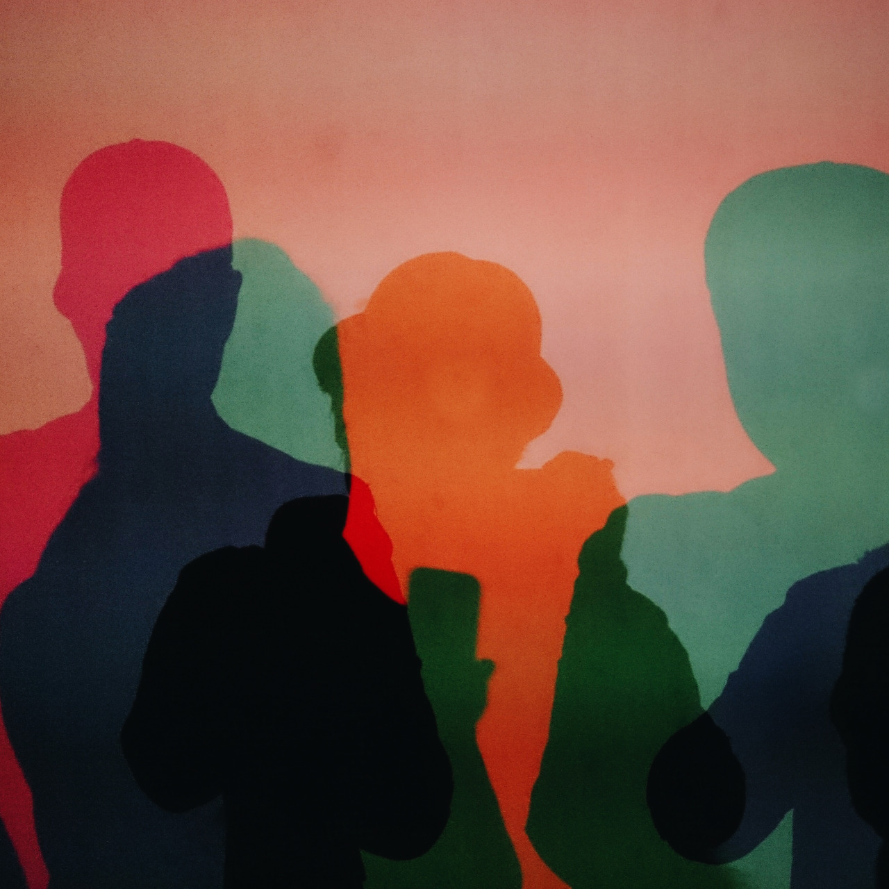


Every year Nuit Blanche (which stands for All-Nighter and not ‘white night’) comes and goes …like all nights I guess. Anyways, I figured I’d have some fun and as a tribute to all the artists that put together cool stuff for the evening, that I’d have my own “fleeting art” installation ..virtually ..through my instagram account. Yeah. Really, I just thought of the silly idea while passing the time, waiting for a few friends to show up at Nathan Phillips Square.I decided to post a picture that I took with my phone (sony xperia z1 compact) and upload the first one for 2mins, the next for 3mins, and so on.
Why? Meh, I dunno. Probably ‘cause I’d forget to leave it there if I left it for too long. Why not leave it there? Meh, I dunno. Probably ‘cause I don’t want to spam everyone and I’m not that witty to come up with a creative caption for each image like I usually do. (nor did I really have time) I still wanted to actually enjoy the event and not be on my phone the whole time - though to those with me, it probably seemed like I was on there more than usual anyways. Probably the first time I’ve actually ‘insta’grammed in.. a year (last nuit blanche actually).
I did this throughout the night at various installations we visited and tagged my stuff #FleetingArtExhibit ‘cause it wasn’t taken yet and because I wanted to be cool and have my own tag (temporarily). I did take photos with my real camera but it was fun shooting stuff with my phone and really seeing what this little camera can do in low light These were all taken in the 20mp mode and edited with vscocam for those who want to get into specifics.Man, this was just supposed to be a ‘short’ post to just show the phone pictures I took last night… gah. Well, long story short. Photos. Look. thanks.