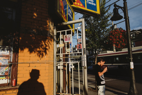
In the 1st official “Street Vlography” POV tutorial, we explore the technique of incorporating transparent objects to give a unique look while shooting street photography.
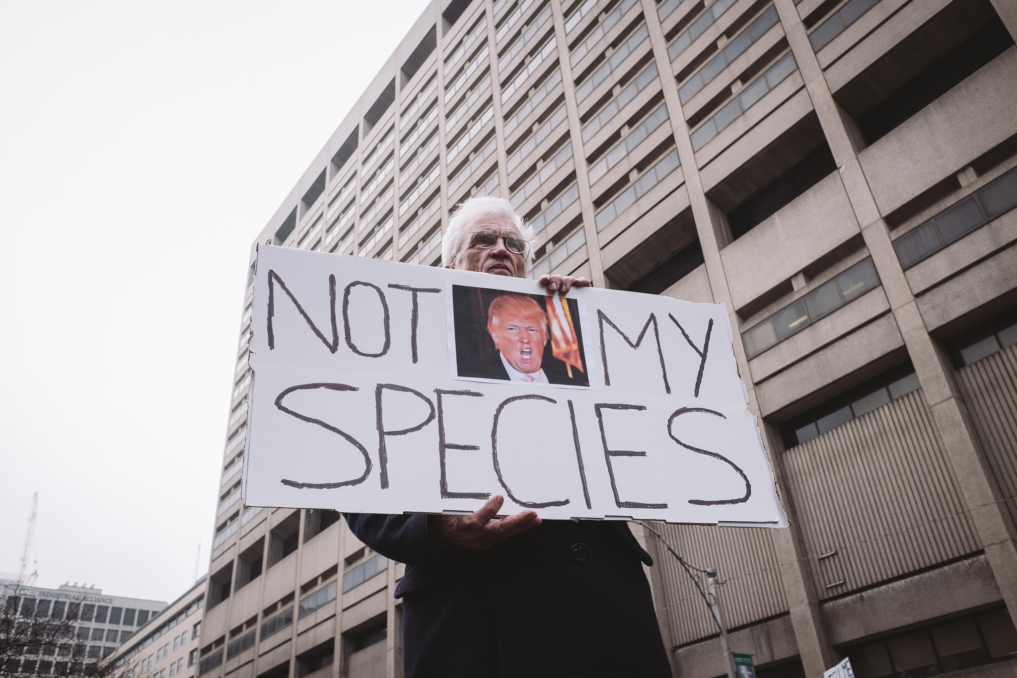
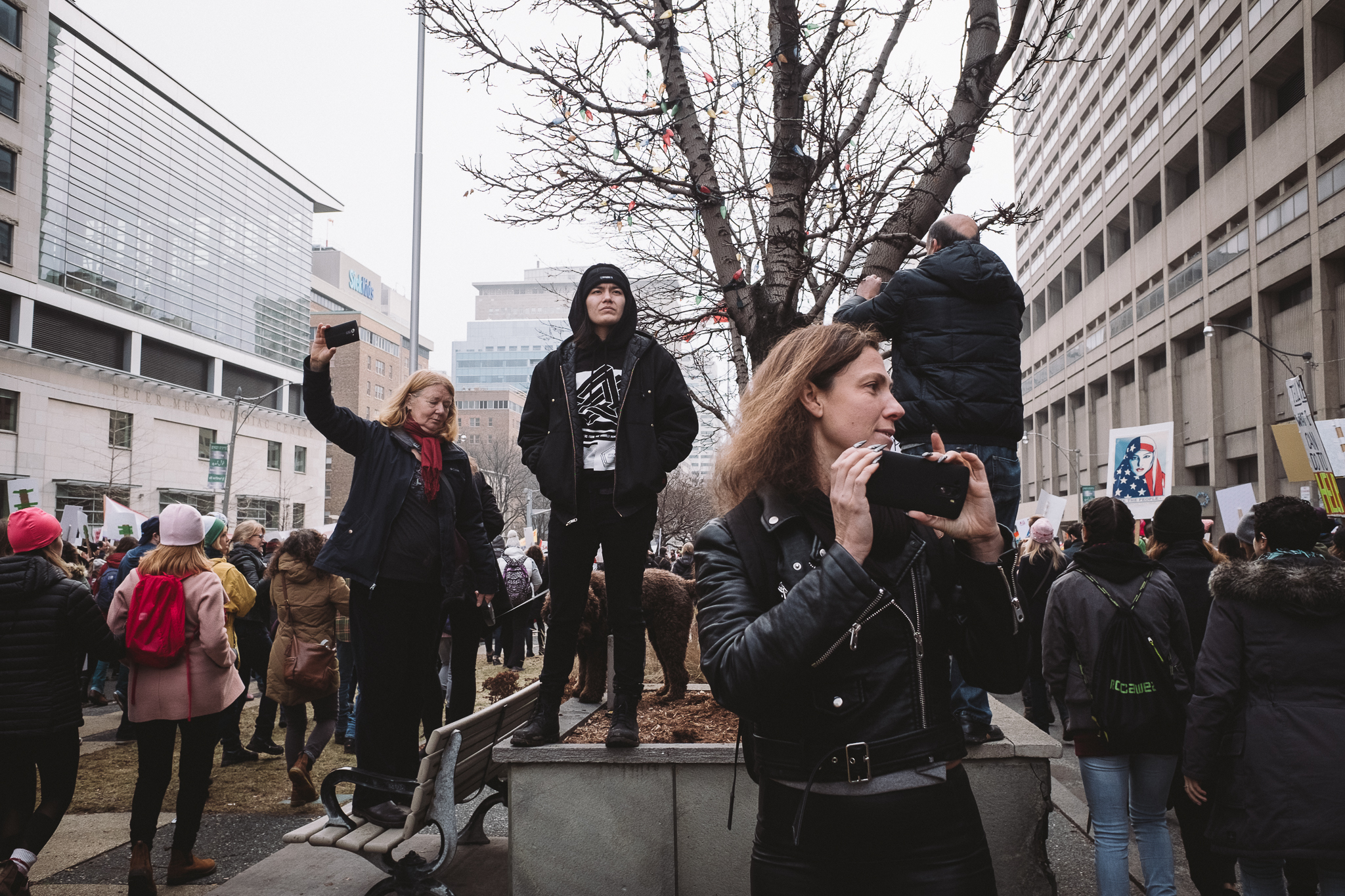
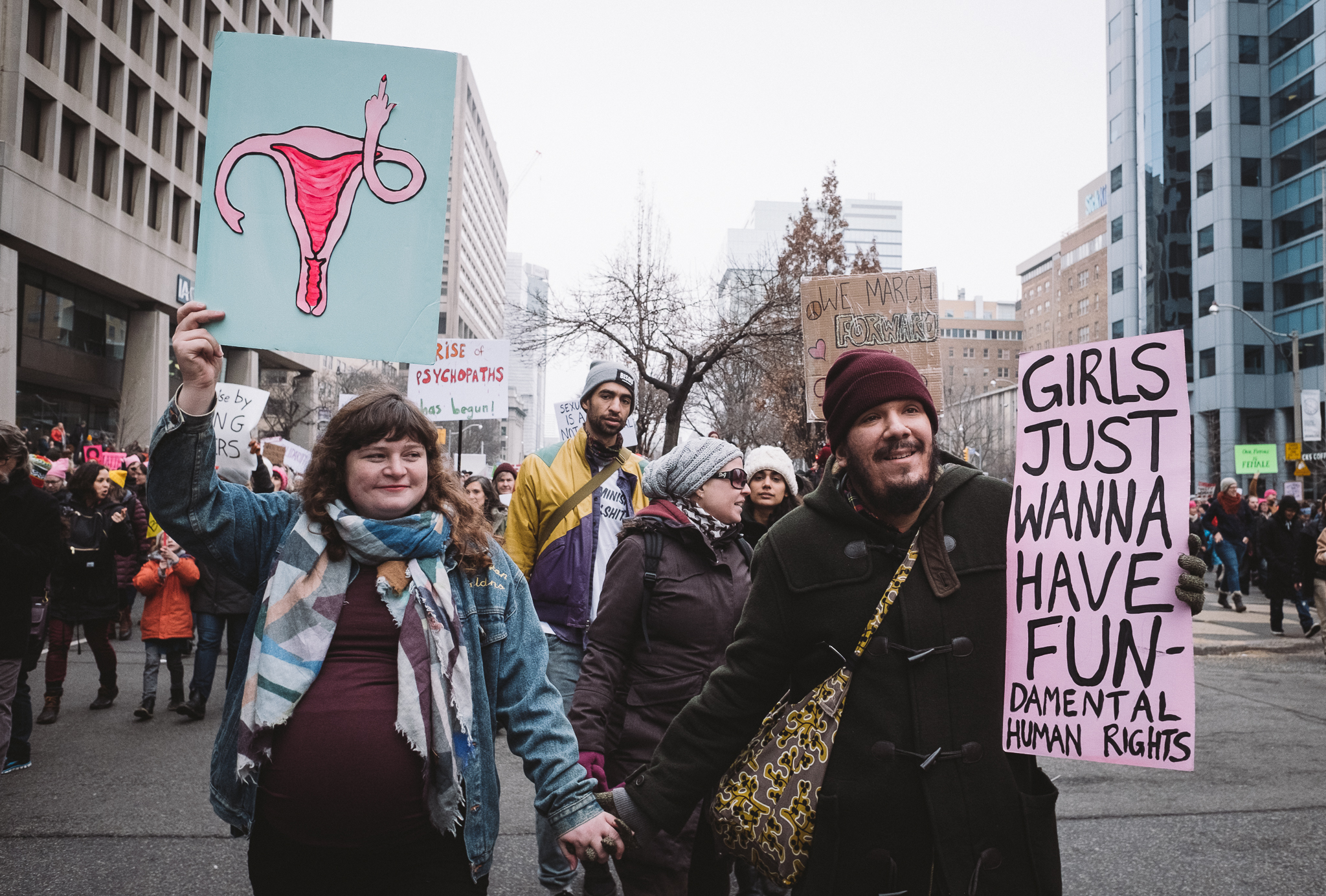
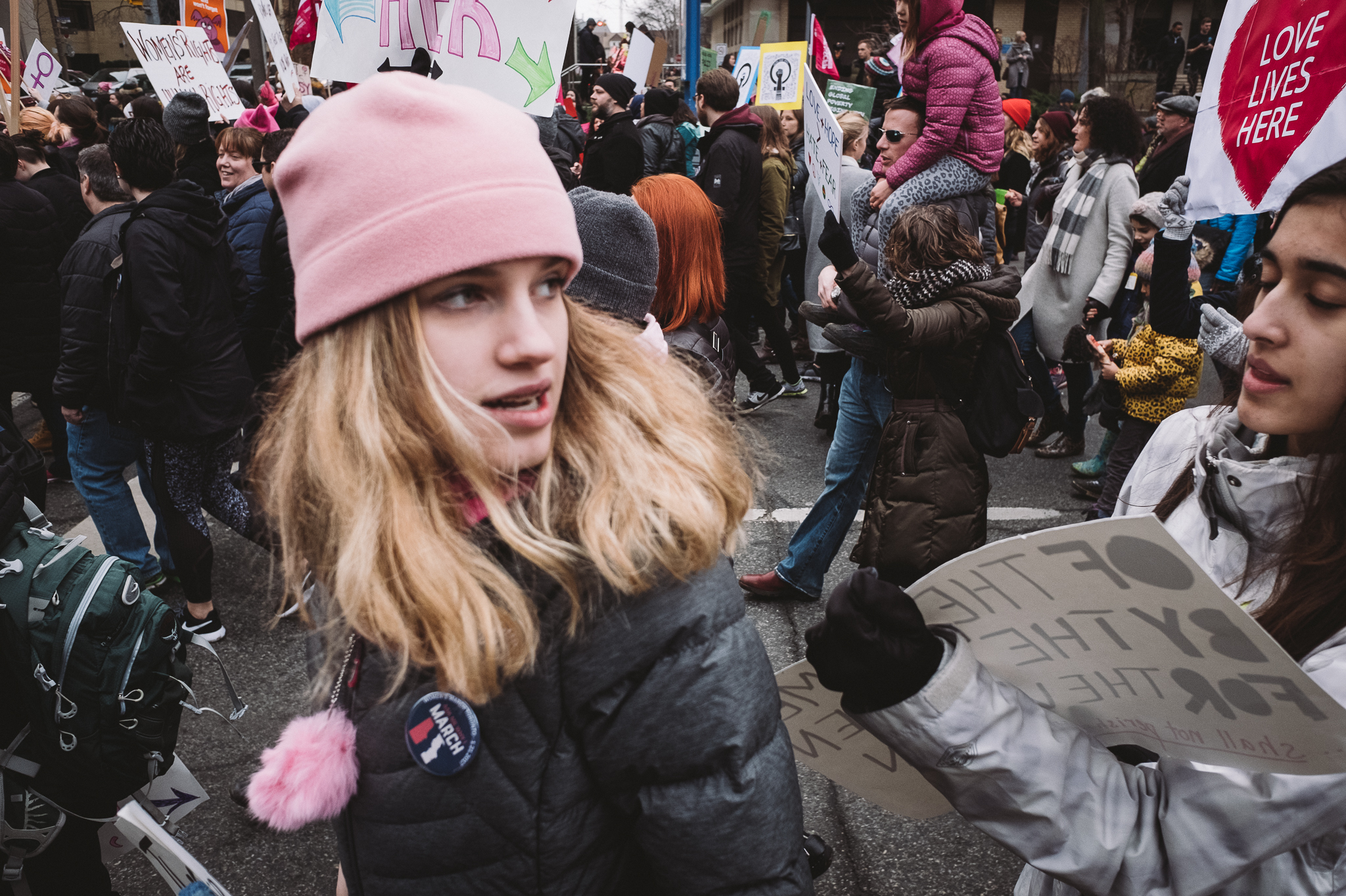
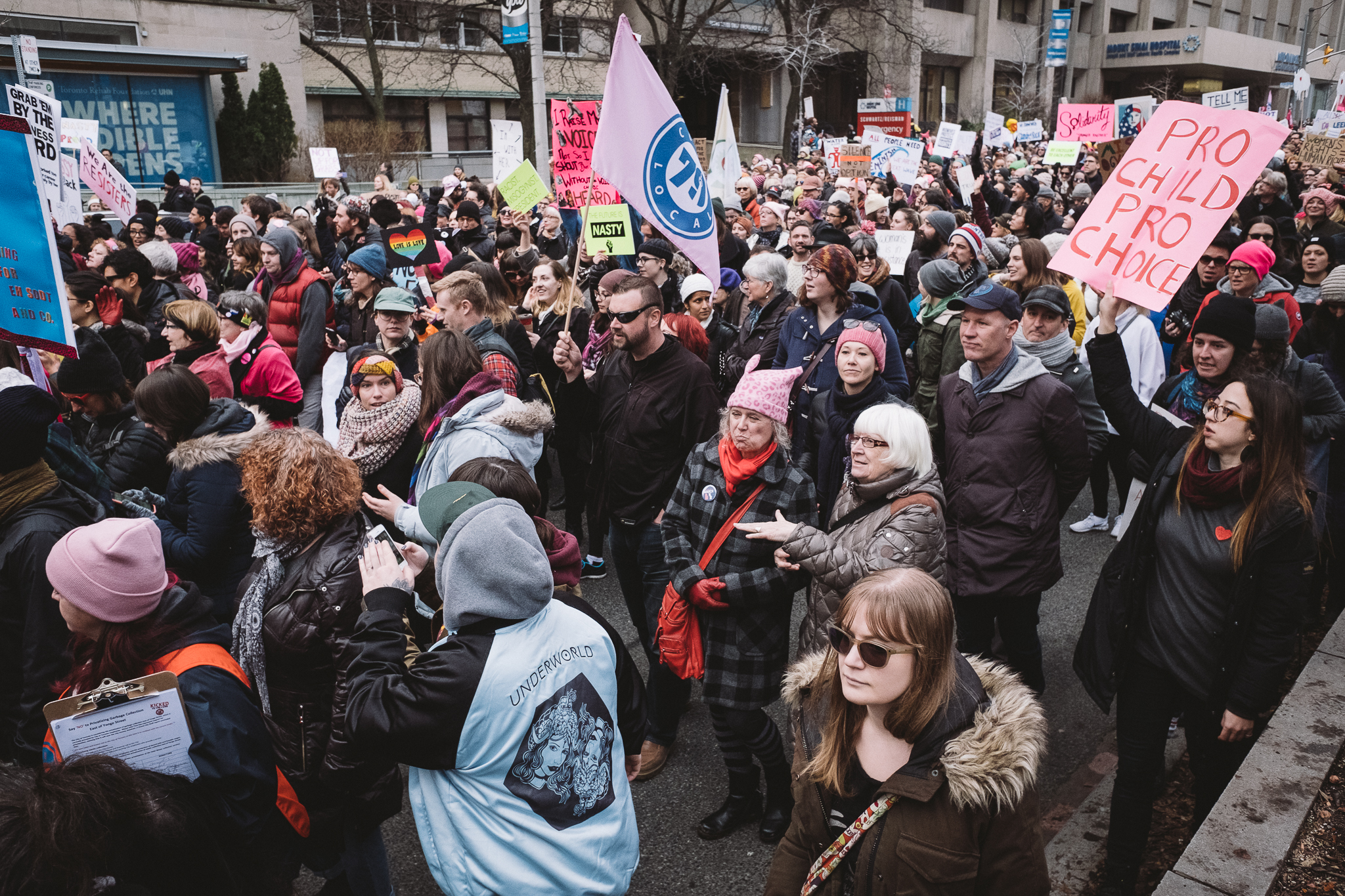
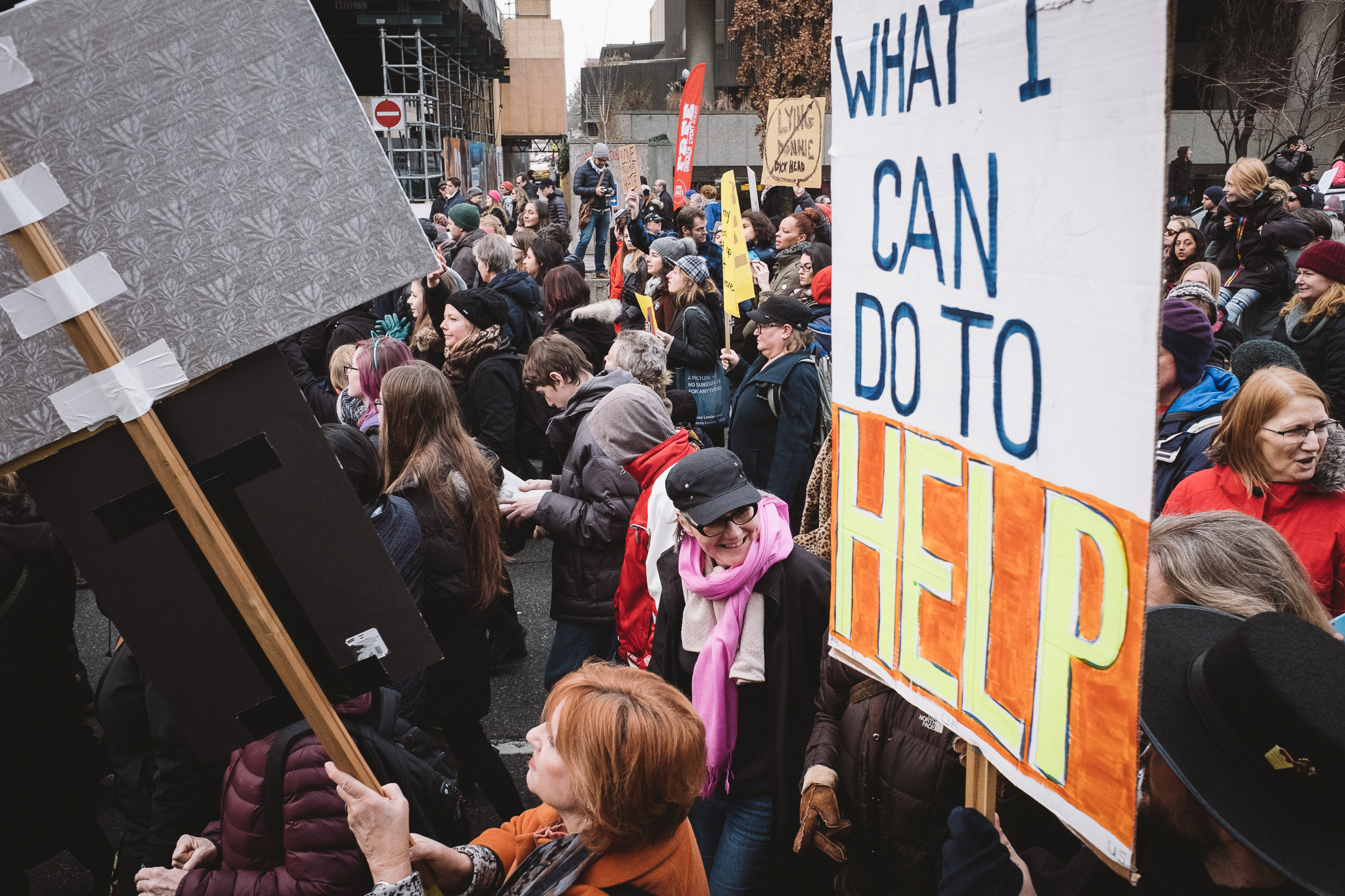
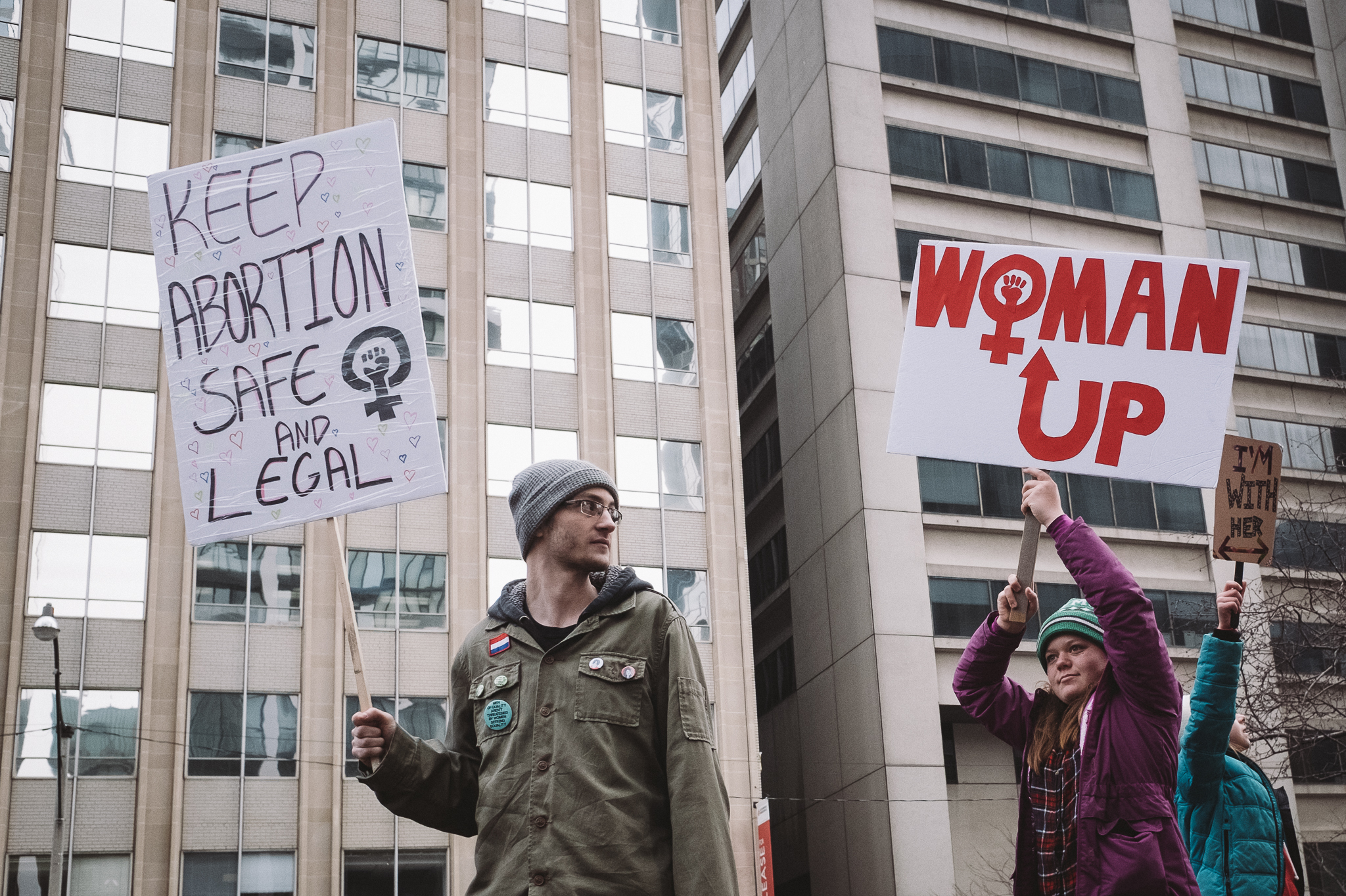
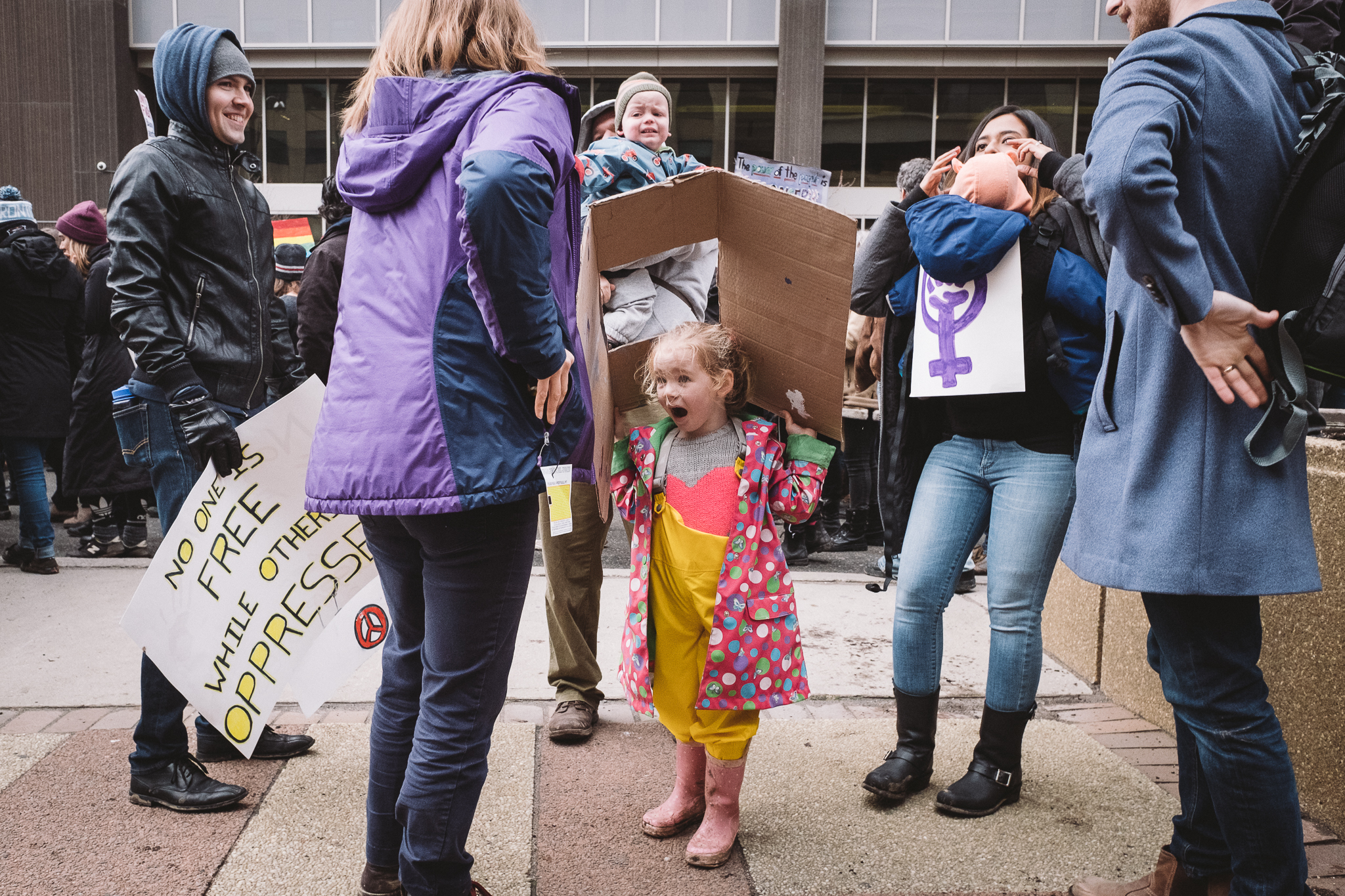
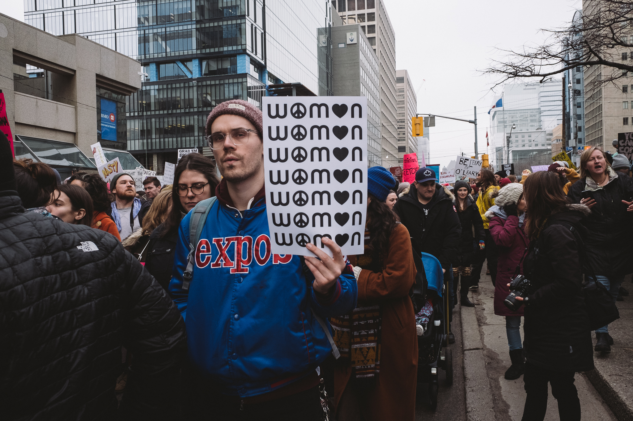
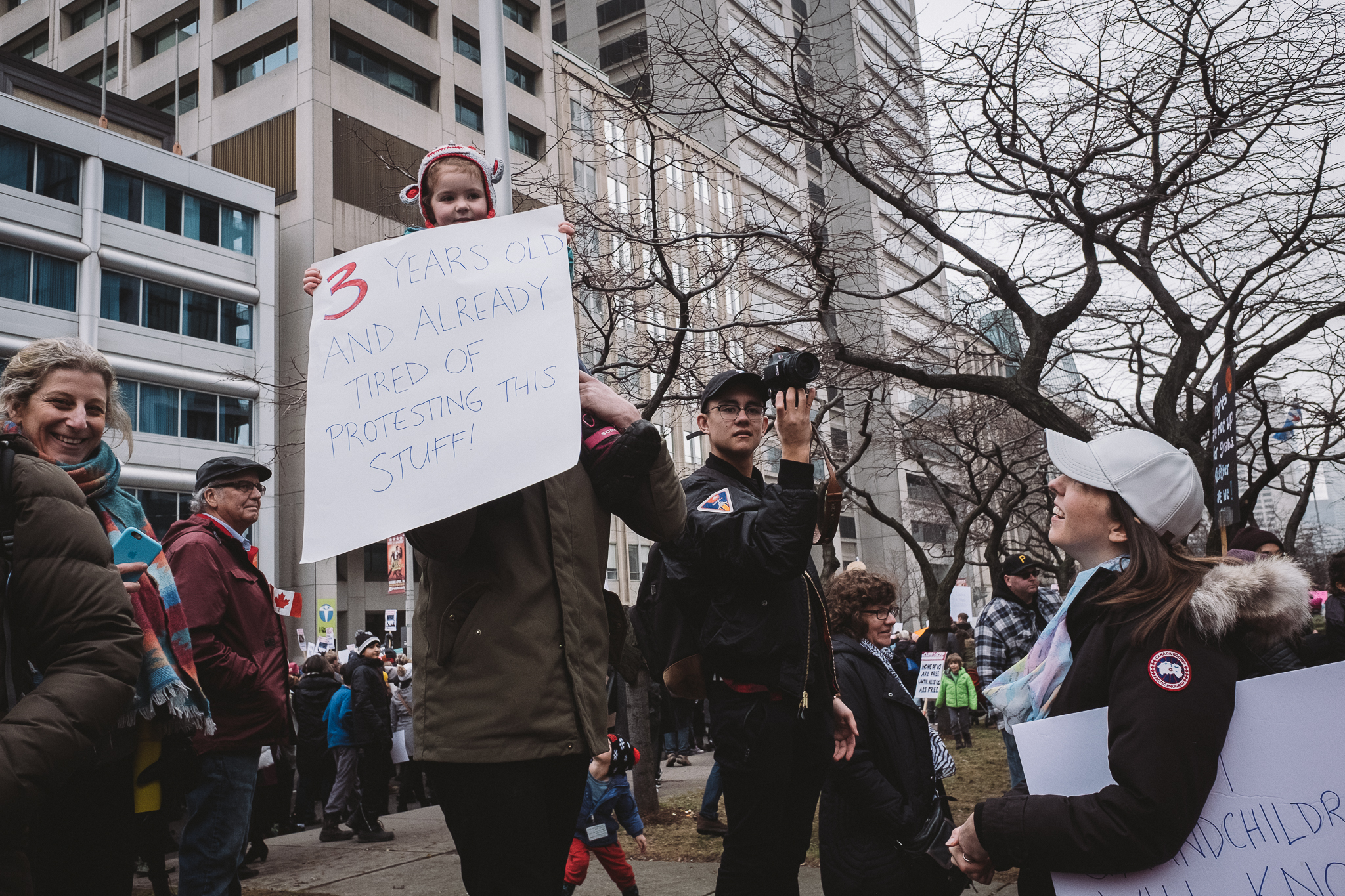
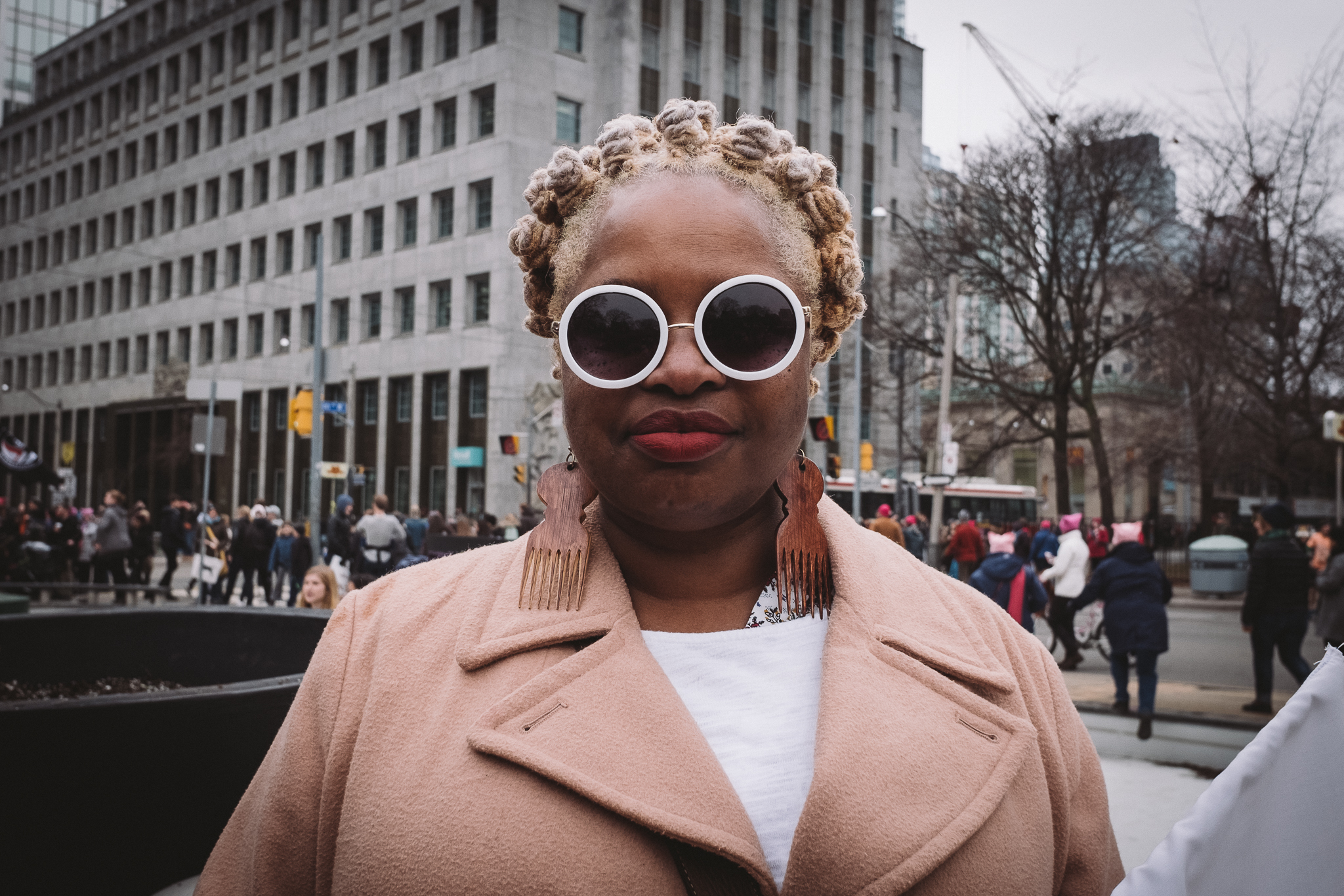
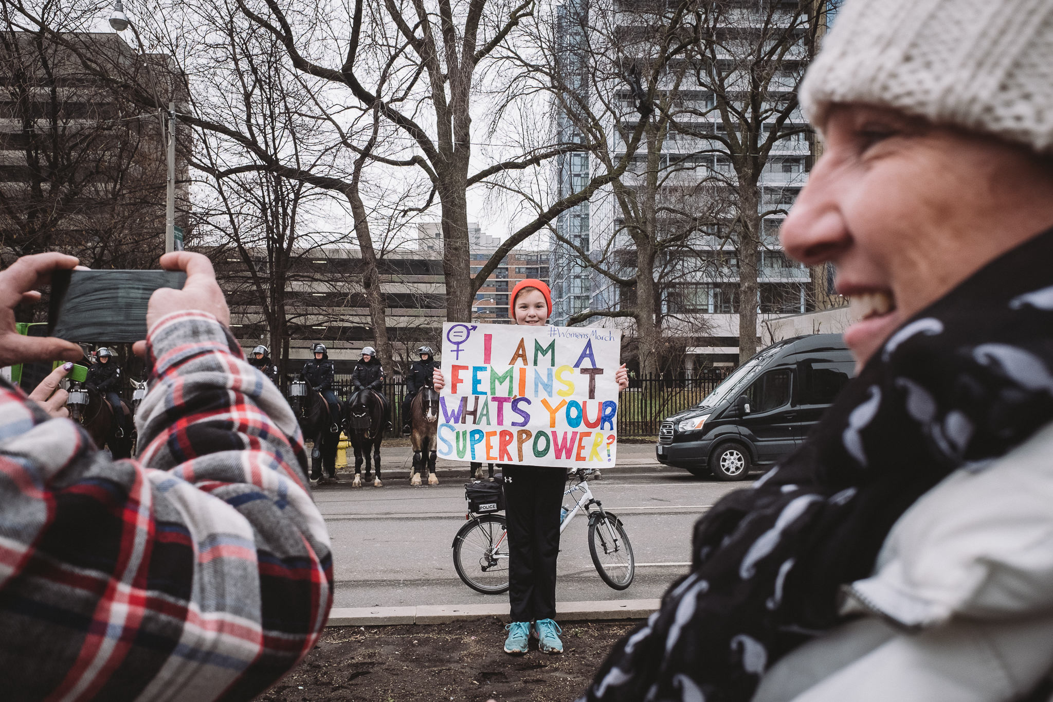
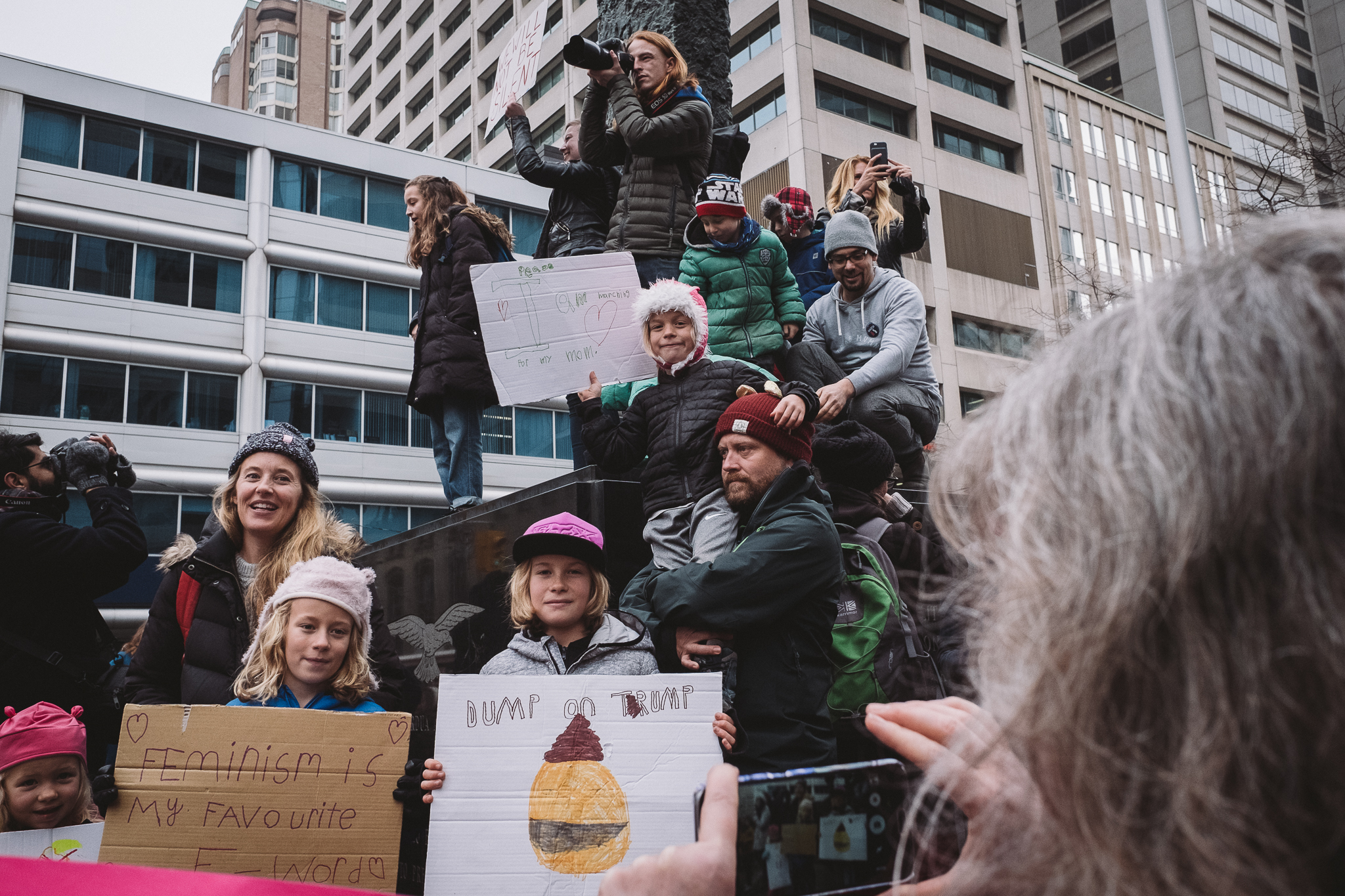
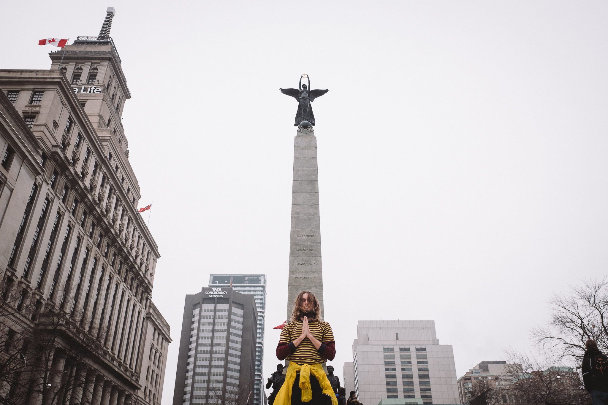
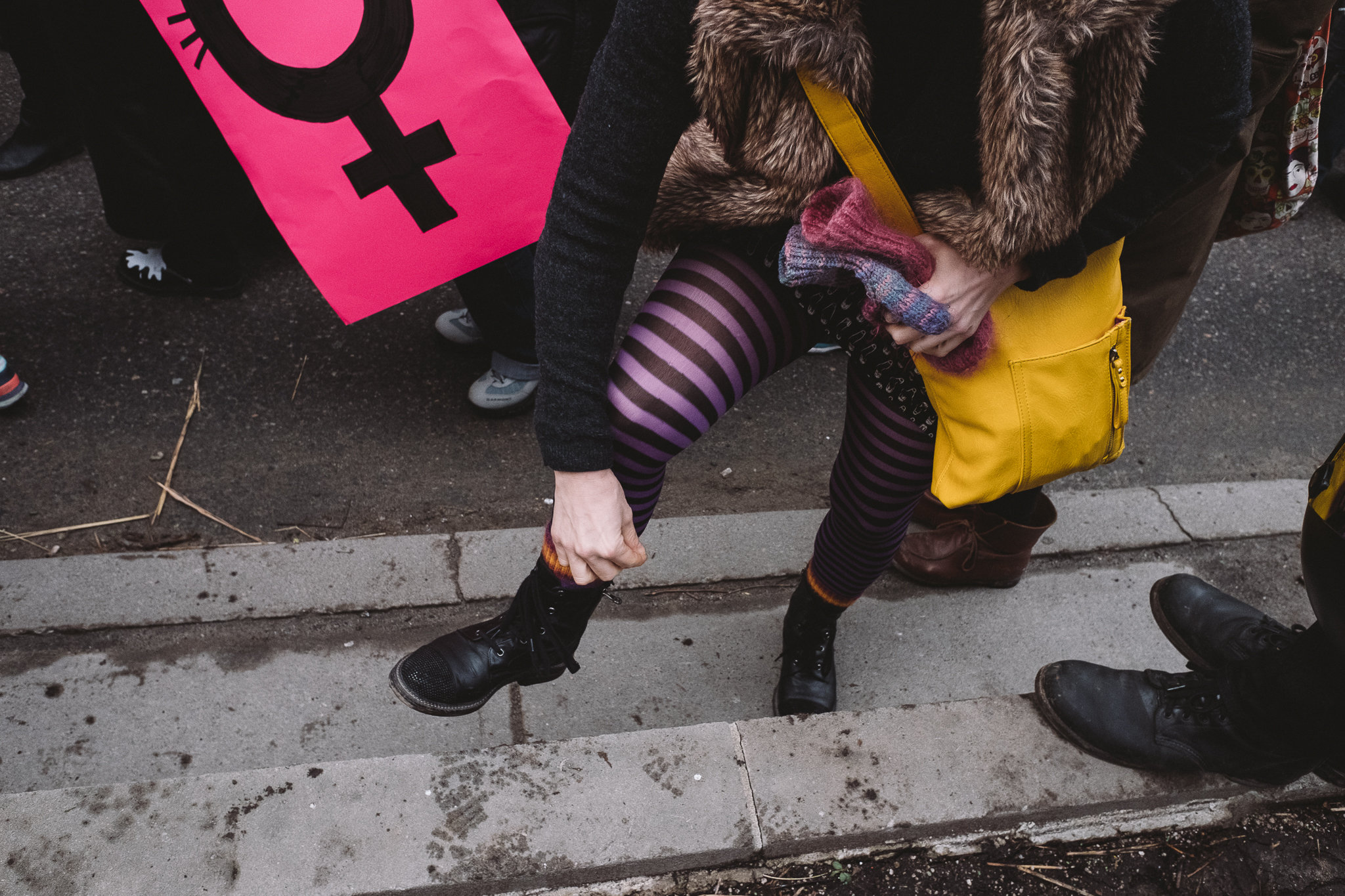
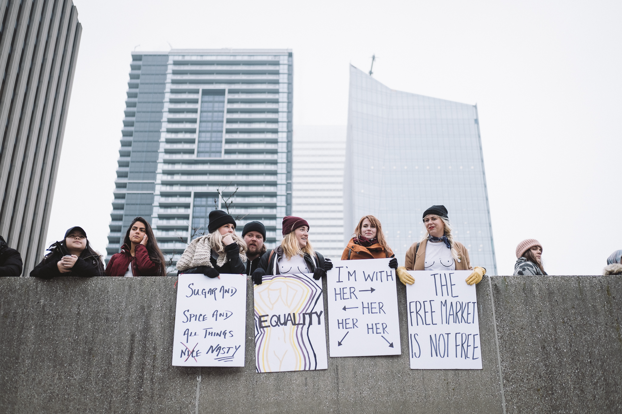
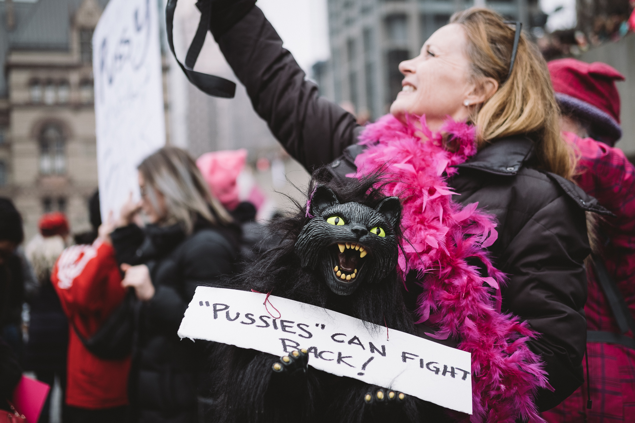
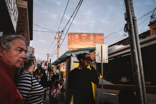
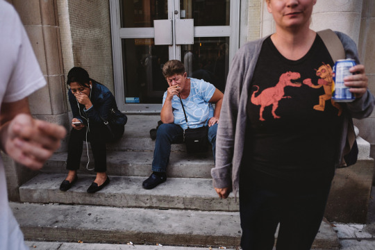
Saturday was an important day to show solidarity and try to capture the moments of the Women's March movement. I was glad to be a part of it but I had no idea just how much energy this would require until I actually got there...
It's one thing to be a part of the demonstration and to stand with those with a significant message to say, it's another to do so while walking and trying to capture the event using both stills and video.
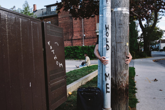
Imagine a photographer having to capture his own wedding and try to take part in all the festivities, while trying to use Facebook live to share the event with those who want to see it as it happens. I mean, it's not too hard to fathom as our insatiable lust for media consumption is just that real these days folks.
I wasn't on assignment, but to be honest, when you're at something like this, it's hard to shut off your mind from always being in documentation mode.
I mean just because you're not being paid to do something, doesn't mean that you shouldn't use available opportunities to learn more about yourself, hone your craft, and improve problem-solving skills. This is why, even though it was such an exhausting event, I still felt that I was able to come away with something that was both beneficial to myself and to others.
My takeaway from documenting the event: Judging from what I think is underwhelming stills and footage (because I know that I can shoot better than this,) I learned that splitting your focus between two mediums can split the quality you come away with. If you decide to shoot video, then just shoot video. If you decide to shoot stills then just shoot stills.
If you are overly ambitious (stubborn) as I am and decide to do both anyway, at least go in with an idea of what you want to accomplish. I usually don't do this as sometimes inspiration happens on the spot, but don't risk it if you know you have to deliver. Understand when you've got enough images and frames to tell the story you want to tell and use the rest of the time to enjoy the moment.
Get more than 3hrs of sleep the night before an event.
I wanted this post to be simply about my experience at an event, but as I kept writing it went from simply sharing images to sharing a message that surpasses the actual media itself. A fine example of how you can go into something with one set of ideas but completely come out the other side with a new understanding. Hopefully this theme of adaptation and openness to new ideas as they present themselves will go beyond this page and rub off on places in the world where it could really be beneficial.
Above are the snaps I took from the event and below is the video I managed to put together with the random clips I captured throughout the day.
Scenes from the Toronto Women's March on January 21, 2017. 12:00 pm at Queen's Park. A peaceful march in solidarity with the Women's March on Washington.
Here's the next image up for critique. You might have seen a variation of this shot that did make the cut but this version did not and I'd like to hear why you guys think that's the case. Again, I'll refrain from sharing my reasons for not posting this version but will update the post after 24hrs with the answers - once you guys had a chance to come up with your own assessments.
2016-09-11 9:02pm 24mm (eqv) 1/6s f2.8 800 ISO
Below is the one that I ultimately did select (just for comparison)
2016-09-11 9:02pm 24mm (eqv) 1/9s f2.8 800 ISO
*Update* I've received a bunch of great feedback on both my instagram feed and below in the comments section and am delighted to see that many of you guys are on the same page as I was regarding my deciding factors in choosing one image over the other.
In the top (rejected) shot, there's too much overlap with the characters near the middle of the frame which creates a two-headed man. The man standing at the foot of the staircase and in the foreground were there for a while which gave me a greater opportunity to be picky and to try and time the other people coming down the stairs to be more evenly staggered.
The other thing that caught my eye or rather the eye of the hero in this shot is the glare in his glasses. What a difference a slight tilt of the head can make in removing a distracting element like that but of course I just got lucky that he did so in the frame where better things were happening in the background. Also, what might have been causing the glare may have been a bright screen that turned on just outside of the frame which explains a bit of why his shirt is a bit more blown out than the other frame.
The other thing that the better shot had was a bit more breathing room at the top of the frame. While some may say that the balance between the bottom of the foreground guy's shirt and the space between his head and the edge of the frame is equal and thus more balanced, I see the ceiling fan being cut off and wanted more emphasis on where the people were entering the frame.
One last thing that was mentioned is the motion blur. I actually don't mind it and in some cases, prefer it in the right places as it conveys movement and activity within the scene. I'm ok with it just as long as it's not too distracting, which in this case here since it's only found on the supporting characters.
I guess that's a wrap for now - thanks again for participating in these critiques. It's great to hear your input and share your thoughts with all those wanting to learn more. Stay tuned for the next installment!
A visual mark-up of what I was talking about above.
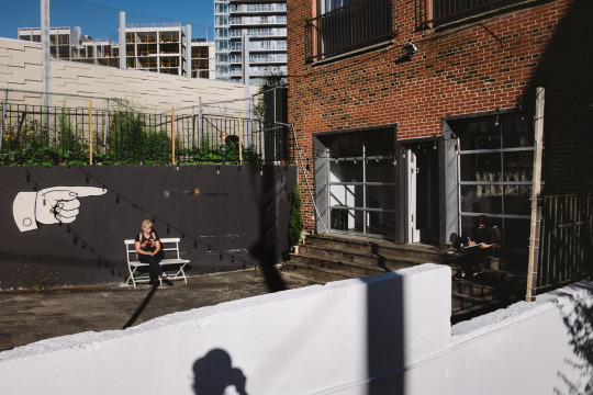
Here's the next image up for critique. Right now I'll refrain from sharing my reasons for not posting this image but will update the post after 24hrs with the answers - once you guys had a chance to come up with your own assessments. You guys offered such great feedback with DM's on my instagram accounts that I felt that instead of keeping all this fabulous information for myself, that it would be better served to have everyone's thoughts in one place and use it as a collective learning tool for all. Feel free to leave your comments below on what you liked/didn't like about it, what could've been done better, and why you think I rejected this shot in the first place.
*update* What I primarily disliked about this image is that ultimately it's just a picture of people eating. I remember being once told that the most unflattering shots of people you could take is of them either eating or caught in mid-sentence making a weird gesture with their mouths. Street photography to me is about respecting your subjects and not making them either a spectacle or exploiting a moment of vulnerability. While this isn't the most embarrassing image you can take of someone in mid-chew, it also has nothing else going for it.
The tree shadow, while it fills the right side of the frame, doesn't fill it with anything that relates to the human subjects. On the top left corner, it's pretty dead and those sliver of elements also don't add to the scene.
Just because the light may be good, doesn't necessarily mean the subject matter or the scene is worth capturing. I was attracted to the light and how it hit the people but when you really break it down, that's all it's really got going for it.
I decided to try something new with images that I never ended up posting for whatever reason. I'm going to use them for critique analysis and share my thoughts on why they just didn't cut it for me. I hope to use this as a tool to help others as well as myself. By sharing my process, perhaps future work will not suffer the same fate and overall growth can happen for everyone!
Featured below are the previous images I shared on my instagram stories from my @phraction_street page and here's what I had to say about each:
In this shot I felt, that the entire right side was empty, the characters weren't all that interesting nor did the foreground or background elements connect in any way.
A lot of people commented that I could crop the entire right side out but I'm a stickler for keeping the original aspect ratio I shot in and extreme cropping will only make me a lazier photographer knowing that I can just fix things in post. I'm a professional photo retoucher and though I know I can do a lot of things but I'd rather spend my time enjoying photography instead of working ;)
In this one I rejected it from consideration because there were too many objects sticking out of the guys' head, there were only 2 points of interest (and they're not even that interesting). I usually go for at least 3 if possible, and the red car overlap simply bugs me.
And that's where we're at so far. I wanted to put this up and future posts on something that doesn't disappear after 24hrs because I think this is something that can be useful and can be built upon even after the fact. If there are any additions or comments to any of the images you see above, please comment and share your thoughts so others may learn as well!
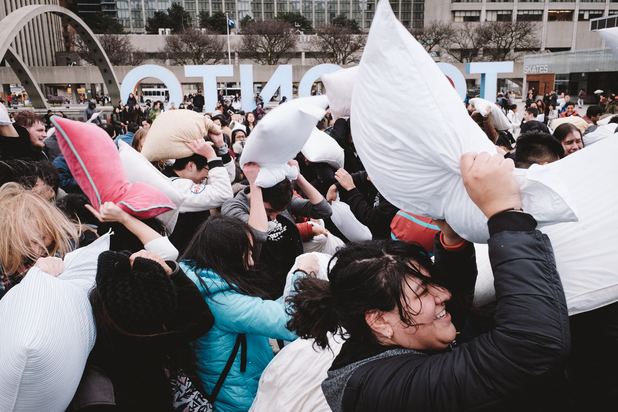
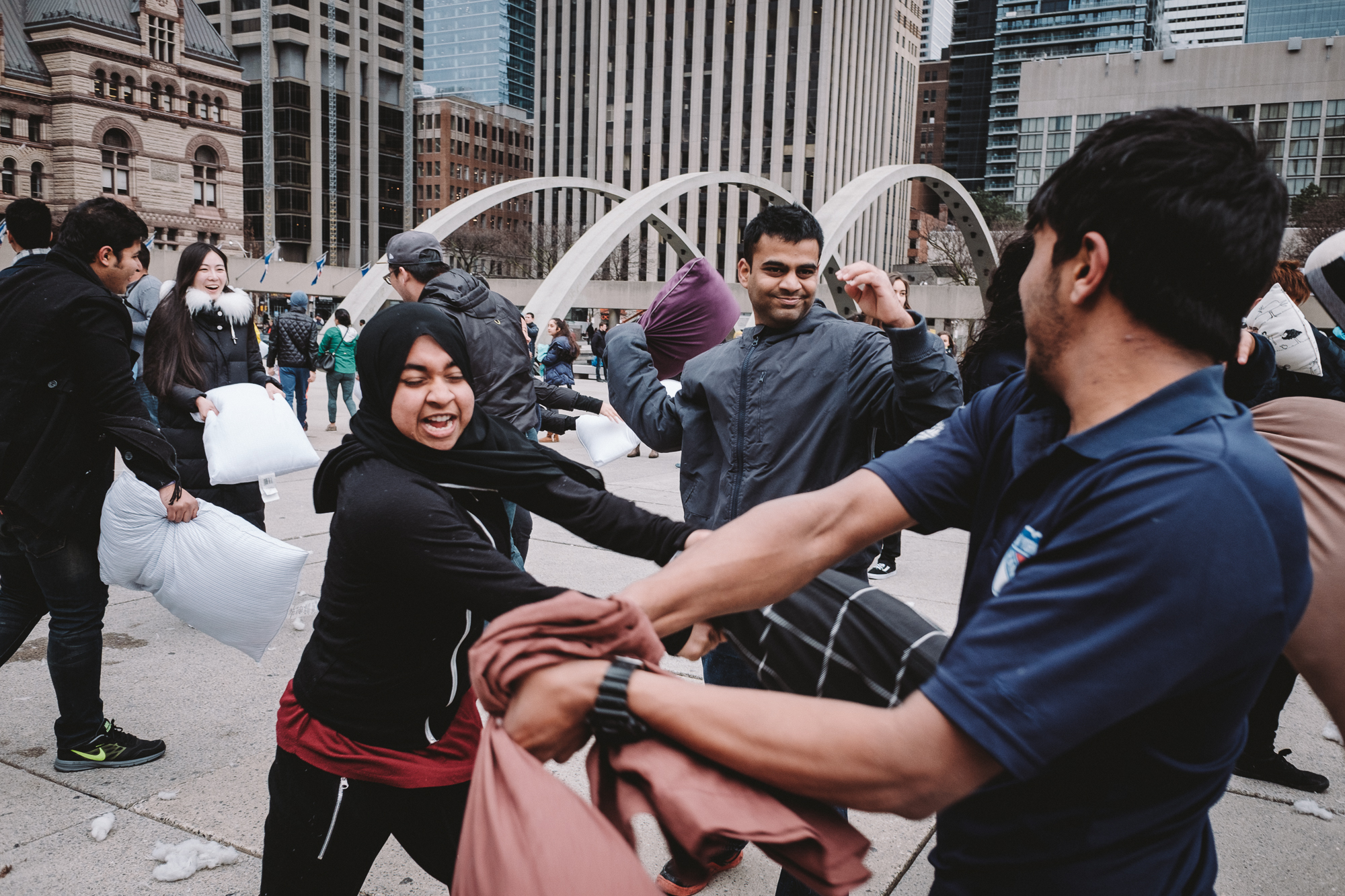
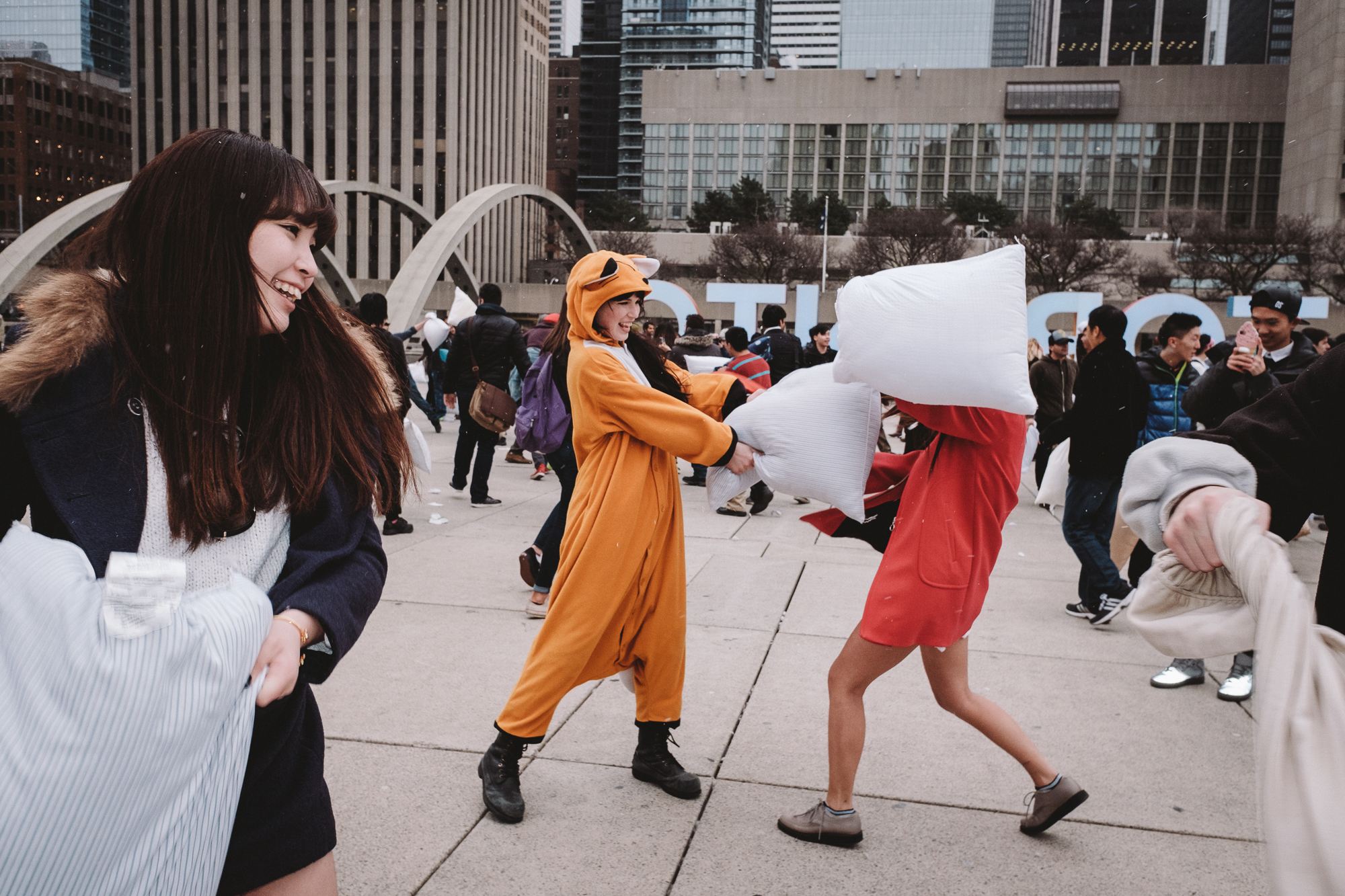
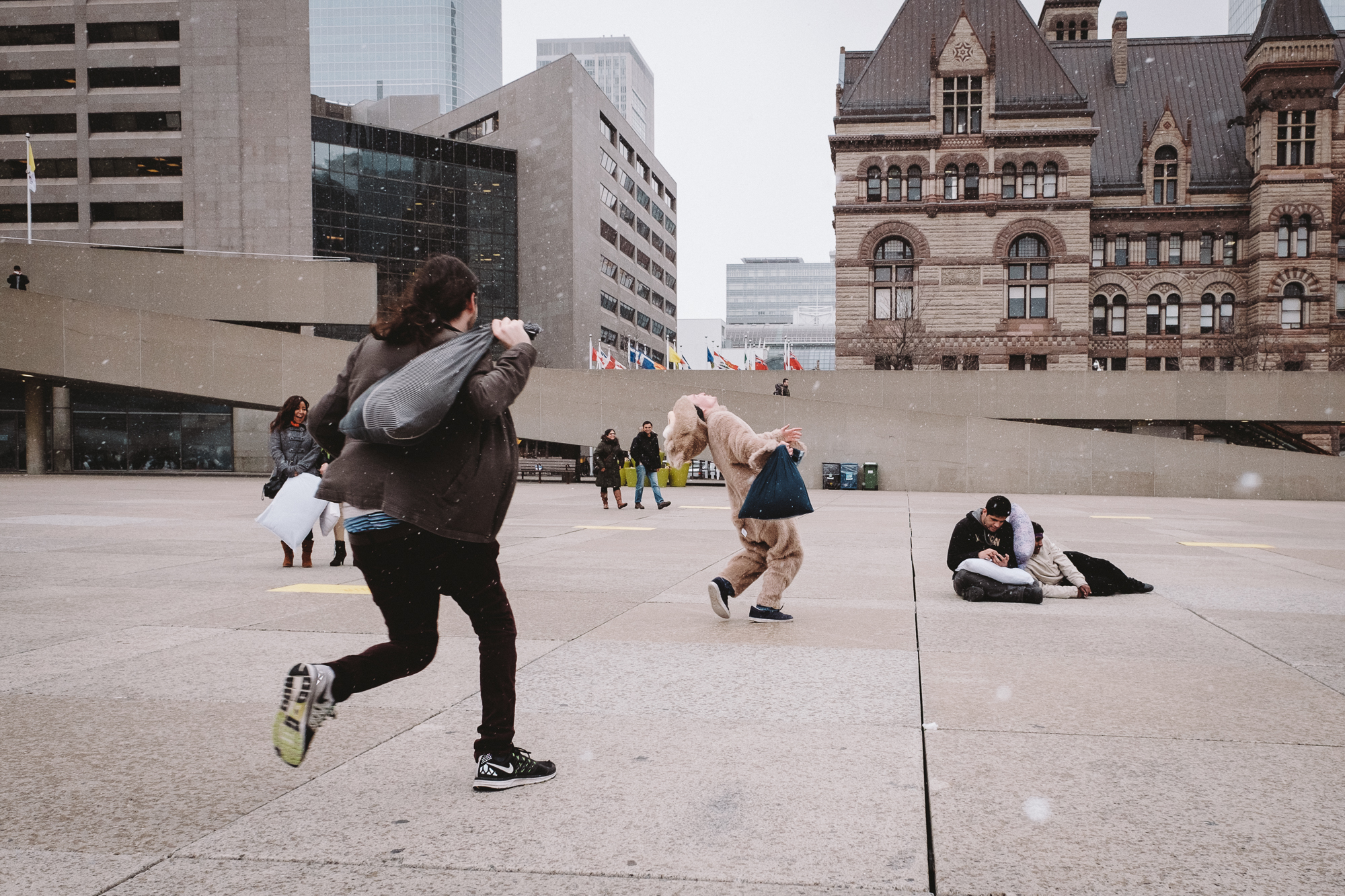
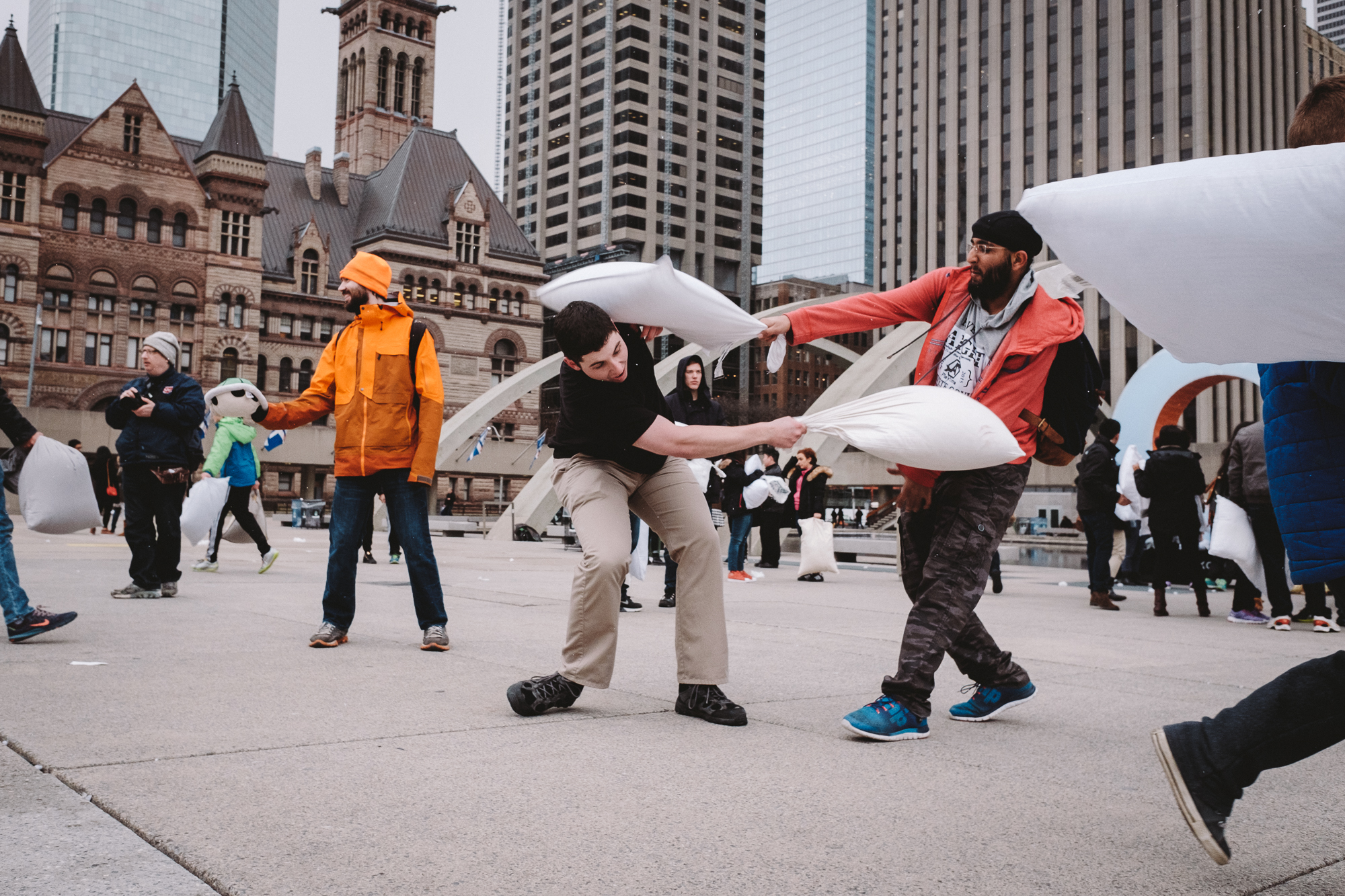
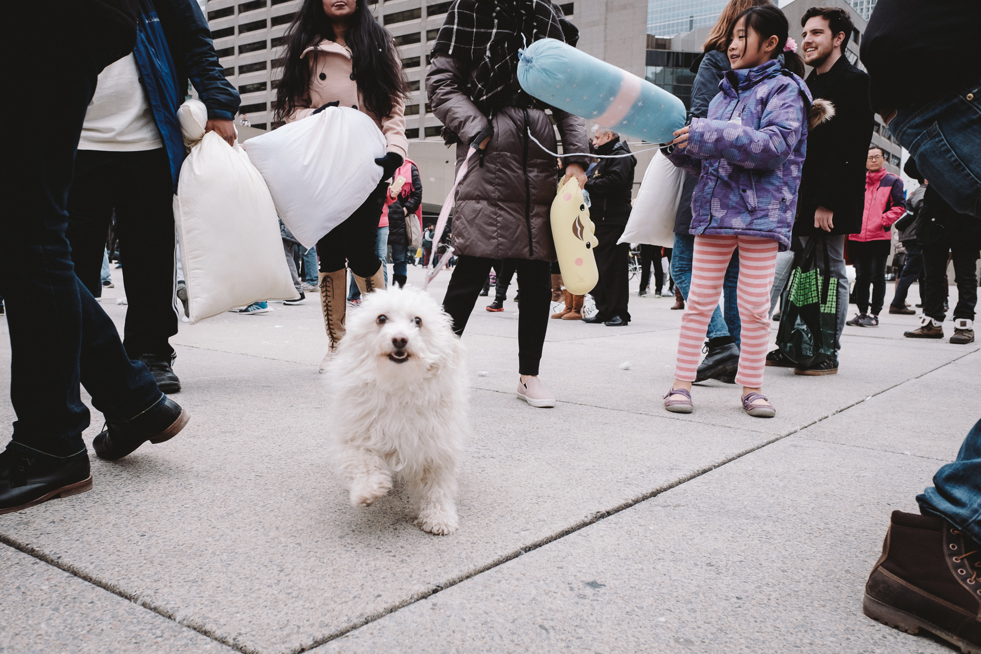
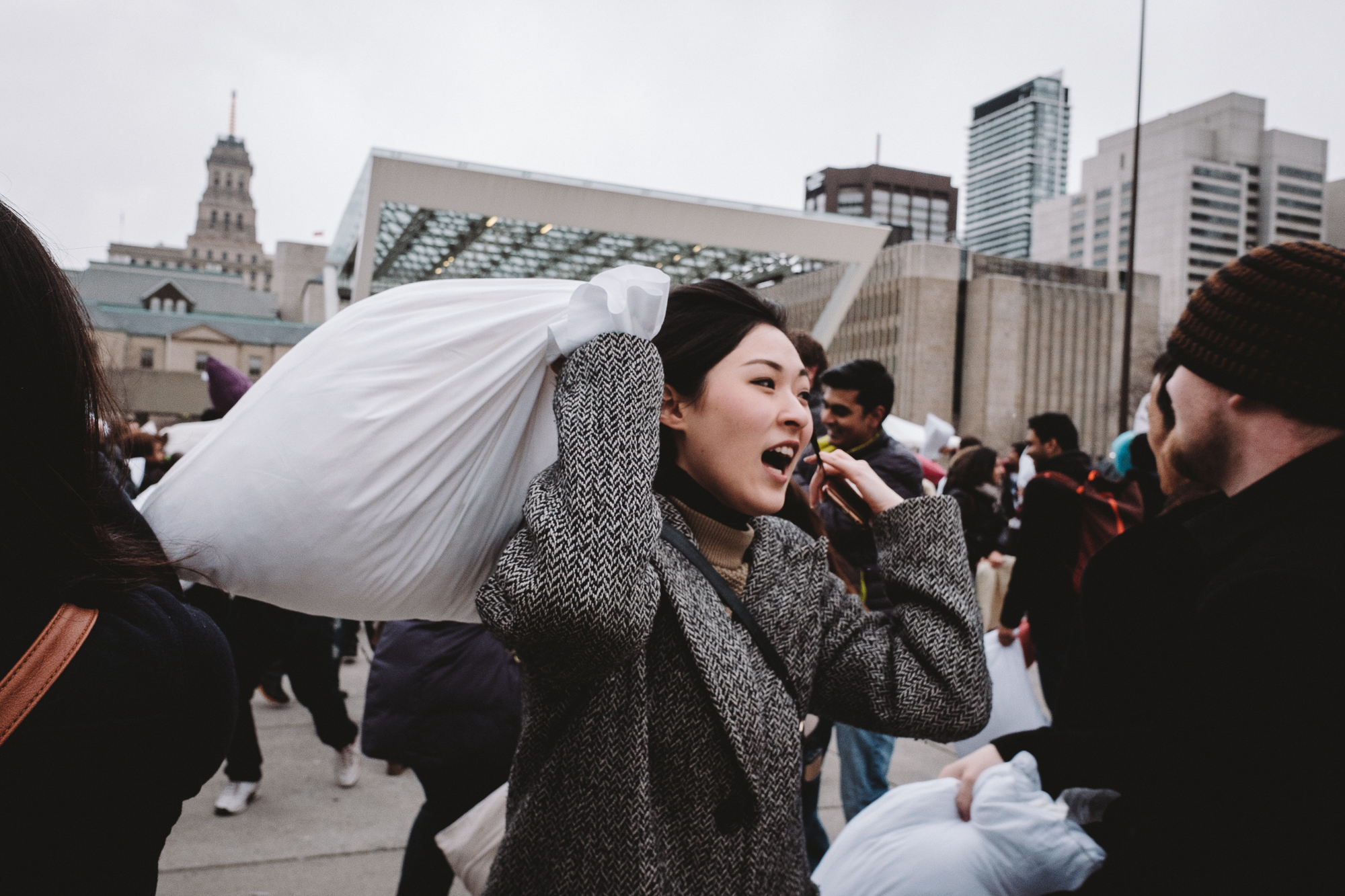
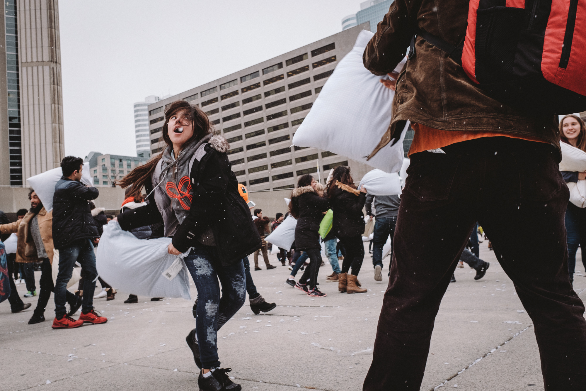
I find that the best way to really shake the rust off when you haven’t shot street in a while is to go to these massive public events where everyone has a camera out and just shoot with little possibility of confrontation. I mean, really if someone were to be that pissed that you’re taking their picture at something like a pillow fight, then they’ve obviously need to use their pillow to catch up on their sleep.
Usually when the lighting is as drab as it was today, I just opt to stay home but in these cases, the flat lighting takes one photographic variable out of the equation and gets you to focus on composition and getting your timing down - both of which I felt was still in Winter hibernation mode. (seemingly all the snow indicated that Spring was still in hibernation mode too)
This was also an excuse to stretch my in story-telling and editing muscles as those I feel need a good workout as well. I mean, I hardly look at images the minute I get home from a shoot so it was weird adhering to a false sense of time sensitivity as I gave myself a deadline to work with. I just wanted to see if I could still curate images quickly and narrow down a story to only a few selects.
Given the nature of social media and how I’m terrible at posting on the fly, I knew I’d never keep up with those who tweet and actually ‘insta’gram. Probably another reason why I think I wouldn’t be a good photojournalist.
In any case, trying to narrow things down to 10 images or less was a struggle. Even when narrowing things down in Lightroom with first flagging selects, then colour coding, then again with star ratings, I still ended up with about 17 images. Fail. Might as well share the link to the rest of the 50+ images for the While I’m at it. Click here to view the rest of them on facebook.
Good thing this event is pretty self explanatory because I’d feel pretty bad if you still didn’t get the concept of a pillow fight just by looking at the images. Clearly it’s simply legal assault ;)
Hey, if any of you guys have some solid techniques when it comes down to narrowing down selects for photo essays, feel free to let me know, otherwise enjoy the snaps!
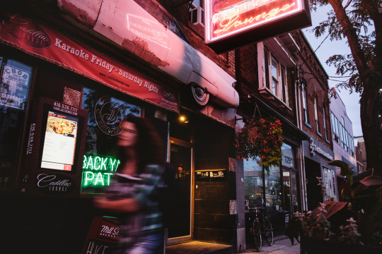
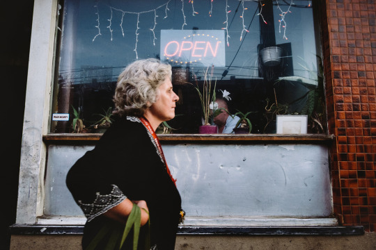
Almost my entire life has been spent within the little box of Toronto’s downtown west-end. Walk out of my childhood home, turn in one direction and skyscrapers bite the sky, turn in the other and a scar-like expressway extends forever, separating the city from the polluted lake and the evils of small-town Ontario.
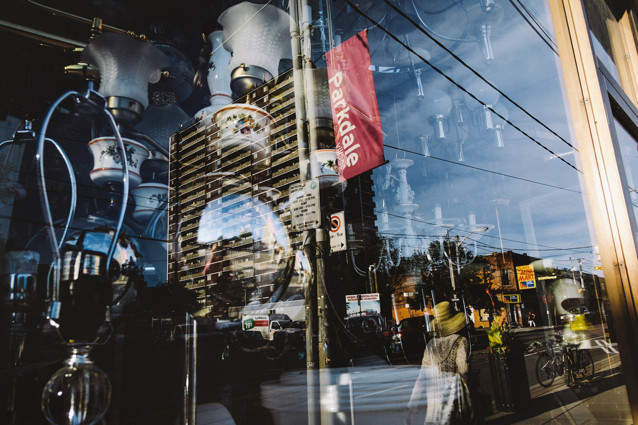
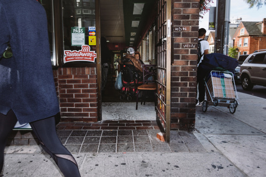
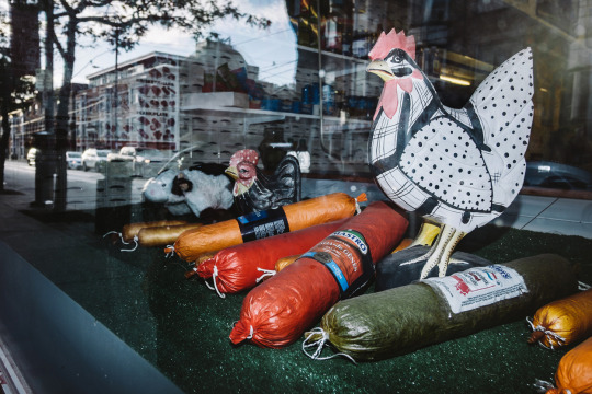
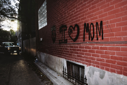
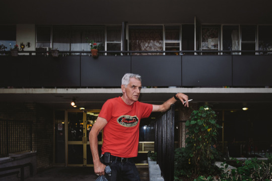
Parkdale isn’t lovely in any conventional sense. It’s a beautiful mess of neon-bright colours, perpetual gridlock, people from all walks of life and social strata, graffiti art, garbage, crumbling brick, and grey cement. The exorbitant cost of living, condominium developers, and pressure to gentrify may have forced steady change on it, but its heart remains. It’s a layered, intersectional part of the city, and while it may be possible to stay in your own particular layer some of the time, walking from one block to the next, you’ll pass chichi coffee shops, rooming houses, and faltering businesses.
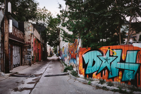
Growing up there in the 1980s—the decade that brought us Pac-Man’s release, Michael Jackson’s Thriller, and the World-Wide Web—I found comfort in the fact that maps were superfluous. I felt my way around with my eyes half-closed—sometimes reading a book or singing along to music. I loved shortcuts and back alleys. Some people preferred fine art galleries, but I would just head to my neighbourhood’s shadowy places to look at the ever-changing murals. Sticky situations were handled by making eye contact, picking my nose, giving someone the finger, ducking into a corner store, or hailing a cab.
I learned to appreciate the things people who fled to the suburbs warned you about: chaos, the ugliness of haphazard growth, and “crazy” people. Given the choice between sterile serenity and hectic density, I always chose the latter. I’d still rather schlep my sorry ass around the city on crowded streetcars, with sweaty businesswomen in polyester suits breathing fishily down my neck, than live an enclosed bubble existence.
In Parkdale, nothing was truly private, and nobody bothered to pretend, because we lived on top of each other, and were forced to witness each other’s private moments and humiliations. Often we pretended not to see. But not always. A few years after my parents divorced, when I was about nine, my father moved to a tiny dead-end street called Virtue that consisted of about twenty houses. Virtue Street was an enclave of gossips who seemed to know and see all.
Every couple weeks, I stuffed all my clothing and school books into big black garbage bags, and lumped them on my back from one parent’s house to the other past the corner where the sex workers did business—they kept an eye on me. On foot seemed like the most hassle-free way to go. Waiting for a drive was intolerable, because I was an empowered, independent sort of girl who thought she was Nancy Drew incarnate. I took action, investigating all potential mysteries, taking people’s fingerprints, examining their handwriting, and poking around abandoned buildings for clues. Only now do I realize that maybe some of those things weren’t so safe.
An insatiable desire to understand the why and what of my universe eventually turned me into a writer. It was either that or an anthropologist. There were so many characters. It was virtually impossible not to interact with someone on the way to the corner store. I remember this one man, an outpatient from the nearby mental health hospital, who sat on our corner, rocking back and forth, with his hands over his face, whispering his traumas. Summer, autumn, winter, and spring came and went, year after year, but he was still there, wearing thin lace-up leather shoes with no socks. We never spoke a single word to each other, and I have no clue whether he even saw me, but I was grateful for the sight of him there by the streetcar stop, because it meant I was home.
He is just one of the memories that follow me around the area. Rita Cox, the local children’s librarian, told the best Anansi the trickster stories. She saved incredible dress-up costumes for all her Parkdale “kids” in the basement of the library and rounded us all up so we could dance in the carnivalesque Children’s Caribana along the waterfront. I fell in love with steel bands, and the fact that gorgeous music could be made from the lid of a garbage can or an empty oil drum. That’s the music in my head when I think of Parkdale.
There was my best friend Sheena, who moved away, but used to live in the duplex unit upstairs from us. She was an amazing dancer and made me practice routines to Madonna’s early oeuvre and the Rocky Horror Picture Show until I pretended to hear my mother calling me for dinner. She was also the best teacher of everything naughty. She showed me how to light cigarette butts with a magnifying glass, how to cut a hole in my screen window so we could escape at night (or let the boys in), how to dress for clubbing, and how to do a strip tease the sexy way.
I once saw a man have a heart attack on Queen Street, within spitting distance of two beat cops, who did nothing until I screamed at them to call an ambulance. A frail Bird Lady lived in a boarding house on my street, and her family consisted solely of the pigeons she fed every afternoon. Her head was injured one day, when her door was busted down during a raid on her building, so I brought her flowers from the lilac bushes in our front yard, and asked why she’d refused to go to the hospital. She was convinced they’d lock her up.
A person’s life was both worthless and priceless at the same time. It just depended on who was doing the measuring. Some people would be there for you no matter what, others would steal the shoes off your feet. Understanding this was the key to how the community functioned. If you were an insider, you were pretty safe, unless you crossed certain lines.
But when I traveled just twenty blocks in any direction, the rules changed. I got disoriented. People became inscrutable. North was no longer up, south wasn’t down. Things were further apart, more uniform, less familiar. If I went just a bit further, and blinked for a moment, when I opened my eyes, I’d shifted into a parallel universe.
In some ways, flying through space would have been more appropriate than taking the subway out to North York. Everything matched: people, houses, box stores. I immediately missed the sound of a thousand different voices, the strains of every kind of music in the world floating down from open windows and out of tricked-out Honda Civics. Parkdale always had its own particular vibe.
So I always returned with a sense of relief. While forays outside the little box were enlightening, nothing beat familiarity. Besides, a mental chasm existed between the urban and the suburban, between hectic chaos and artificial order.
We are all shaped by our environments. I am a child of the city.
*An early version of this piece was published in City of Words edited by Sarah Elton (Cormorant Books, 2009).
Shooting Assignment - Fluevog/@streetvogs: A Wrap-Up Review
About a month ago I was asked if I wanted to be a part of a project put together by Fluevog. Naturally interested and always skeptical, I figured I’d see what the catch was. Turns out they were starting a new instagram account called @Streetvogs to showcase street photography from each city their stores were located in. With the theme of “Unique Soles for Unique Souls” one representative of each of the 16 cities would have to post daily to the black and white feed as well as the main colour feed.
If you shoot street, you’ll know that having a daily deadline is super stressful. There’s no telling if you’ll get any shots that day, especially when you’re shooting candids. It’s not like you can say, “hey man can you do that thing again where you look ominous and menacing, but do it naturally, it’s for Fluevog” Yeah, doesn’t quite work that way.
On top of me subscribing to the practice of letting my images ‘marinate’ (as spoken about in my last post) I also caption most of my images because, entertainment. Seeing that I had enough on my plate as it was, I figured I’d add to my workload and limit myself further by choosing to feature 1 of the 140 neighbourhoods in Toronto daily to give a balanced overview of the city. Clearly balancing everything else going on in my life wasn’t enough..
So I said yes. Whatev, challenge accepted. fml.
I was actually the 2nd photographer in line with the project, as this idea was brought to life by Take @bigheadtaco and Stephen of Fluevog while in Gastown, Vancouver. Since Take was still shooting at the time of contacting me, I had a bit of a head start to organize what neighbourhoods I wanted to do and what kind of shots I needed to get. I “#latergram” everything anyways so I don’t feel bad for not sharing the images the day I take them. Besides, the more time I have to edit my images, the better the quality of my postings.
Not gonna lie, I had a few images in my archives that worked with some neighbourhoods I wanted to feature so I used them. They would’ve collected virtual dust anyways had I not posted them because they were just sitting there waiting to see the light of day. This project actually brought life to some images that I couldn’t have fit into my feed because they either looked meh, as colour or they just didn’t fit aesthetically with the rest of the stuff on my feed. I’m that picky folks. My OCD mixed with indecisiveness knows no bounds when it comes to image selection. Honestly, they actually looked better in the streetvogs feed considering how Take was shooting his stuff so it kinda worked out. "Sometimes you go out to shoot street and have nothing to show for it”
The first week was brutal. So was the second. It was a lot tougher to come up with 3 posts daily (2 BW + 1 colour) when I normally just post once a day on both my accounts @phraction and @phraction_street. 4 accounts to manage!? Sleep?! I got this. Also trying to post at certain times of days to stagger each post from all accounts was super nuts.
I was am bitching a lot but I actually enjoyed myself. It’s been a while since I’ve been ‘on assignment’ and going out to shoot something specific in mind gave me some much needed direction and focus when out shooting on the street. It made me pick the location properly knowing that not only did I have to get a good street shot, I also had to make sure that it was visible that I was in that part of the neighbourhood I was wanting to feature. So basically no more looming in dark alleys and creepily stalking people without their knowledge… oh wait. I totally did all of that. Like all the time. *no I didn’t…well.. only some of the time..*
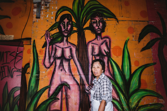
On top of doing the candid street stuff, I actually got out of my comfort zone and met a few people who were willing to pose for me. Prior to this project I wouldn’t have called myself a Fluevog connoisseur so spotting their shoes was a huge challenge. Luckily… luck. I met food/lifestyle/travel blogger Annie (Chu On This) and Karyn @karyndejong who actually found me and made my life a bit easier with their great looks and style. I’m no portrait photographer and my art direction was rusty to say the least but I got the shots. I’ll probably have a separate post showcasing the images that didn’t get featured because I think there’s tons of images in each set and I can only post 10 photos here. Besides, I like to mix things up a bit and variety is key to keep everyone interested I guess.*Karyn DeJong in front of Guu restaurant’s cube wall*
What was also neat was that my shots were fed straight from the @fluevog and @streetvogs instagram feed and right onto the official fluevog website. That’s right folks, big leagues ;) *Screencap of the Fluevog site featuring my posts on their IG feed*
When it was all done, it was obviously bittersweet. The challenge was completed, the ‘deadlines’ to have something up was over, and the ‘need’ to go out and shoot had changed to a ‘want’ once again. It’s not every day that you have full creative control over photo assignments. In the industry with art directors, clients, client’s clients calling the shots, it was an opportunity that I would be stupid to pass up and in the end I actually picked up my first pair of Fluevog shoes: *My fluevogs are called “Down To Earth - Hadfield”*
Gotta say thanks to everyone who brought me into this and supported me throughout the project, so it’s my time to show support to the next @streetvogs photographer who is currently shooting now and representing Ottawa: Mink Williams @minkwilliams. It was conceived during the time of shooting that the current photographer would have to suggest a suitable candidate for the next city and his quirky style and awesome eye for spotting fluevogs on the street clearly made him a top choice. If you’ve got some time (and I know you do, if you’ve read up this far) why not check out to see what they’re up to over there but be sure to come back ‘cause I’ll miss you guys if you’re gone for too long :)If you feel like sticking around for a bit, feel free to hang up your coat and stay a while - I’ve got some black and white images at the top of the page that you can click onto for a larger view showcasing some stuff that didn’t make the streetvogs feed because I had too many shots from one neighbourhood or couldn’t find a way to fit it in without being fair to the other ‘hoods. Equality and all that stuff right?
#Latergram: Shoot 1st Post l8r
The concept of posting an instagram image way later than when it was taken is a #latergram. I do this. Like all the time. Everything on my feed has been posted days if not weeks from when it was taken. Contrary to instagram being something that’s supposed to display what’s going on currently in the user’s life, I fail to believe that people are all that interested in what I’m doing at this very second. Nor would anyone probably really want to know. flushes toi uh.. *washes hands*.
I think that being able to post something when I please gives me better control over what I want to share with the world and gives me the time to think whether this is something that people would actually enjoy or if it serves as something that’s shared for the sake of sharing.
I prefer my images to have a flow, to tell a story and to work well from one to the next so I carefully select which shot I want to post to reflect a certain continuity in my feed and make it coincide with whatever it is that I may be feeling at the time. If there’s anything ‘insta’ about my feed, it’s the captions that usually go with the images.
What this also allows me to do is actually enjoy the time I’m out doing something. I can’t be fully experiencing the moment if I’m constantly on my phone posting throughout the day. I like to fully experience the moment and worry about the images later.
By letting my images ‘marinate’ (something I learned from Garry Winogrand in lesson number 6 of Eric Kim’s article) I create an emotional disconnect with my images and this allows me to go back and look at them more objectively to see whether or not it was actually a good shot or if I just thought it was because of how I was feeling at the time of taking it. But of course it’s good… ‘cause I took it pfff… *not really*.
Obviously all this requires more work than needed. Some people can snap a photo, edit it if needed, apply a filter, write something (or not), hasthtag, and post within minutes if not seconds. I’m sure there’s a joke about finishing quickly but I’ll keep this PG-13 (for now). This is great if you don’t want to spend too much time in front of a screen. I however, obviously like making extra work for myself, but clearly it’s for the purpose of making a quality contribution to the world of the internets.
What I’ve noticed is that the more you post, especially of the same angle/subject matter, the less people start to care. What separates you from another person posting pretty pictures? Frankly I find it funny when feeds start to look exactly like one another. Especially from people in the same city shooting the same stuff but that’s another topic in itself. The underlining message here I guess is quality over quantity. *NBC’s “The More You Know” PSA banner suddenly files by*
I do all this because it’s a hobby for me, an outlet to share my images and to an extent, my words. I’m not being paid to do this so the only deadlines I have are the ones I give myself. It’s better this way (at least for me) and perhaps for you as a viewer who can hopefully appreciate that there’s a bit of thought put into each pixel on the screen. Also might renew faith in humanity that we’re not all consumed by the rules of social media - but who am I kidding, we all are, in a way, sucked into it. Maybe by doing things my way, it serves as a method to stick it to the man. What can I say, I’m a rebel that’s bad to the bone and tomorrow, I’m gonna remove all the ‘do not remove’ tags from my couch cushions… *no I’m not..*
I figured some shots of the CNE (Canadian National Exhibiton - for those not from Toronto) would be a perfect pairing for this post given that it ended two weeks ago - Enjoy!


 "Sometimes you go out to shoot street and have nothing to show for it”
 *Karyn DeJong in front of Guu restaurant’s cube wall*
 *Screencap of the Fluevog site featuring my posts on their IG feed*
 *My fluevogs are called “Down To Earth - Hadfield”*


