canada

Multitasking While Marching With Women

Saturday was an important day to show solidarity and try to capture the moments of the Women's March movement. I was glad to be a part of it but I had no idea just how much energy this would require until I actually got there...

It's one thing to be a part of the demonstration and to stand with those with a significant message to say, it's another to do so while walking and trying to capture the event using both stills and video.

Imagine a photographer having to capture his own wedding and try to take part in all the festivities, while trying to use Facebook live to share the event with those who want to see it as it happens. I mean, it's not too hard to fathom as our insatiable lust for media consumption is just that real these days folks.

I wasn't on assignment, but to be honest, when you're at something like this, it's hard to shut off your mind from always being in documentation mode.

I mean just because you're not being paid to do something, doesn't mean that you shouldn't use available opportunities to learn more about yourself, hone your craft, and improve problem-solving skills. This is why, even though it was such an exhausting event, I still felt that I was able to come away with something that was both beneficial to myself and to others.
 

My takeaway from documenting the event:
Judging from what I think is underwhelming stills and footage (because I know that I can shoot better than this,) I learned that splitting your focus between two mediums can split the quality you come away with. If you decide to shoot video, then just shoot video. If you decide to shoot stills then just shoot stills.

If you are overly ambitious (stubborn) as I am and decide to do both anyway, at least go in with an idea of what you want to accomplish. I usually don't do this as sometimes inspiration happens on the spot, but don't risk it if you know you have to deliver. Understand when you've got enough images and frames to tell the story you want to tell and use the rest of the time to enjoy the moment.

Get more than 3hrs of sleep the night before an event.
 

I wanted this post to be simply about my experience at an event, but as I kept writing it went from simply sharing images to sharing a message that surpasses the actual media itself. A fine example of how you can go into something with one set of ideas but completely come out the other side with a new understanding. Hopefully this theme of adaptation and openness to new ideas as they present themselves will go beyond this page and rub off on places in the world where it could really be beneficial.

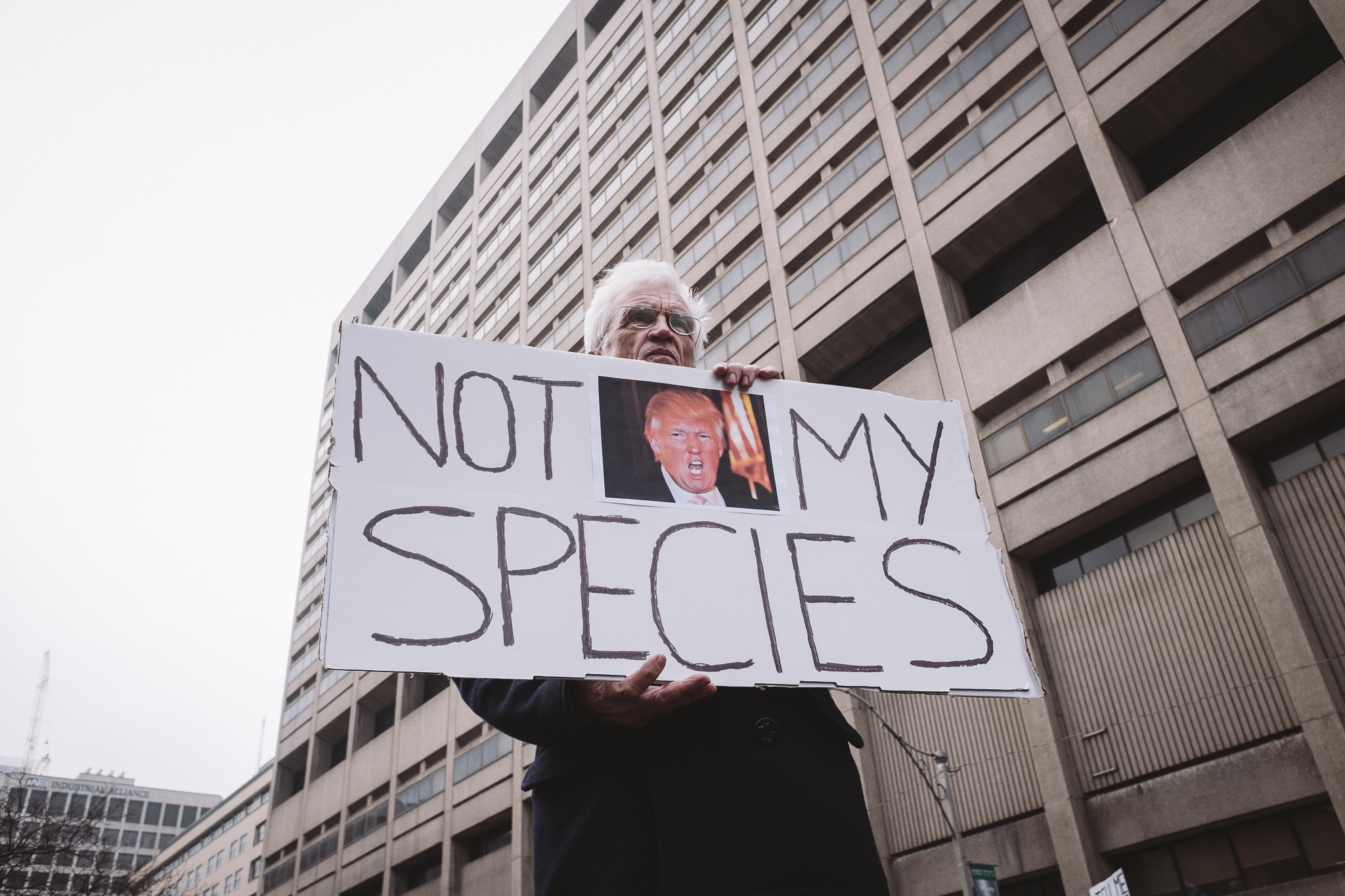
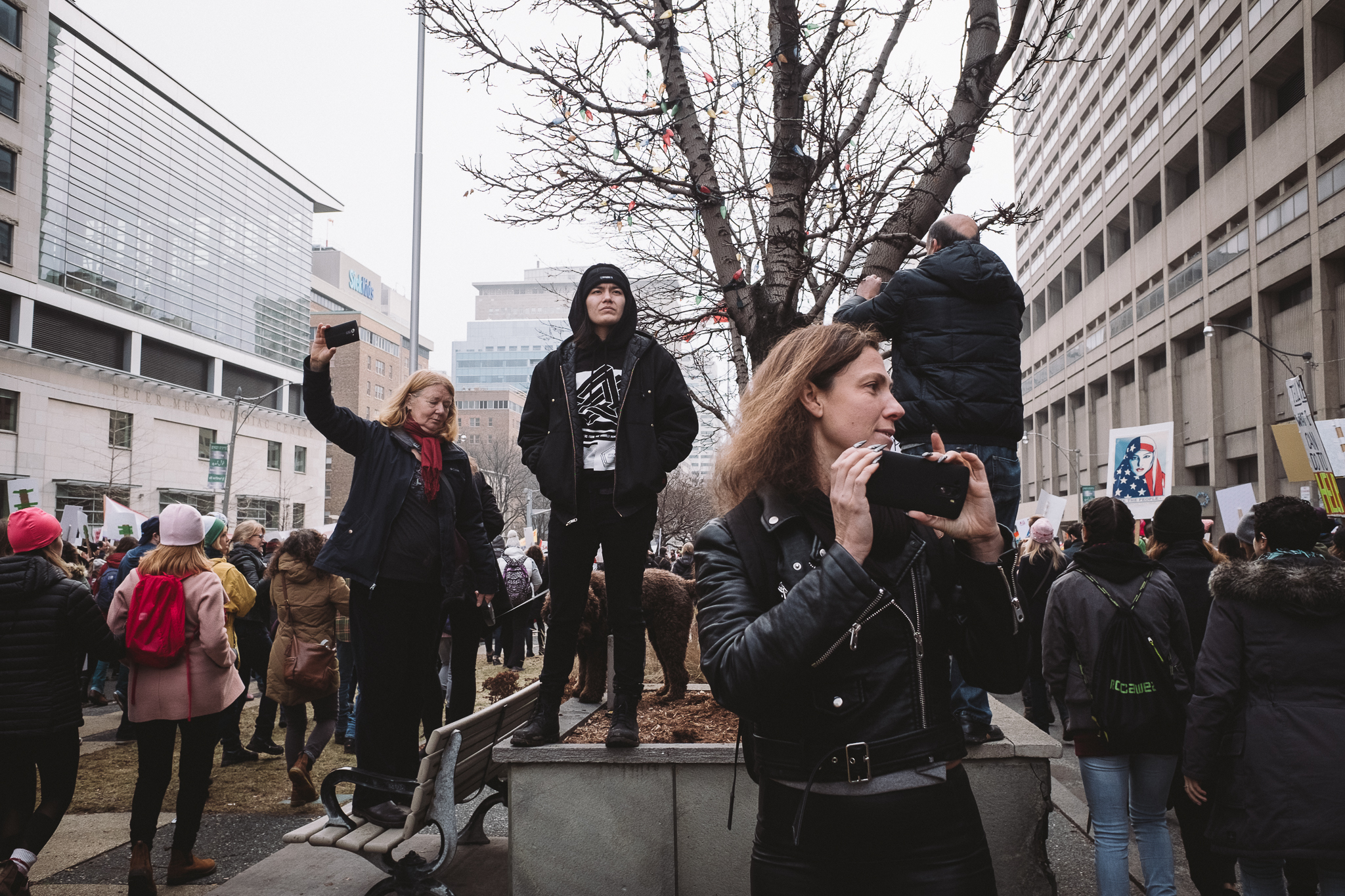
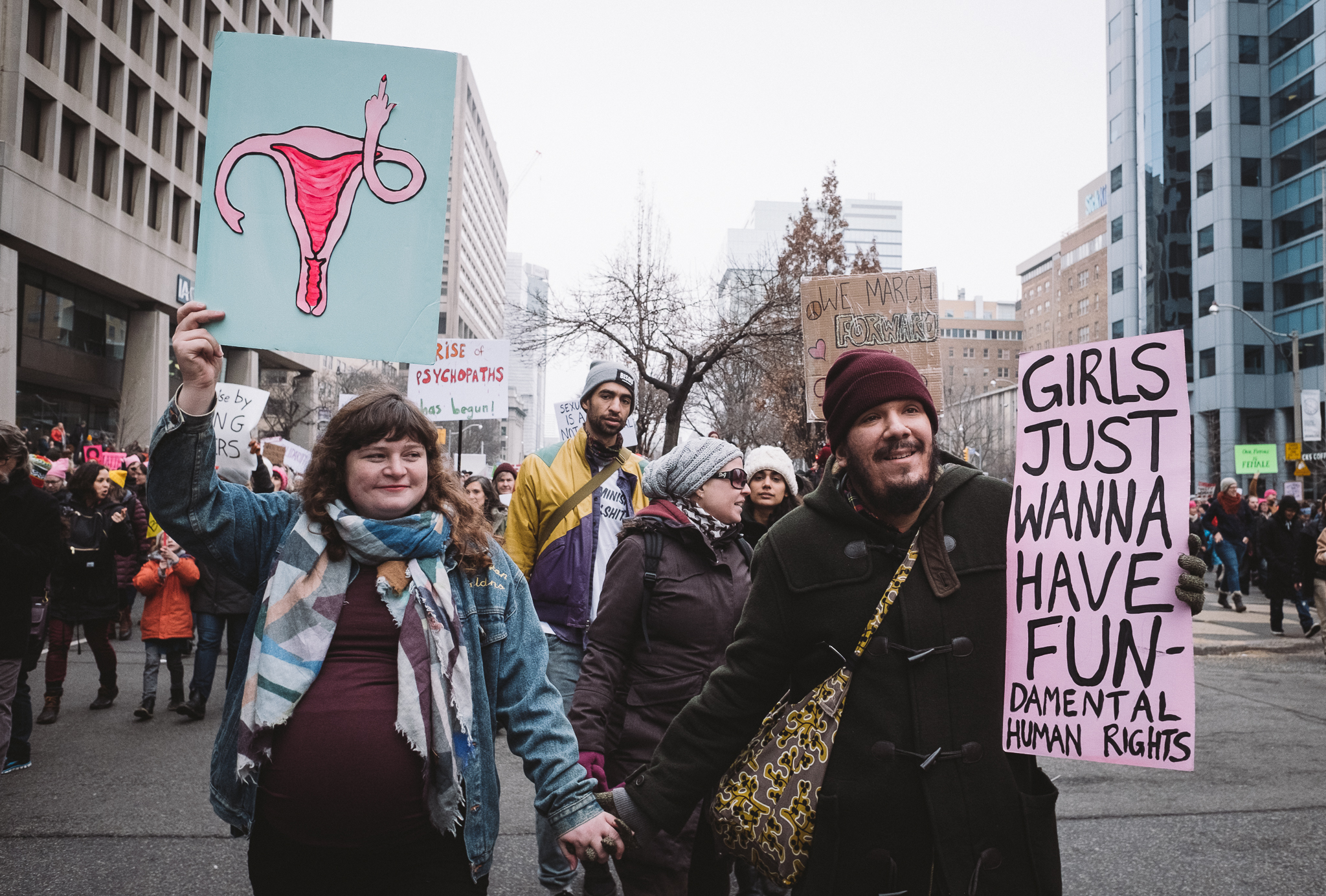
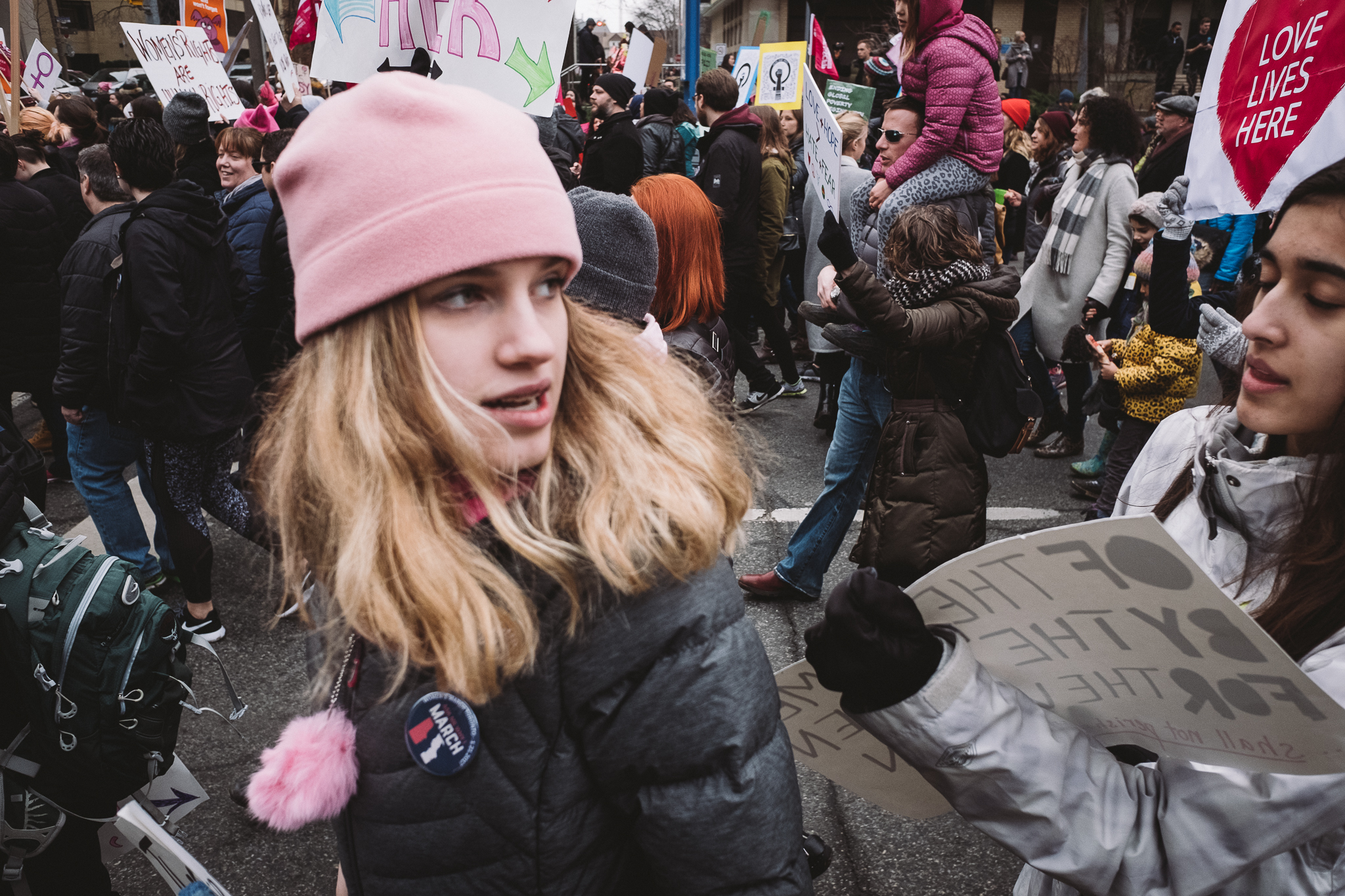
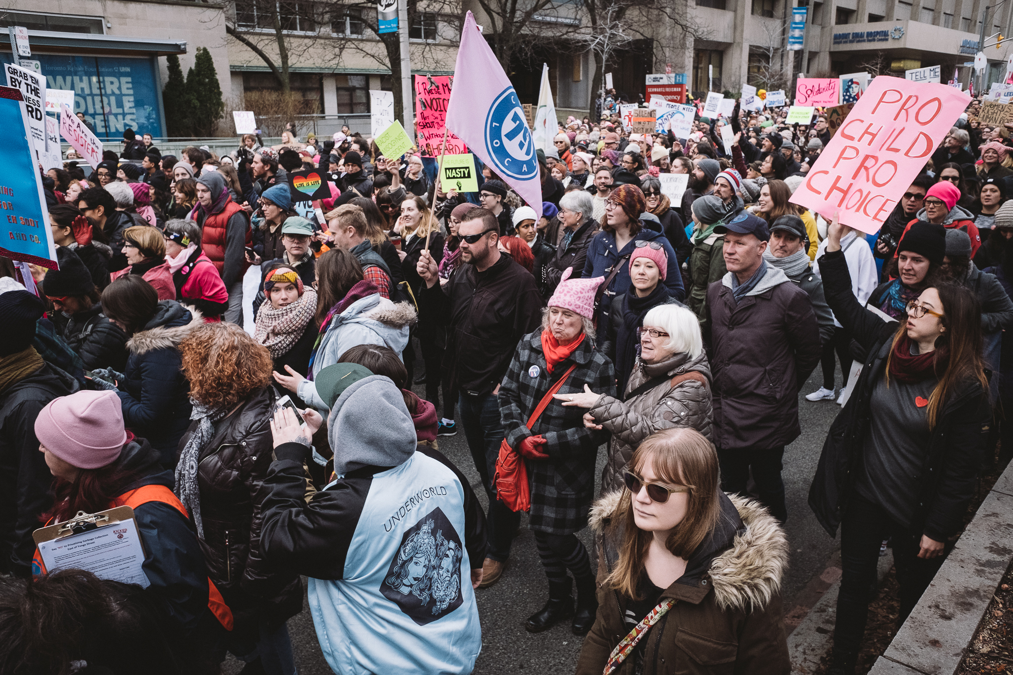
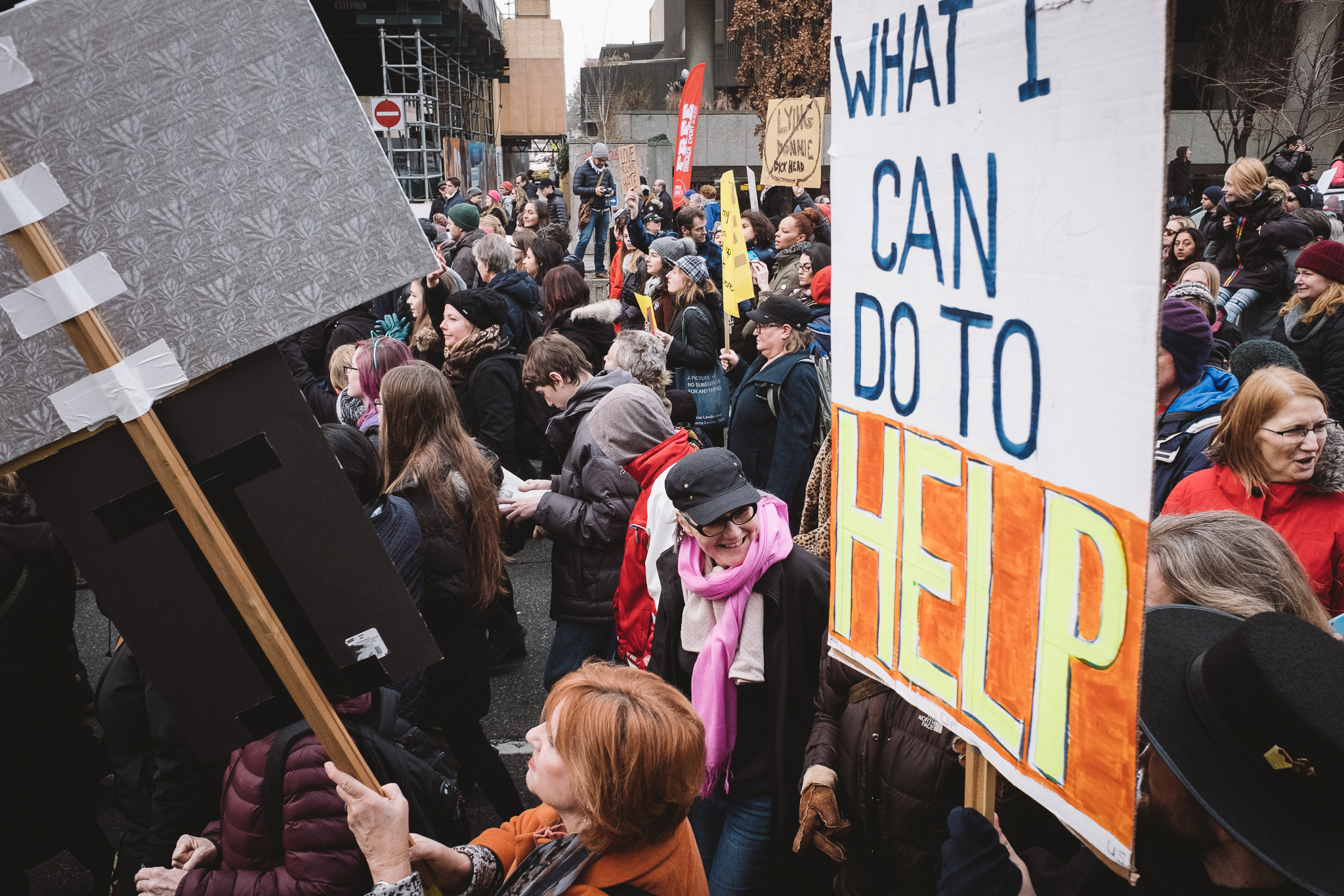
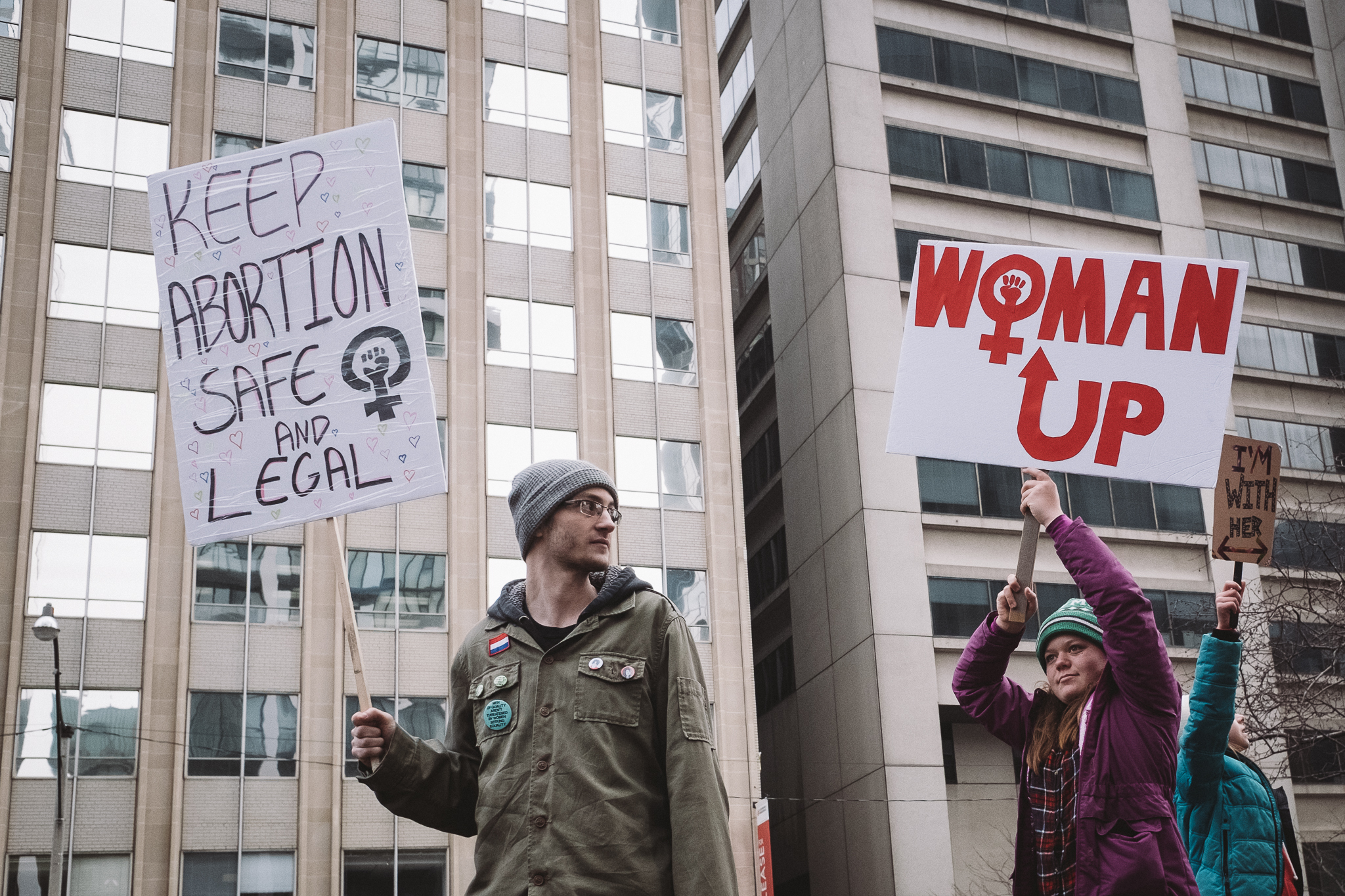
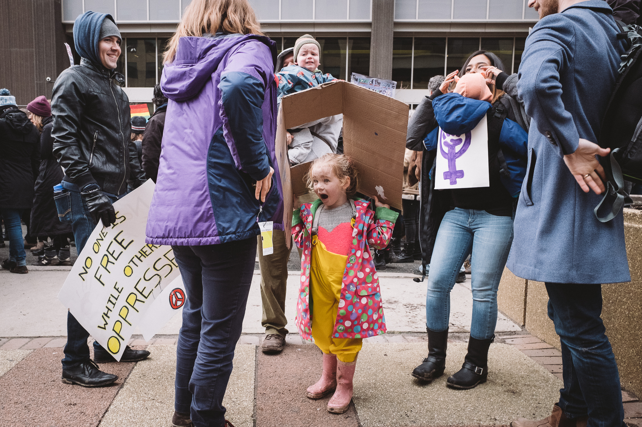
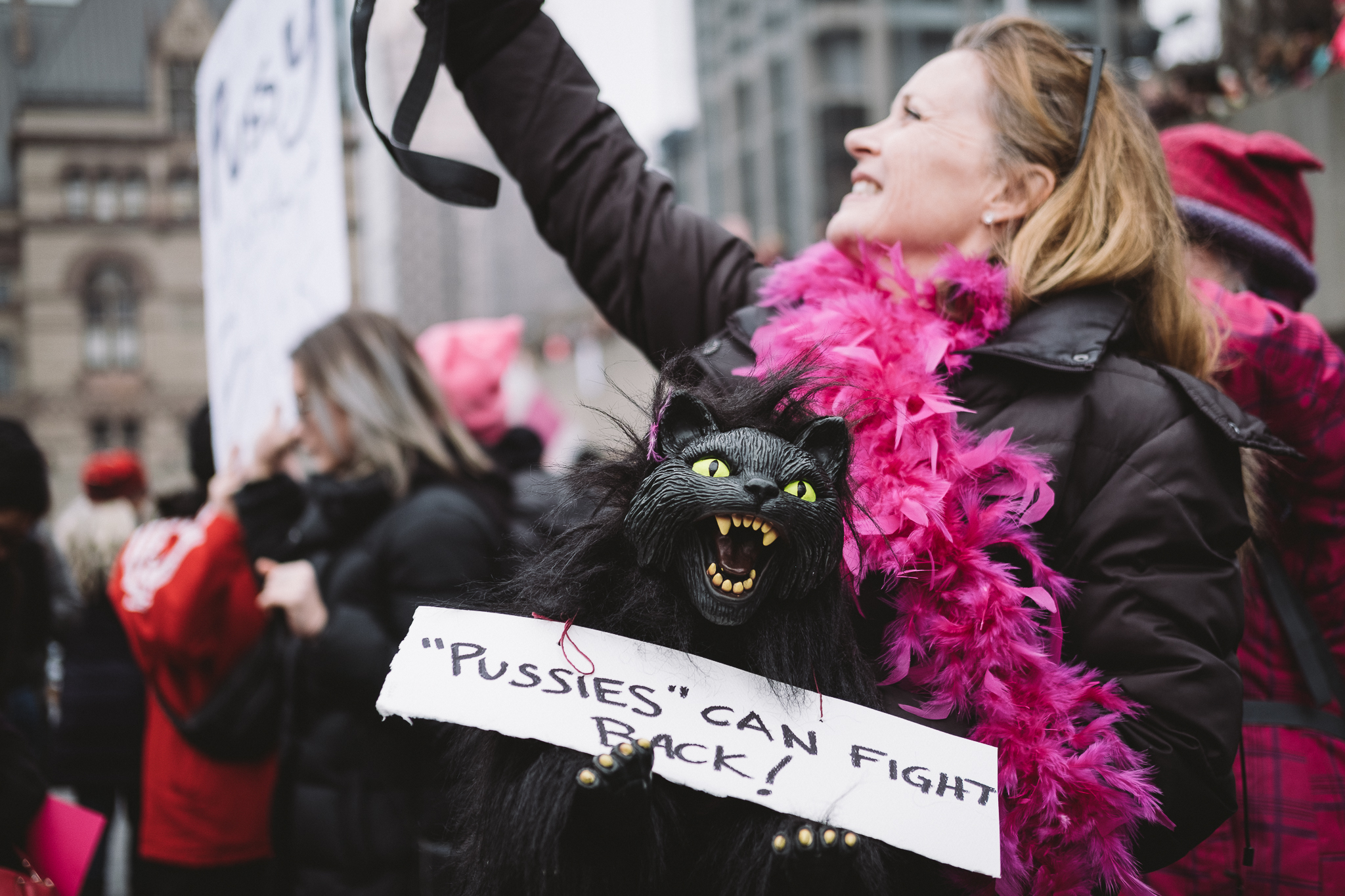
Above are the snaps I took from the event and below is the video I managed to put together with the random clips I captured throughout the day.

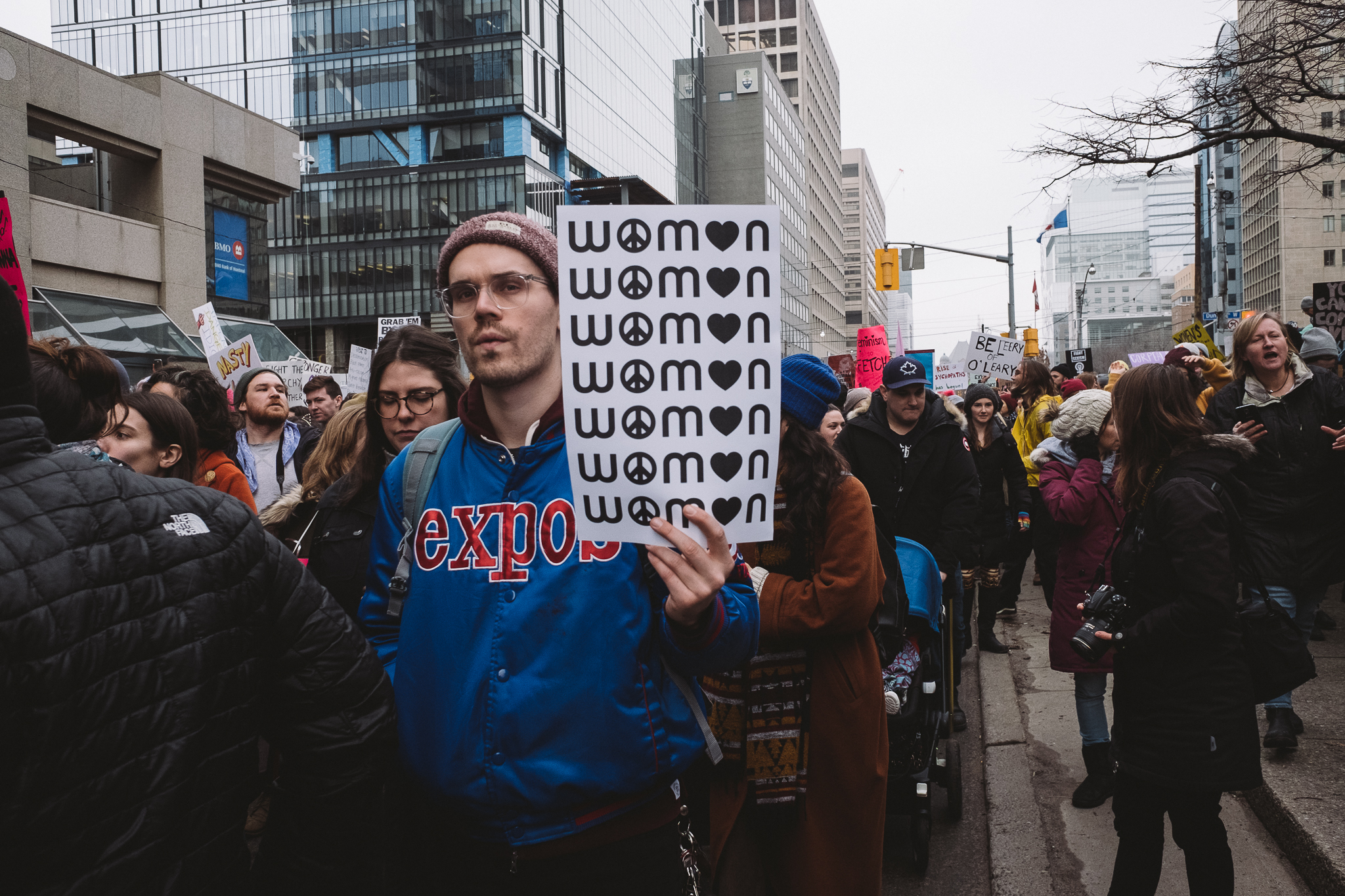
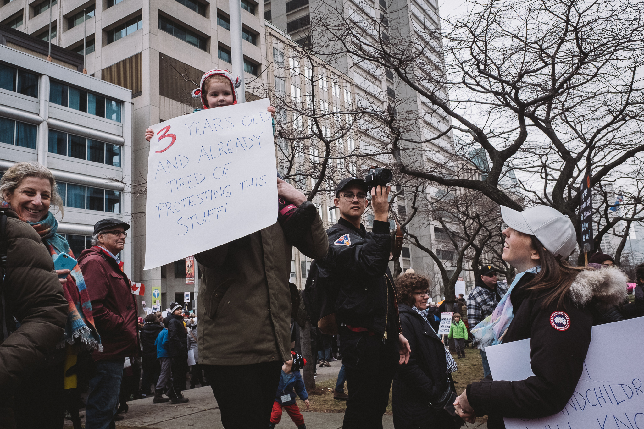
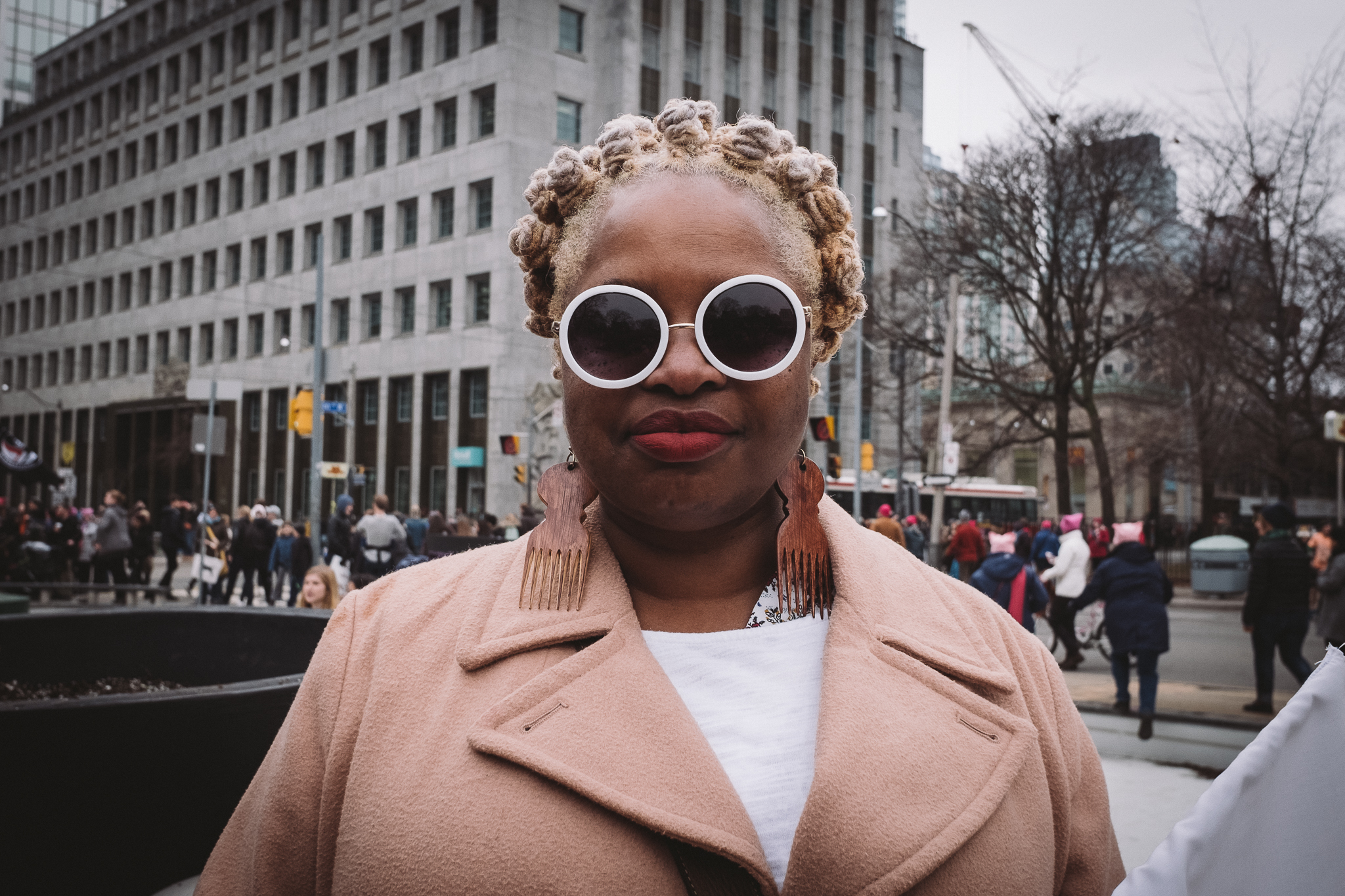
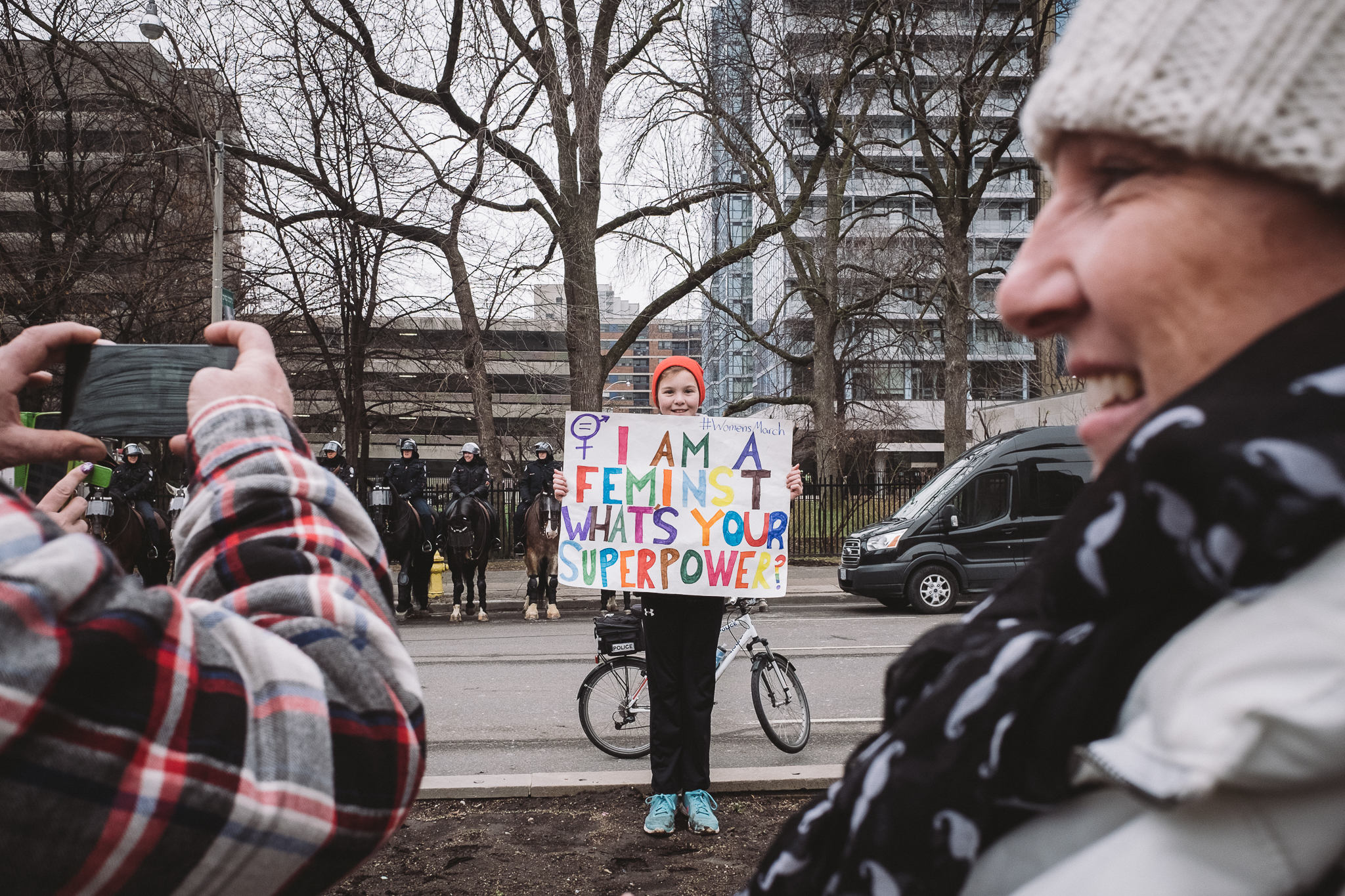
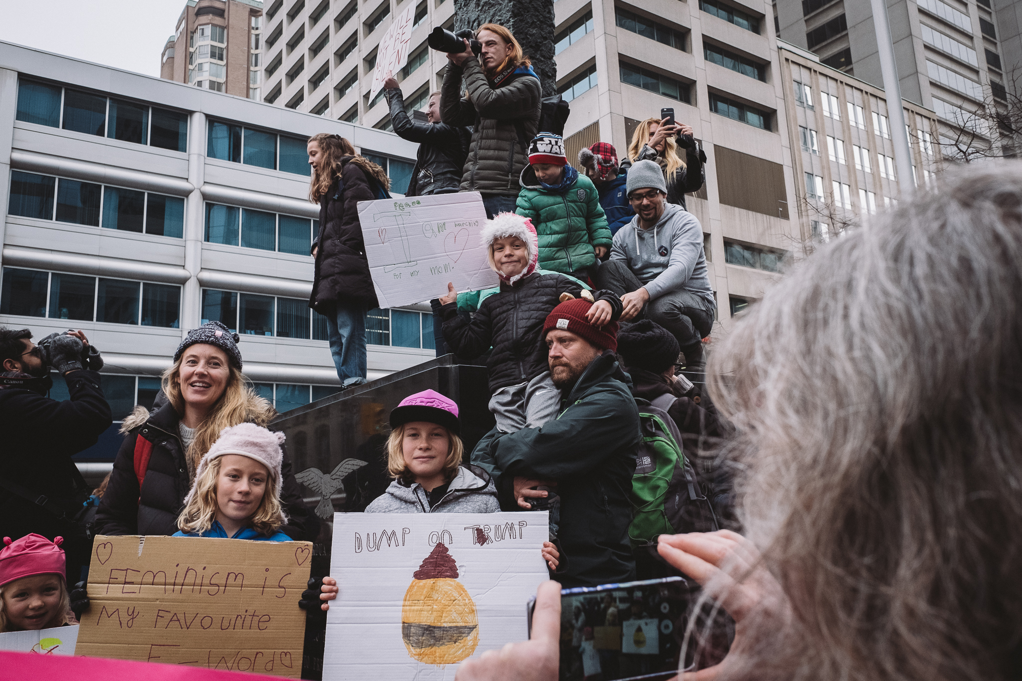
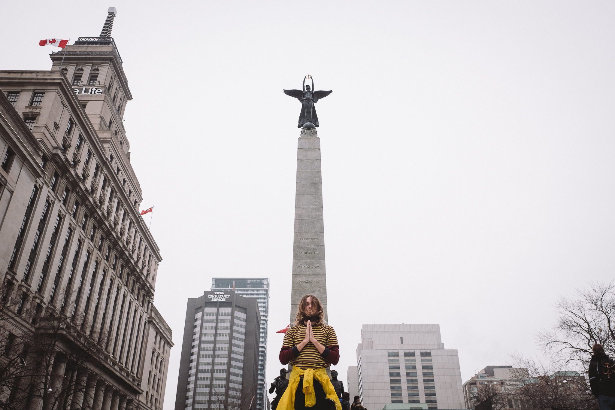
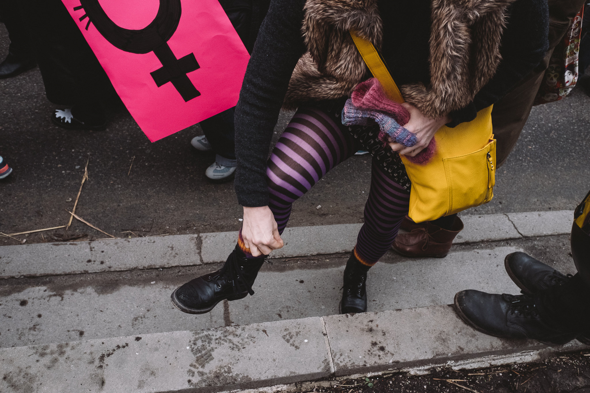
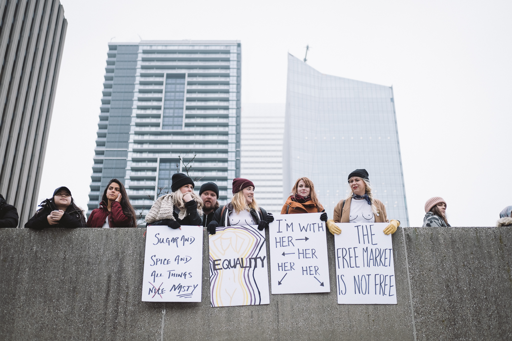
Scenes from the Toronto Women's March on January 21, 2017. 12:00 pm at Queen's Park.
A peaceful march in solidarity with the Women's March on Washington.

Music by:
Dyalla - Fight For You

Shot on:
Fuji X70
Fuji XT2
Samsung S7
GoPro Session 5

Starting A YouTube Channel: "A Phraction Of A Second"

With a new year starts a new experiment and there’s no better way to really see what you’re made of than to try something you have absolutely no experience in and see how well you do. For me that’s video.  I’ve always known that this medium has always been at the top and up until the last few years or so, it’s become so increasingly accessible for the general public to be able to create high-quality content that rivals what we see coming out of professional studios. I mean, for the longest time that’s been the case for photography - just ask any grumpy pro photog and the phrase ‘undercutting the industry’ and ‘weekend warriors’ will be said a few times or ten.

I guess I’ve decided to jump on the bandwagon and start kind of a vlog-esque web series focused on street photography because up until 2 months ago, I had no idea what kind of stuff was circulating around YouTube and I honestly found myself really captivated by it. I was curious to see if I could somehow merge this style of filming, along with point-of-view street photography, and post-production screen capture editing tutorials into one. Very ambitious for someone who didn’t know the differences between frame rates or even how to use any editing programs. Good thing iMovie is so intuitive otherwise it would’ve been super frustrating and I would’ve never gotten anything off the ground.

I’m still trying to figure out the best way to shoot video and stills all in one outing because honestly, it’s tough as it is to get a good shot if I’m not focused. While videography may seem to be a sibling of photography, it’s really more like the distant cousin, twice removed (whatever that means). It’s SO different you guys. What Im trying to say is that, getting my video work to match my photo level is something that will take some time and I embrace the challenge.

With any divergence from the path of stills and more specifically street photography, I feel that I will take a bit of a step back when it comes to the quality of work I’m doing with my shots. I look at it as a "1 step back, 2 steps forward" situation where hopefully the skills I learn from shooting motion pictures will somehow strengthen my still images.

I know one day I’ll look back on this video and see all the cliches, rookie mistakes, and the hack job I did on the audio, but if I consider something like this cringe-worthy in the near future, that just means that at that point in time, I’m at a much better place than when I started. To me, this is one New Year’s resolution that I hope to keep.

Anyways, enough talk (there’s enough of that in the video below) so here it is, enjoy!  

Critiques From The Cutting Room Floor 004

Here's the next image up for critique. You might have seen a variation of this shot that did make the cut but this version did not and I'd like to hear why you guys think that's the case. Again, I'll refrain from sharing my reasons for not posting this version but will update the post after 24hrs with the answers - once you guys had a chance to come up with your own assessments.

2016-09-11 9:02pm 24mm (eqv) 1/6s f2.8 800 ISO

2016-09-11 9:02pm 24mm (eqv) 1/6s f2.8 800 ISO

Below is the one that I ultimately did select (just for comparison) 

2016-09-11 9:02pm 24mm (eqv) 1/9s f2.8 800 ISO

2016-09-11 9:02pm 24mm (eqv) 1/9s f2.8 800 ISO

*Update*
I've received a bunch of great feedback on both my instagram feed and below in the comments section and am delighted to see that many of you guys are on the same page as I was regarding my deciding factors in choosing one image over the other.

In the top (rejected) shot, there's too much overlap with the characters near the middle of the frame which creates a two-headed man. The man standing at the foot of the staircase and in the foreground were there for a while which gave me a greater opportunity to be picky and to try and time the other people coming down the stairs to be more evenly staggered.

The other thing that caught my eye or rather the eye of the hero in this shot is the glare in his glasses. What a difference a slight tilt of the head can make in removing a distracting element like that but of course I just got lucky that he did so in the frame where better things were happening in the background. Also, what might have been causing the glare may have been a bright screen that turned on just outside of the frame which explains a bit of why his shirt is a bit more blown out than the other frame. 

The other thing that the better shot had was a bit more breathing room at the top of the frame. While some may say that the balance between the bottom of the foreground guy's shirt and the space between his head and the edge of the frame is equal and thus more balanced, I see the ceiling fan being cut off and wanted more emphasis on where the people were entering the frame.

One last thing that was mentioned is the motion blur. I actually don't mind it and in some cases, prefer it in the right places as it conveys movement and activity within the scene. I'm ok with it just as long as it's not too distracting, which in this case here since it's only found on the supporting characters.

I guess that's a wrap for now - thanks again for participating in these critiques. It's great to hear your input and share your thoughts with all those wanting to learn more. Stay tuned for the next installment!

A visual mark-up of what I was talking about above.

A visual mark-up of what I was talking about above.

Critiques From The Cutting Room Floor 003

Here's the next image up for critique. Right now I'll refrain from sharing my reasons for not posting this image but will update the post after 24hrs with the answers - once you guys had a chance to come up with your own assessments. You guys offered such great feedback with DM's on my instagram accounts that I felt that instead of keeping all this fabulous information for myself, that it would be better served to have everyone's thoughts in one place and use it as a collective learning tool for all. Feel free to leave your comments below on what you liked/didn't like about it, what could've been done better, and why you think I rejected this shot in the first place.

Cutting room floor image 003: : 2014-09-06 5:40pm 41mm (eqv) 1/500s f6.4 iso 200

Cutting room floor image 003: : 2014-09-06 5:40pm 41mm (eqv) 1/500s f6.4 iso 200

*update* What I primarily disliked about this image is that ultimately it's just a picture of people eating. I remember being once told that the most unflattering shots of people you could take is of them either eating or caught in mid-sentence making a weird gesture with their mouths. Street photography to me is about respecting your subjects and not making them either a spectacle or exploiting a moment of vulnerability. While this isn't the most embarrassing image you can take of someone in mid-chew, it also has nothing else going for it.

The tree shadow, while it fills the right side of the frame, doesn't fill it with anything that relates to the human subjects. On the top left corner, it's pretty dead and those sliver of elements also don't add to the scene.

Just because the light may be good, doesn't necessarily mean the subject matter or the scene is worth capturing. I was attracted to the light and how it hit the people but when you really break it down, that's all it's really got going for it.

Critiques From The Cutting Room Floor 001-002

I decided to try something new with images that I never ended up posting for whatever reason. I'm going to use them for critique analysis and share my thoughts on why they just didn't cut it for me. I hope to use this as a tool to help others as well as myself. By sharing my process, perhaps future work will not suffer the same fate and overall growth can happen for everyone!

Featured below are the previous images I shared on my instagram stories from my @phraction_street page and here's what I had to say about each:

Cutting room floor image 001: 2015-04-26 6:50pm 28mm (eqv) 1/500s f8 iso800

Cutting room floor image 001: 2015-04-26 6:50pm 28mm (eqv) 1/500s f8 iso800

In this shot I felt, that the entire right side was empty, the characters weren't all that interesting nor did the foreground or background elements connect in any way.

A lot of people commented that I could crop the entire right side out but I'm a stickler for keeping the original aspect ratio I shot in and extreme cropping will only make me a lazier photographer knowing that I can just fix things in post. I'm a professional photo retoucher and though I know I can do a lot of things but I'd rather spend my time enjoying photography instead of working ;)

Also check out Eric Kim's blog entitled: "10 Things Henri Cartier-Bresson Can Teach You About Street Photography"and pay attention to the section about cropping.   

Here's the next image I put up for critique:

Cutting room floor image 002: 2015-04-29 5:45pm 28mm (eqv) 1/500s f8 iso200

Cutting room floor image 002: 2015-04-29 5:45pm 28mm (eqv) 1/500s f8 iso200

In this one I rejected it from consideration because there were too many objects sticking out of the guys' head, there were only 2 points of interest (and they're not even that interesting). I usually go for at least 3 if possible, and the red car overlap simply bugs me.

And that's where we're at so far. I wanted to put this up and future posts on something that doesn't disappear after 24hrs because I think this is something that can be useful and can be built upon even after the fact. If there are any additions or comments to any of the images you see above, please comment and share your thoughts so others may learn as well!